You can add a custom trend graph to your Admin Hub as a Widget Preset. This graph shows the CPU and Memory usage by all cluster machines. This allows you to easily monitor the performance of your system over time.
Understanding the Graph
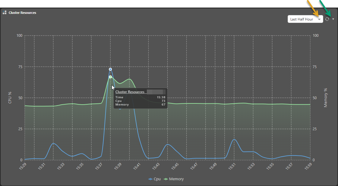
The Cluster Resource graph allows you to monitor the percentage of CPU and Memory usage as a percentage of the available resources over time:
- The graph maps the report time (orange arrow below) along the x-axis and CPU % and Memory % as the y-axes.
- The data that underlies the graph is reported by all the machines in the cluster and is aggregated and stored for 30 days. This allows you to create reports over different possible time periods as part of your monitoring.
- Note that the granularity of the graph differs depending on the selected duration, with the average of times taken between the timestamps.
- The graph itself can be refreshed / redrawn at appropriate intervals, based on your selection from the Refresh drop-down (green arrow).
Tip: To view the Cluster Resources at a particular point in time, hover your cursor over the graph to open a summary pop-up as shown below:
Where do I see this graph?
This graph is not included on the Dashboard by default, you must add it as a Widget using the supplied Widget Preset. For details describing how to perform this customization, see Admin Hub.