Area Chart
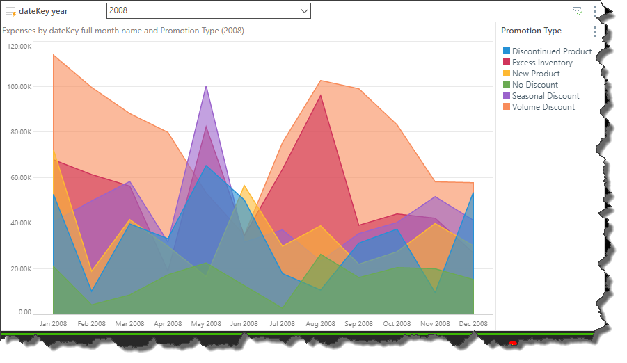
An area chart is very similar to a line chart, in that it plots data points across Cartesian coordinates, connecting each data point with a line. However, unlike a line chart, the area between the data points and the x-axis is shaded or colored for emphasis.
Area charts are often to display a trend in quantitative data over a period of time. They are particularly useful when comparing trends across multiple hierarchies, as the contrasting shaded areas make it easy to spot trends.
How to Build an Area Chart
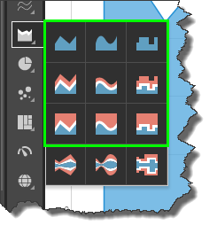
Select the required area chart type from the Area Chart sub-menu:
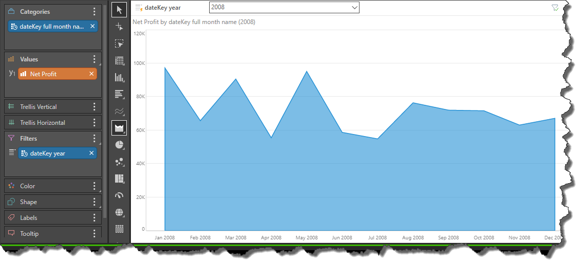
As with other Cartesian charts, you must have at least 1 measure in the Values zone and 1 hierarchy in the Categories zone. This will produce a basic area chart, plotting the data points representing the value for each hierarchy element. In this example, the chart plots net profit by month:
Here, a second hierarchy, “Class” was added to the Color zone. Now the chart shows net profit by month for each product class.

Spline Area Chart
The spline area chart is functionally identical to the area chart. The difference is that each data point is connected by a curved line instead of a straight line.
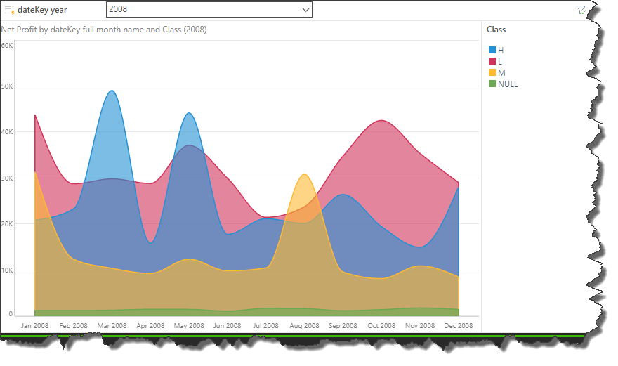
Stepped Line Area Chart
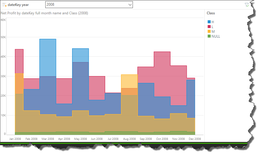
The stepped line area charts connects each data point with steps. This can make it easier to read the chart accurately.
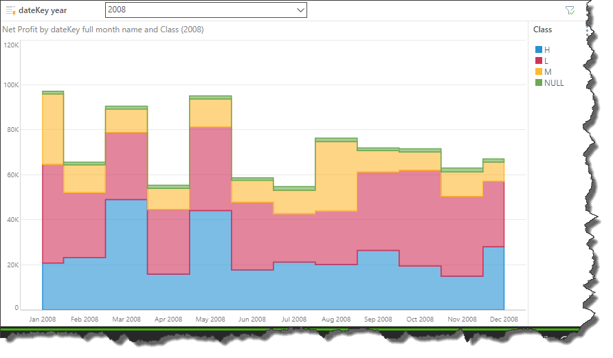
The stacked area chart is an extension of the area chart, but rather than each shaded area starting at the x-axis, each area is stacked one on top of the other. The chart shows the cumulative values based on absolute totals. That is, each area represents a portion of the total.
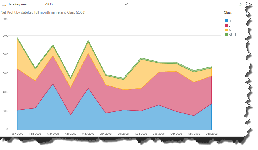
Spline Stacked Area Chart
Spline stacked area charts connect the data points in the stacked area chart with a curved line instead of a straight one.
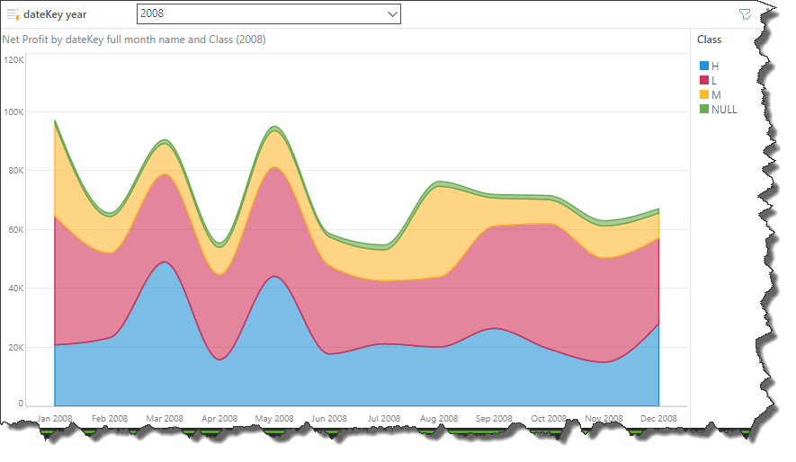
Stepped Line Stacked Area Chart
Stepped line stacked area charts connect the data points with a series of steps, making it easier to read accurately.
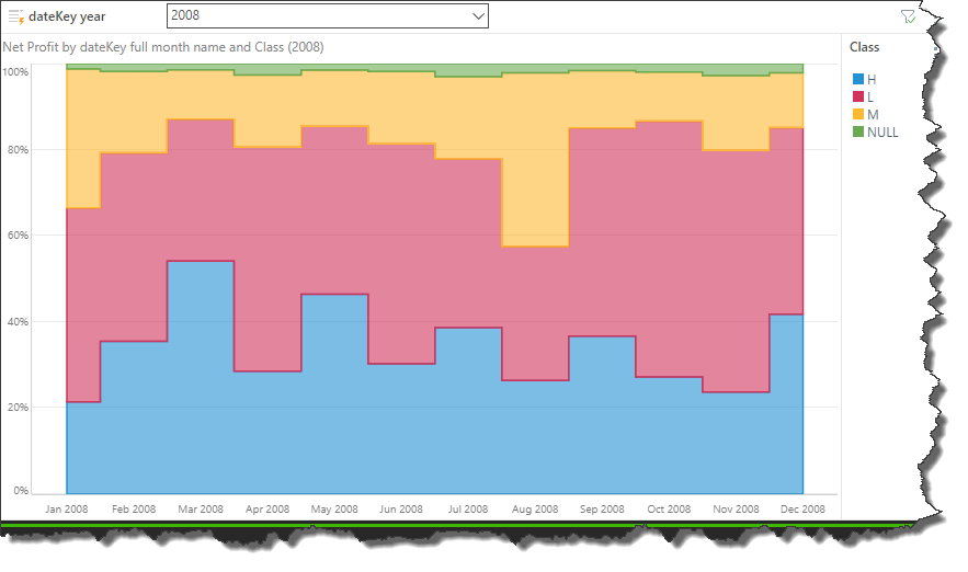
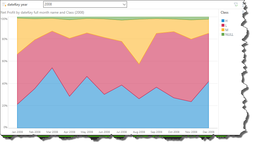
The stacked 100 are chart is similar to the stacked area chart, in that each shaded area represents a segment of the total. However, here the total is based equal to 100%, rather than an absolute value.
So, the stacked 100 area chart represents cumulative values relative to a total of 100%. The y-axis measures from 0-100%, with each stacked area representing a percentage of the total.
Spline Stacked 100 Area Chart
The spline stacked 100 area chart connects the data points with a curved line.

Stepped Line Stacked 100 Area Chart
The stepped line stacked 100 area chart connects the data points with a series of steps. This is useful if accuracy in readying the values is needed.
