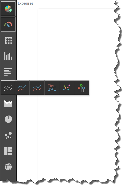
The Visualization "Smart" Picker is located along the left-hand side of the workspace. It features dozens of visualizations, offering users tremendous flexibility in the visualization of their data. By default - the visualizations are drawn using the AI engine that plots the data using the most appropriate visual with the most appropriate data layout given the user's selections. The base visual can, however, be overridden by the user with manual selections from the visualization picker.
Smart Visualizations
The Auto Recommend (green arrow below) button is located at the top of the Visualization Picker, and is enabled by default. When enabled, Pyramid uses AI driven Smart Visualization engine to automatically select and draw a visual for the data you have selected. In this example, the data was displayed as a pie chart:

When a single measure is added, the Auto Recommend engine will select a gauge visual (blue arrow).

Disable Auto Recommend
Click the Auto Recommend button to disable it. Alternatively, simply selecting a visual from the picker will also disable Auto Recommend. Reclick the button to use the automated suggestions.
Manually Selecting a Visual
The Visualization Picker features 10 categories of visualizations: gauge, grid, column chart, bar chart, line chart, area chart, segment chart, scatter chart, advanced charts, and maps.
Clicking on any of these will open the fly-out menu for that visualization category; from here, click a visualization to display in the query.

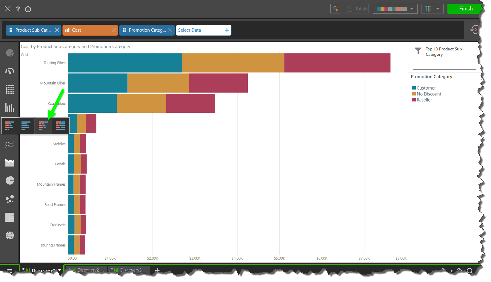
In this example, the data was displayed in a Stacked Bar Chart:
