Accessing Content
The content system is pervasive through the pro application. Apart from the main content manager and related views, content-related functionality appears within each app, from the App Tab interface and from the Home page. Variations of the functionality can accessed from the viewer client, on mobile devices and also be accessed via API.
The following explains the main entry points to the content system for the pro client.
Home
The home page is the main landing page for pro users entering the app normally. From the home page users can access the main content manager from the App Toolbox, the Quick Search option in the Home Menu or via the Home Dashboard.
App Toolbox
The "app toolbox", found from the home page in the Pro client or the admin console in the Pro client provides a fast link to the content manager (red arrow below). When clicked, the content manager will open up with the default view as defined in user defaults.

Quick Search
The quick search option in the home menu is a fast way to seed and execute a content search directly from the home screen. By entering a search string into the box, the search framework is triggered and a simple "contains" search query is run on the repository for the current user.
- Click here to better understand how the content search works.
Home Dashboard
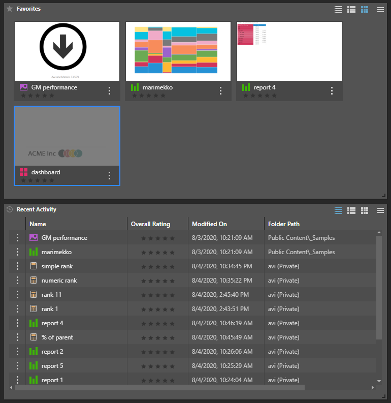
Another access point for content is via the favorites and recent listing panels found in the home dashboard.The dashboard is shown if users choose to hide the Quick Start and Learning center panel.
App Tabs
Once apps are opened (either by starting new sessions or opening existing content items), the application interface changes to the "App Tab" mode. Here, each opened app appears as a tab allowing users to open and swap between multiple, concurrent sessions.
Within the App Tab interface, there are two key access points to the content system: The App Tab home menu and the tab menus for each app.
App Tab Home Menu
Content Explorer
Users can click "Content Explorer" item from the App Tab Home Menu to immediately navigate through the Content Manager . This is the primary method used by most users to switch to the content system from the open app tab interface.
Quick Open
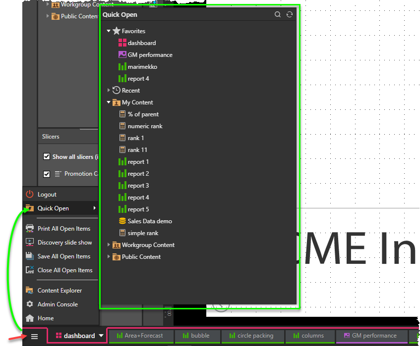
Another option is the "Quick Open" item which offers a fast way to find and open content without leaving the App Tab interface. It exposes an explorer like interface with the current user's folders, together with recent and favorites. The Quick Open also offers a quick search choice.
Tab Menu
The Tab Menu offers a variety of content related functions for each open tab. This includes the following functions: save, save as, duplicate, delete and opening related content. Importantly, it also offers a menu item to go to the selected item's specific location within the content explorer view.
- Click here for more on the tab menu.
Within each App
When an app is opened in the App Tab interface, there are multiple content system touch points common to all the apps: this includes "save" and in most cases "open".
Save
The most common entry to content from EVERY app is the save function. Users can trigger the save from the status bar or from the tab menus.

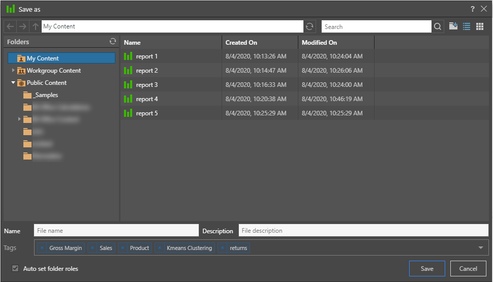
When triggered, the following dialog is presented if saving content for the first time (or choosing the "Save as" mechanism). The dialog lets users pick the folder location, name and description for the content, as well as any meta tags that can be used in the future for content search.
- Click here for more on saving content.
Open
Most of the apps open in the "App Tab" interface have open capabilities. In some cases the "open" refers to panels to allow content to be embedded (for reusability purposes); in other cases the open is a convenient mechanism to see and edit previously embedded content for ongoing edits; and finally there are cases in which the open function operates outright as a mechanism to simply open the next item. The following is an example list of a few typical "open" functions available within each app.
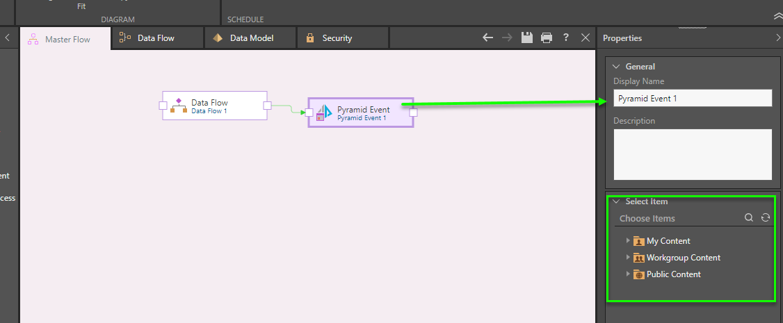
In the master flow panel of Model, users can trigger other Pyramid flows or publication jobs to run as part of the workflow. The event widget requires the user to select one of these packages from the content explorer.
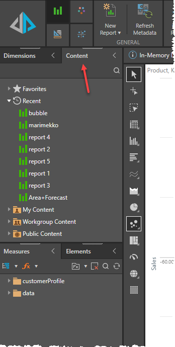
In Discover, users can click on the content panel to open more Discover items without needing to go back to the content explorer or using the quick open function from the App Tab Home menu..
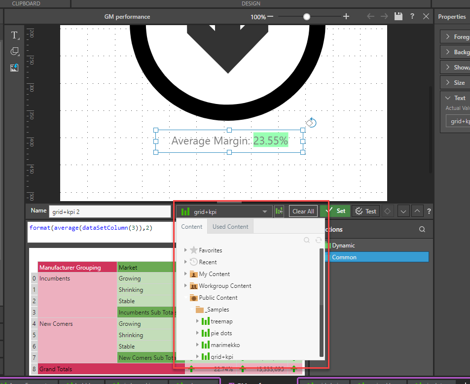
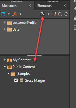
All shared business logic , stored in the CMS, is available for users to incorporate into Discover (and in many other parts of the application), Clicking the FX button in a given element tree will expose the content explorer with the relevant items to choose from.
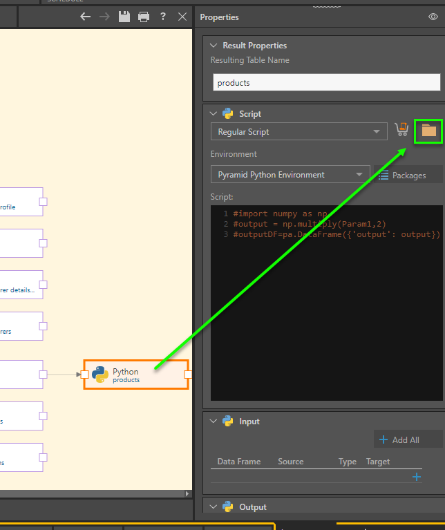
Like Discover, shared business logic items can be incorporated into formulations. Where appropriate, users can click on the FX button to expose the content explorer with the relevant items to choose from.
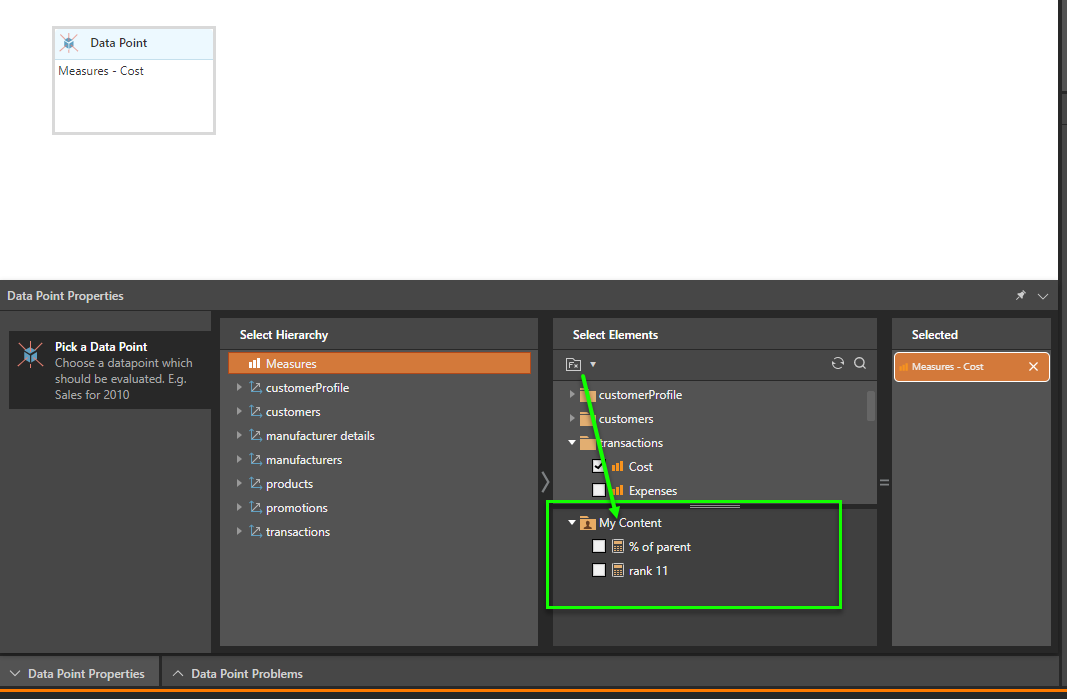
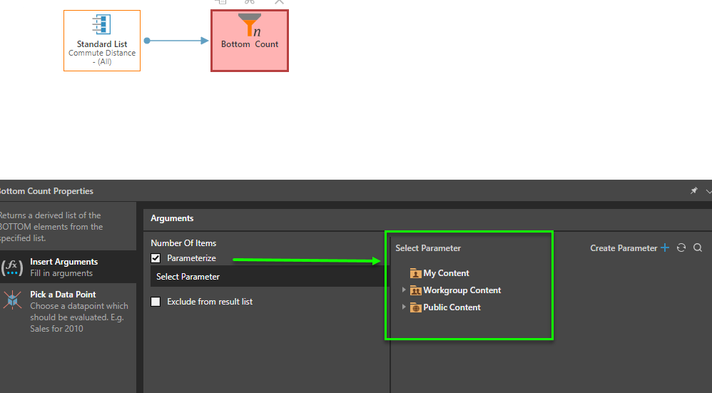
The same technique and approach applies to other elements, for example shared parameters - where the content explorer with relevant parameters can be opened within the appropriate panels.
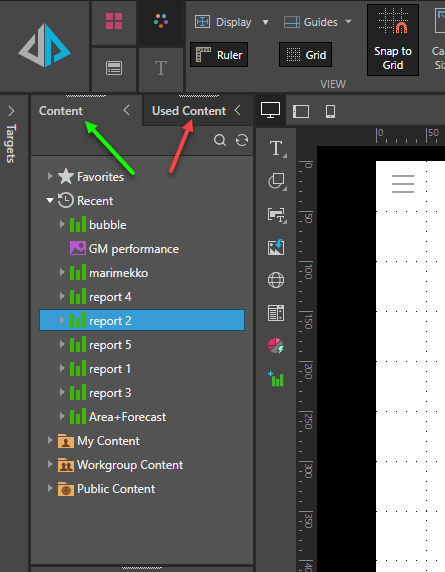
Present and Publish have common functionality. Both expose a content tree panel showing the content explorer of items that can be used as embedded content for the presentation or publication template. Separately, the used content tab shows all items that have been previously embedded. This can be used to quickly open these items for editing.
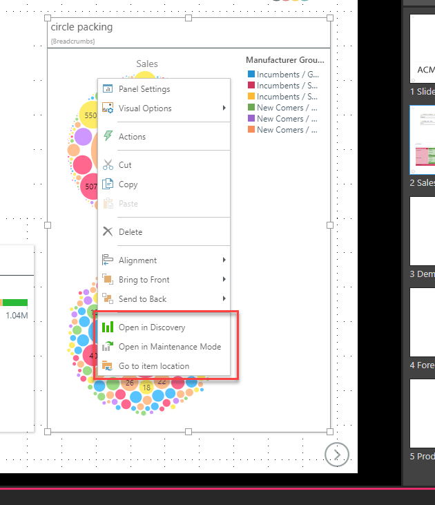
Another technique for opening embedded items for editing from Present and Publish, is to right click on an item and choose to open them (in Discover or Illustrate). The context menu also lets admins open the content in maintenance mode (which means without query execution) and to jump to the item's folder in the content explorer tools.
In Illustrate, all data driven logic is based on existing Discover reports. As such, when building out the formulas, the user is required to find and open these items using the content explorer tree.
