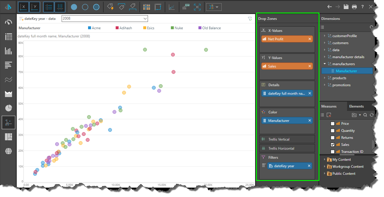
Drop Zones
The Drop Zones panel features several different types of drop zones, with each zone driving a corresponding component in the visualization. The chose visual also determines which drop zones will be exposed; for instance, when a grid visual is chosen, the Columns and Rows zones appear in the drop zones. But if the visual is changed to a gauge, Columns and Rows will no longer appear; instead, you will see Target and Status. Click here, for more information about how the metadata trees, drop zones, and visualizations drive each other.

To learn about each of drop zone types, follow the links below:
- Values: measures are placed in the Values zone, which drives the quantitative data in the query.
- Columns and Rows: arrange hierarchies and measures according to where they should be located in the grid.
- Category: add a hierarchy to display it on the x-axis of the Cartesian chart.
- Trellis: display multiple Cartesian charts or gauges driven by the given measure or hierarchy.
- Color: add a color component, driven by a measure or hierarchy.
- Size: drives the size of the visualization’s segments or cells according to the given measure.
- Labels: label the chart with a measure other than the measure of actual data point.
- Tooltip: drives the tooltip in the visualization.
- Status/ Indicator: visualize the status of a given measure for each data point in a grid or gauge. The status zone appears when a gauge visual is selected, while the indicator zone appears when a dragging a measure to the drop zones when a grid visual is selected.
- Motion: adds visual animations to the chart. The Motion zone is exposed when working with Cartesian, charts.
- Details: add multiple member hierarchies to scatter, advanced (except Sankey and word), and bubble map charts.
- Mapping:
- Filters: add 'slicers' or data driven filters to the query.
- Background Selections: used to filter the entire query using single elements.