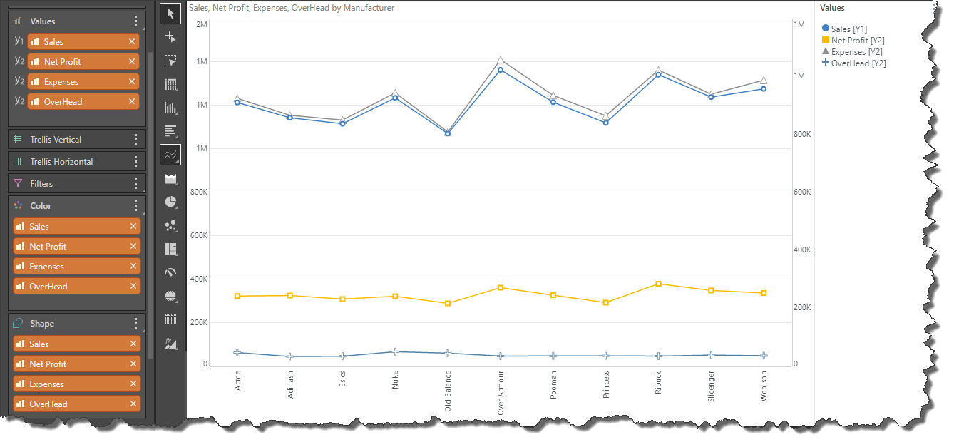
The Shape drop zone is enabled when working with charts that display data points: line, point, lollipop, area, stream, scatter, and bubble charts. It is used to drive the shape of the data point, witch each element in the hierarchy represented with a different shape.
The Shapify function in the Value drop zone context menu allows you to use measures to drive the shape of the data points.
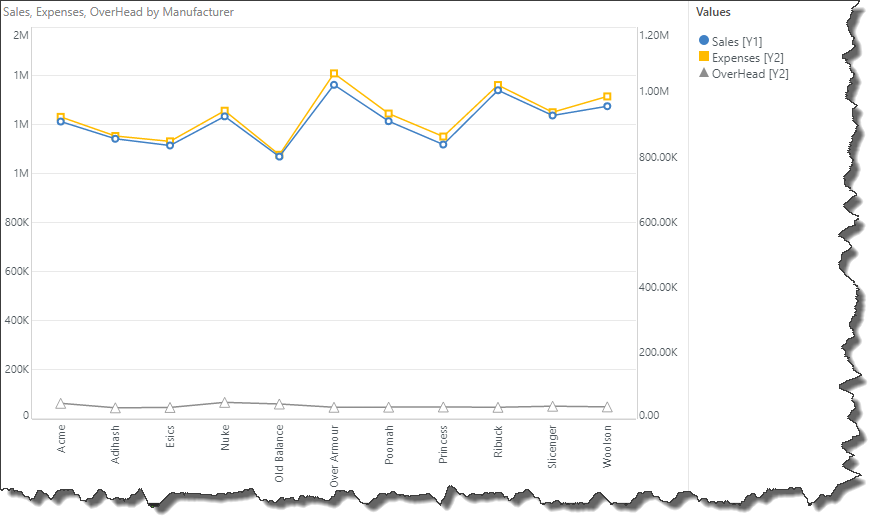
How to Shapify Measures
Step 1
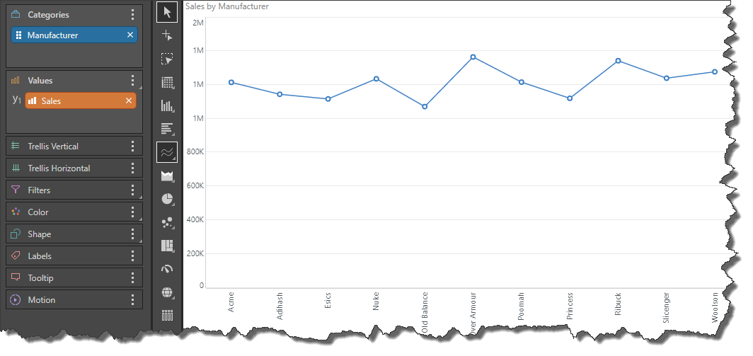
Start by adding a single measure to the chart.
Step 2
Add your second measure to the secondary axis, making sure to drop it in the "All" Column, for the chart type that you are using. For instance, in this example, a line chart is used. So, the second measure must be added to the Line Chart, All zone (green highlight):
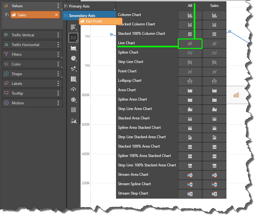
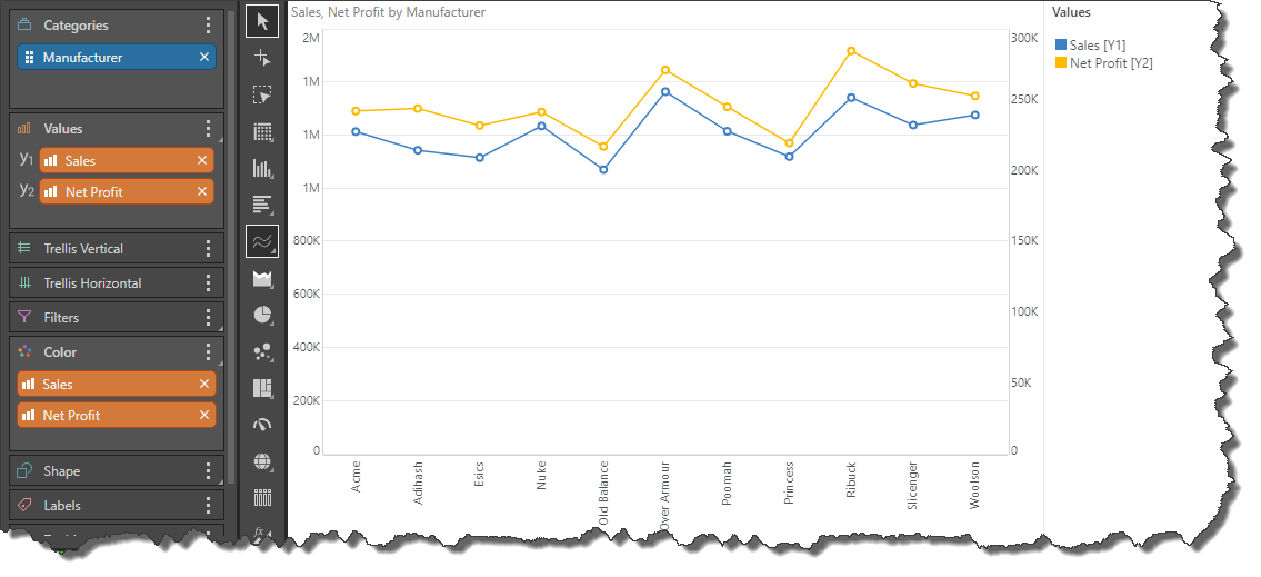
This will result in your measures being added to the same chart and automatically colorized.
Step 3
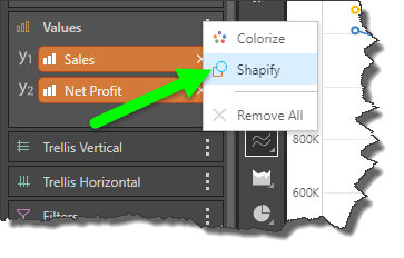
To shapify your measures, open the Values context menu and click Shapify,
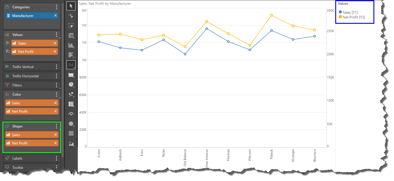
Your measures will be copied to the Shape zone, and a combined color shape legend will be produced automatically. The shape of the data points in the chart is now driven by the measures in the Shape zone.
Step 4
You can continue adding measures to the chart in the way described in Step 2. Each time you add more measures, you must repeat Step 3 to apply the Shapify function to newly added measures.
