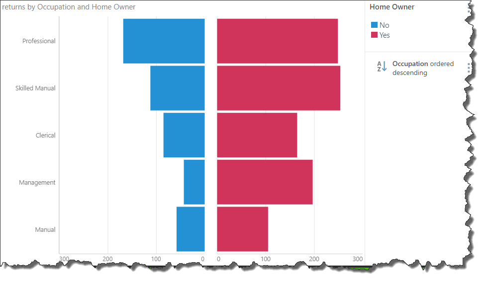
Tornado charts are commonly used for sensitivity analysis, by facilitating the comparison of the affects of one variable (or uncertainty) on the output (value) of an independent variable. Tornado charts are also useful simply for comparison purposes.
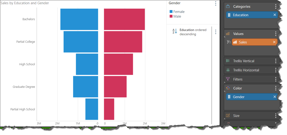
Tornado charts map data across 2 bar charts; each bar represents the value of the independent variable. However, each chart is shaded according to the 'uncertainty', enabling you to ascertain the impact of the uncertainty on the value of the independent variable. Each bar in the 2 charts is draw opposite its corresponding bar, extending from the center value outward, in descending order of widest to thinnest bars; this is what creates the 'tornado' effect.
The center value on the x-axis is the smallest value in the data set; depending on the data set, this may be a positive or negative number.
Build a Tornado Chart
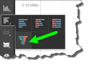
The tornado chart can be selected from the Bar chart sub-menu in the Visualization menu or from the Change Visualization drop-down in Report ribbon.
To build a tornado chart, you must place 1 hierarchy, containing 2 member elements, in the Color drop zone. Another larger hierarchy must be added to Categories, and a measure to Values. You can then sort the chart by the hierarchy on the y-axis to display the bars in order of widest to thinnest.
Example
Step 1
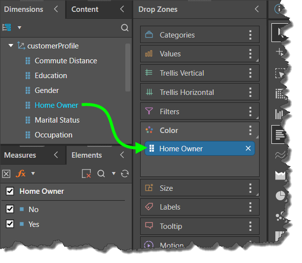
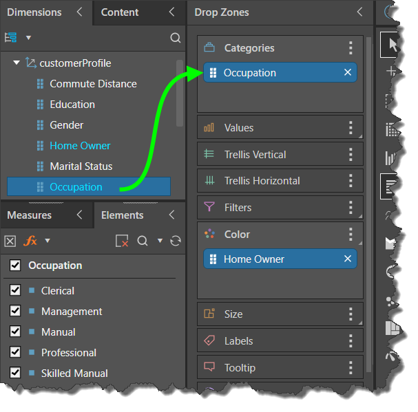
Add a hierarchy containing 2 member elements to the Color drop zone. In this example, based on the Sample Demo model, the Home Owner hierarchy was added to Color.
Step 2
Add a larger hierarchy to the Categories drop zone. Here, the Occupation hierarchy was used.
Step 3
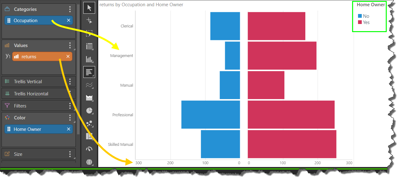
Add a measure to the Values zone. In this example, we're using the Returns measure.
One the measure is added, the visualization is drawn. We see Occupation on the y-axis (yellow arrow below), Returns on the x-axis (orange arrow), and Home Owner driving the color of each chart, with the key displayed in the legend (green highlight).
Step 4
Sort or quick sort the chart by sorting values in descending order from the hierarchy on the y-axis.
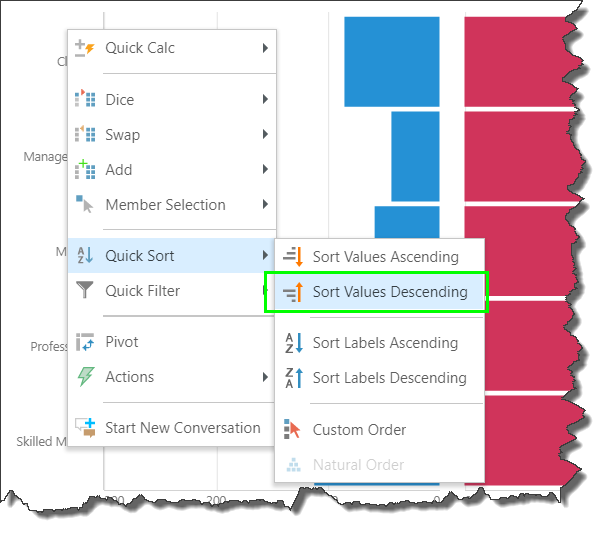
The result will display the widest bars at the top of the chart, and the thinnest at the bottom.
