Custom Visuals
Custom visuals can be configured from Formulate, and then shared with other users. Report-builders can then use those custom visuals to present data in Discover. The specific custom visuals available to you depends on the visuals that have been configured and shared from Formulate.
How to Use Custom Visuals
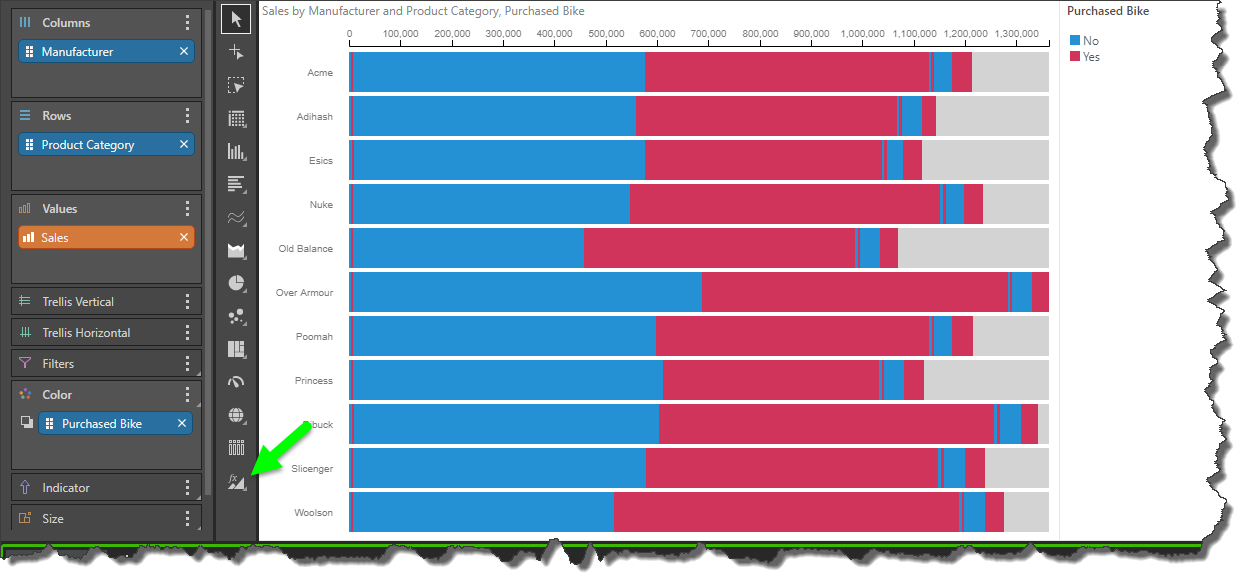
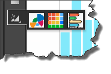
If custom visuals have been configured for the data model that you're querying, and you belong to user role that has access to those custom visuals, you will see the Custom Visual fly-out menu in the visualization picker. As usual, right click on the menu to open it, and select the required visual. Depending on the way the visual was configured, you may see a description of the custom visual when you hover over its icon.
Marketplace Custom Visuals
When a custom visual is built in Formulate, the user has the option to base the visual on a custom visual downloaded from the Marketplace. The visuals currently available for download are described below.
Aster Plot
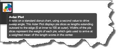
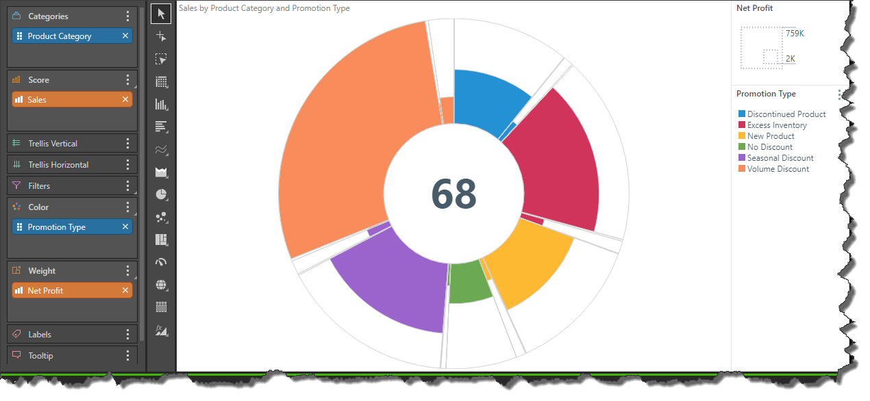
The aster plot is similar a doughnut chart with weighted values. The length of each segment is determined by the 'score' value for the corresponding element in the hierarchy placed in the Categories zone. The width of each segment is driven by the 'weight' value. A second hierarchy can be added to drive the colors of the visual.
The Aster Plot is a good way to visualize data as a proportion of a whole, while seeing more detail and nuance than is offered by other segment charts.
As with other visuals, the drop zones will automatically present the zones that are supported for the selected custom visual. In this example, the selected visual (an Aster Plot), require 1 measure in the Score zone, a second measure in the Weight zone, 1 hierarchy in the Categories zone, and a second hierarchy in Color:
Measure Waterfall
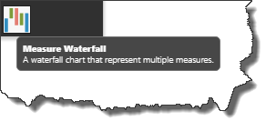
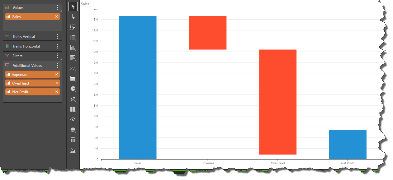
The Measure Waterfall presents multiple measures as a waterfall, which is useful for comparing differences between measures.
This visual requires 1 measure in the Values zone, and multiple measures in the Additional Values zone. No hierarchy is required, but hierarchies can be added to the Trellis or Filters zones.
Heat Grid
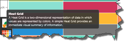
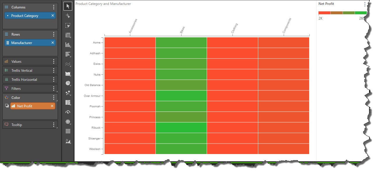
A Heat Grid represents values by color, rather than text. To populate the grid with colors, a measure must be added to the Color zone.
In this example, the Net Profit measure was added to the Color zone; the grid displays a range of colors according to the range of values for the data points in the grid:
Diverging Stacked Bar Chart
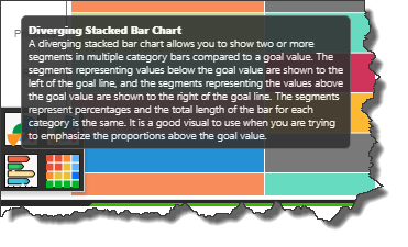
The diverging stacked bar chart is used to display 2 or more member elements as segments in each bar, compared to a goal value. The segments representing values below the goal value are shown to the left of the goal line, and the segments representing the values above the goal value are shown to the right of the goal line.
Each segment in the bars represents a percentage of the total, with the total length of each bar being equal. It is a good visual to use when you are trying to emphasize the proportions above the goal value.
