The Scrollable Panel is a layout container used to display multiple content items in a scrollable format side by side with fixed position elements. Scrollable panels can be used to display visualizations, slicers, dynamic images, text, web panels, buttons, and images.
Note: this feature is not available in the Community Edition.
The scrollable panel is based on a "tiled" layout model, where visualizations and other assets can be sized as required using a "snap-to-grid" interface.
Adding Scrollable Panels
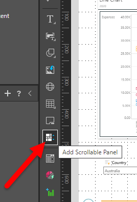
To add a scrollable panel to the slide, click Add Scrollable Panel from slide menu (red arrow below). Then click anywhere on the slide to place the panel, where it can then be moved and re-sized.

Add Assets to Scrollable Panel
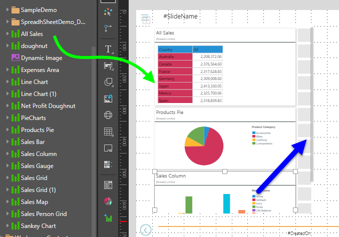
Drag the required visualizations or assets onto the panel, directly from the Content panel or from the elsewhere on the slide.
The assets will automatically be trellised in the panel, and a vertical scroll bar enabled (blue arrow below).
Assets added to the scrollable panel can be re-sized as needed.

Slicers
Slicers can be added inside the panel or outside it; regardless of its location, interactions will automatically be added from the slicer to the assets in the scrollable panel.
Panel Background
The panel background color can be changed from the Component ribbon. Click on the scrollable panel and then choose the background color from the Panel Background drop-down:

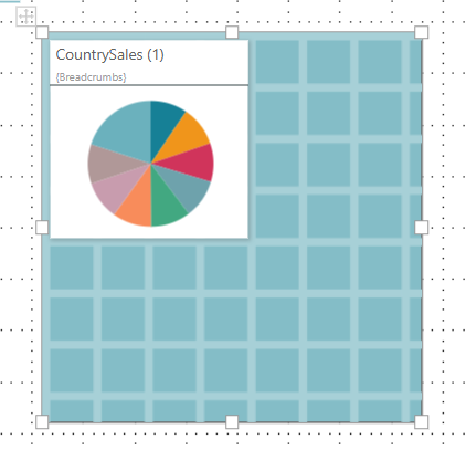
Here, the panel background color was changed to blue:

Scrollable Panels in Runtime
When the presentation is launched in runtime, you can scroll up and down through the panel as needed. The assets behave as usual in runtime; slicer and visual interactions are enabled by default.