Panels are the containers used to display data discoveries in Present and Publish. Depending on the panel type chosen, the panel may display the data discovery's title and breadcrumbs. The panel tools are exposed when hovering over the data discovery, regardless of whether or not panels are enabled.
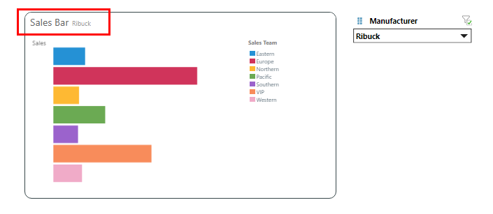
The image below shows a data discovery in a rounded panel; the panel features rounded corners and a black outline. The title is displayed at the top left corner, along with the breadcrumbs.
- Click here to learn how to customize panels from the Panel Settings dialog.
- Click here to learn about the panel tools that are exposed in runtime.
Customize Panels
Panels can be shown or hidden, and they can be customized to show or hide the title and/ or breadcrumbs. The panel type can be changed from a list of presets, to adjust the look and feel of the panel. You can also customize the panels from the Panel Settings dialog.
To Hide the title and/or breadcrumbs, click the visualization and disable the relevant buttons from the Presentation ribbon:

Adjust the panel styles and settings for all panels on the current slide from the Slide ribbon. Toggle Show Panels to show or hide all panels on the slide, or open the drop-down to change the panel style or to open the Panel Settings dialog to customize the panels. Toggle the Title and Subtitle buttons to show or hide titles and subtitles in all panels on the slide.
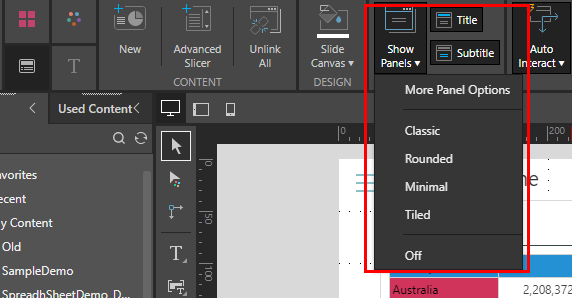
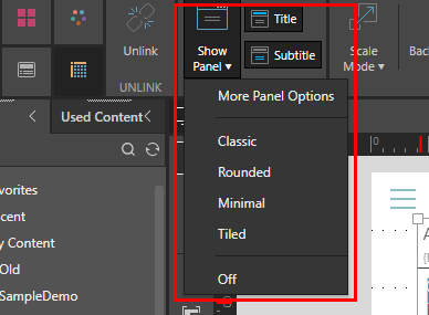
Adjust the panel styles and settings for the currently selected visual from the Component ribbon. Toggle Show Panel to show or hide the panel for the given visual, or open the drop-down to change the panel style or to open the Panel Settings dialog to customize the panel. Toggle the Title and Subtitle buttons to show or hide the title and subtitle in the panel.
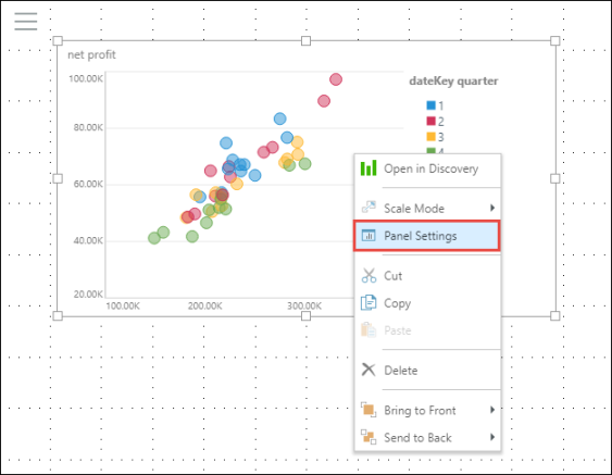
The panels of an individual visualization can be customized (or enabled) from the visual's right-click menu.
Panel Types
The following panel type presets are available from the Show Panel drop-down in both the Component and Slide ribbons.
Classic
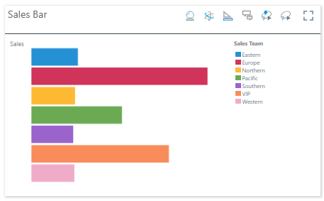
The Classic panel features square corners and a shadow around the edges, as well as a dividing line beneath the title. The title appears at the top left corner, and the panel tools appear at the top right when hovering over the visual.
Rounded
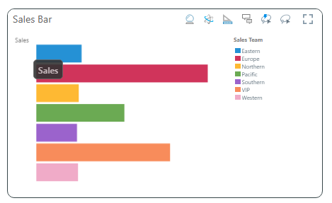
The Rounded panel features rounded corners and a black outline. The title appears at the top left corner, and the panel tools appear at the top right when hovering over the visual.
Minimum
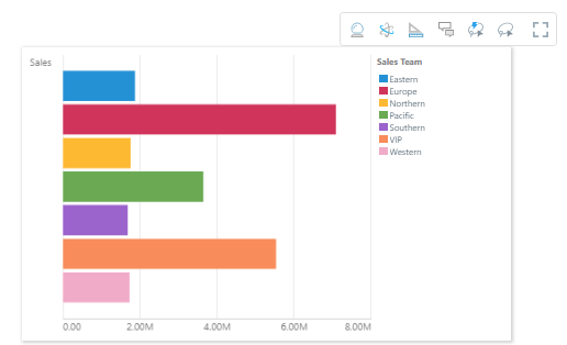
The Minimum panel features square corners and a shadow all around the edges. The title is hidden, and the panel tools appear as a pop-up above the visual when hovering over it.
Tiled
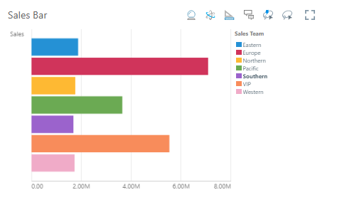
The Tiled panel is totally flattened; there is no outline or shadow. The title appears at the top left corner, and the panel tools appear at the top right when hovering over the visual.
Off/ Hidden
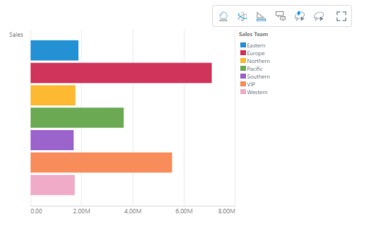
When the panel is turned off, the title is hidden and the panel tools appear as a pop-up above the visual when hovering over it.
Sanctioned Model
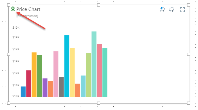
Visuals built from a sanctioned data model will display the sanctioned model watermark in the panels:
Note: this feature is not available in the Community Edition.