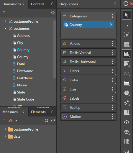
Pyramid's Cartesian charts display the given data as column or bar charts, according to the specific chart-type selected by the user. There are several Cartesian charts to choose from:
- Column Chart
- Stacked Column Chart
- Stacked 100 Column Chart
- Marimekko Chart
- Bar Chart
- Stacked Bar Chart
- Stacked 100 Bar Chart
- Tornado Chart
- Stacked Measure Charts
- Combo Chart
- Line_Chart
- Point Chart
- Lollipop Chart
- Area_Chart
- Stream_Chart
How to Build Cartesian Charts
A simple column or bar chart requires at least 1 hierarchy, either in the Categories drop zone or the Color zone, and 1 measure. Stacked bar and column charts require either 2 hierarchies - 1 in Categories, and 1 in Color - and 1 measure, or a single hierarchy in Categories and multiple measure in Values and Color (this results in a stacked measure chart).
A Marimekko chart requires 2 hierarchies (1 in Categories and 1 in Color) and 2 measures (1 in Values and one in Size).
Begin a Cartesian Chart
The steps below explain how to begin building a Cartesian chart; for further details, refer to the required visualization type as listed above.
Step 1
Start by dragging the required member hierarchy to the column or car icon on the canvas of a new query.
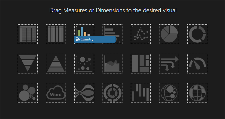
Step 2
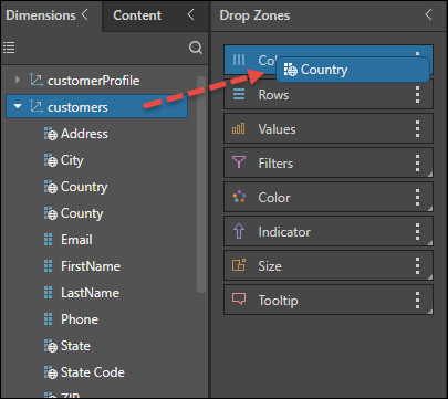
Alternatively, drag the required hierarchy to the Columns or Color drop zone.
Then choose the required Cartesian; for a column chart, click the Column chart icon from the visualization menu. Alternatively, open its fly-out menu and select a different type of column chart.
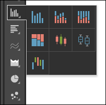
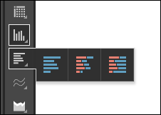
Or select a bar chart type:
Step 3
The drop zones will be updated according to the given visualization.
