Mini-Tabs use a tabbed container to display multiple visuals or other assets in the same screen real estate. The container features tabs; a single asset can be added to each tab, and a single tab can be displayed at any one time.
You can display tabs manually, by clicking on the required tab; or conditionally, by defining actions based on dynamic PQL expressions together with Slicer Actions.
- Click here to learn about conditional display for mini-tabs
Note: This feature is not available in the Community Edition.
Add Mini-Tabs
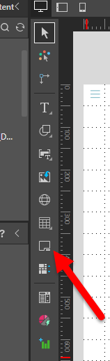
To add a mini-tab container to the slide, click the mini-tab button from the canvas menu (red arrow below). Click anywhere on the slide to place the container there.
Add and Remove Assets from Mini-Tabs
To add an item to one of the tabs, drag the required visual or asset onto the required tab.
To move the asset from the mini-tab container to somewhere else on the canvas, drag it or select it and use the clipboard tools (cut, copy, or paste) from the Present ribbon or right-click context menu.
To delete an asset from the container, right-click on it and select Delete Tab Content from the context menu. Alternatively, right-click on the mini-tabs and click Delete Tab to remove the selected tab and its content.
Edit Mini-Tabs
Mini-Tab Context Menu
To access the mini-tab context menu:
- Right-click the borders of the mini-tab container (green highlight below).
- Right-click a visual inside the mini-tab. In this case, the mini-tab context menu is shown inside a Mini-Tab sub-menu.
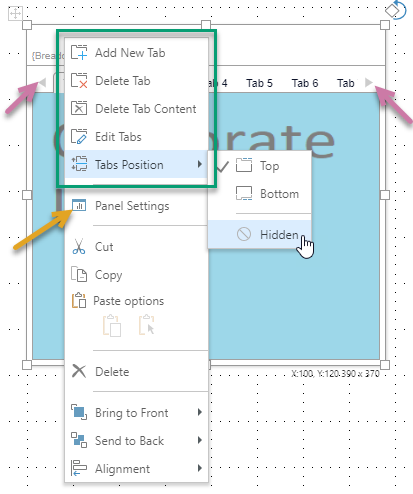
Tip: In addition to the mini-tab items, you can also access other items from the context menu. Where the border is selected, this includes the Panel Settings (orange arrow above) which opens the Formatting Panel.
|
Function |
Description |
|---|---|
|
Add New Tab |
By default, the mini-tab container has two tabs. Click this option to add another tab. Note that the new tab is added after any existing tabs by default, you need to Edit the tabs to change its position. Note: When you add more tabs to the panel than you can see, left and right arrows are added (purple arrows) to allow you to navigate to tabs that are shown but cannot be seen. |
|
Delete Tab |
Delete the currently selected tab. |
|
Delete Tab Content |
Delete the content item in the currently selected tab. |
|
Edit Tabs |
Open the Edit Tabs panel and edit the settings for the mini-tab container. You can use this panel to change the name of the mini-tab container, add, remove, and move tabs, change the tab name, and indicate whether to show an icon. |
|
Tabs Position |
Display the tabs at the Top or Bottom of the container, or select Hidden to hide the tabs. If you select Hidden, you should select which tab to show using the Select Tab option. You can, alternatively, decide which hidden tab to show based on your runtime slicer selections. For more information, see Conditional Display for Mini-Tabs. |
|
Select Tab |
Only shown if one or more tabs are hidden. Use this option to indicate which tab to show at runtime. |
Edit Tabs
Open the Edit Tabs panel to edit the settings for the mini-tab container.
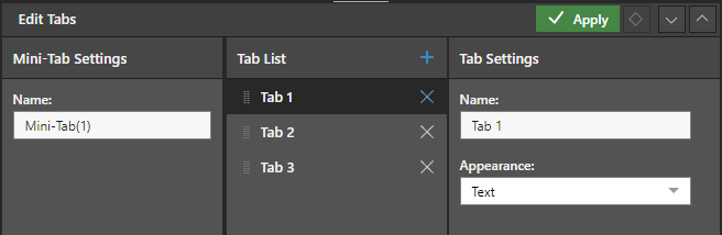
Mini-Tab Settings
Name: Change the name of the mini-tab container.
Tab List
Tab List: Add and remove tabs, and change the order of the tabs as they are displayed in the container. Note: To change the tab order, grab the handle to the left of the tab name (purple arrow above) and drag and drop the tab into its new position.
Tab Settings
- Name: Change the name of the given tab.
- Appearance: Show the tab name or icon.
Tabs Position
Display the tabs at the top or bottom of the container, or hide the tabs. If the tabs are hidden, a new Select Tab option will appear on the context menu; use this to choose which tab to display before launching the presentation at runtime.
If tabs are hidden, you will not be able to change the display at runtime. Instead, you'll need to set up conditional display; in this case the mini-tabs display is driven by a slicer selection.
The tabs position can be set from both the mini-tabs context menu, and the Component ribbon.
- Click here to learn about conditional display for mini-tabs
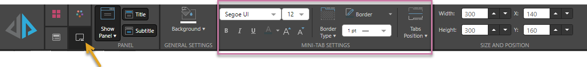
Mini-Tab Settings
With the mini-tab selected on the canvas, click the Component tab (orange arrow below), to access the formatting options associated with the Mini-Tab:
Panel
Use the options in the Panel section to format the panel associated with the mini-tab container. For more information about these options, see Panels in Present Pro.
General Settings
Edit the background color for your mini-tab container using the Color Picker. For more information, see Color Picker
Mini-Tab Settings
Update the formatting options that are specific to the mini-tab (purple highlight):
- Font: Set the font type, size, emphasis, and color for the tab labels.
- Border Type: Set the border for the tabs. Options are:
- Full Box: Display a border around the entire visual and its tab.
- Line Only: Display only a line at the bottom of the visual.
- None: Disable the border.
- Border: Set the border color.
- Border Thickness: Adjust the width of the line used for the border.
- Tabs Position: As described above, set the position of the tabs to the top or bottom of the container.
Size and Position
Change the size and position of the selected item:
- Adjust the item size using Width and Height.
- Adjust the item position using X and Y.
Tip: The X and Y coordinates and width and height are displayed underneath each content item when it is selected on the canvas.
 Formatting Examples: Mini-Tab Settings
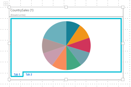
Here, the tab font type and color was changed and set to bold. A full box border was selected and the color and width changed:
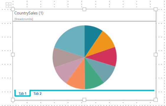
Here the border was set to line only:
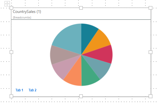
And here, the border was disabled:
Mini-Tabs at Runtime
When the presentation is launched at runtime, you can click through the tabs in the mini-tabs container as required: