Building a visualization is a simple process which requires you to add a hierarchy and measure to the drop zones, and then select a visualization type. The drop zones change according to the requirements of the selected visualization. The process of building visualizations is fluid and designed to enable the user to easily change the selected visual as needed. This allows you to find interesting ways in which to present your data.
It is important to note that Pyramid's data visualization engine offers users a huge range of core visualizations, as well as the ability to create custom visuals. Each core visualization can be tweaked by adjusting the chips in the drop zones. Pyramid also offers tremendous flexibility when it comes to formatting, which can be leveraged to significantly change the look and feel of each visualization.
Building your visualization
Before you begin
This topic assumes you have an empty discovery open in Discover Pro. If you do not, follow the steps in Access Discover Pro to create one!
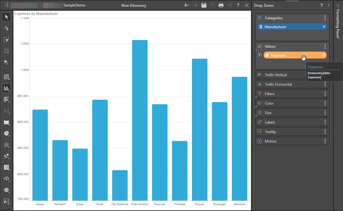
Drop Zones
The drop zones are updated dynamically according to the chosen visualization type. When you add a hierarchy and a measure to the drop zones, your default visual will automatically be generated and populated with the given data:
- Click here for more information about Drop Zone-related functionality
Changing the Visualization Type
Once your query contains a dimension, hierarchy, or measure, the Toolbox is shown to the left of the canvas. You can use either the Toolbox or the Change visual option on the Report ribbon to change the visualization applied to your query.
Your options include:
- Selecting a different Visualization Type from the Toolbox or Ribbon.
- Selecting a custom Visualization Type from the Toolbox.
- Prompting Pyramid to select a Visualization Type automatically, based on your data.
- Opening the Auto Recommended options to select a Visualization Type that Pyramid recommends, based on your data.
- Click here for more information about Visualization Types
Conditional Formatting
In addition to building visuals via hierarchy and measure selections and by selecting a visual type, users can also employ conditional formatting to adjust things like color and indicator graphics based on query values. Although these enhance the basic visualization capabilities, rather than act as a visualization in their own right.
- Click here for more information about Conditional Formatting
Note: Conditional formatting is a critical part of building data-driven visualizations that impart more information than simple charts or grids alone.