This type of map is a combination Bubble and Shape map, with data points displayed as bubbles and map data as polygons.
- Bubbles are used to represent values: the larger the bubble, the larger the value. On a Layered map, bubbles are always circles.
- Polygons (or shapes) are used to visualize a given measure across countries, states, or counties. On a Layered map, shapes do not incorporate data labels.
Layered Maps
Building a Layered Map
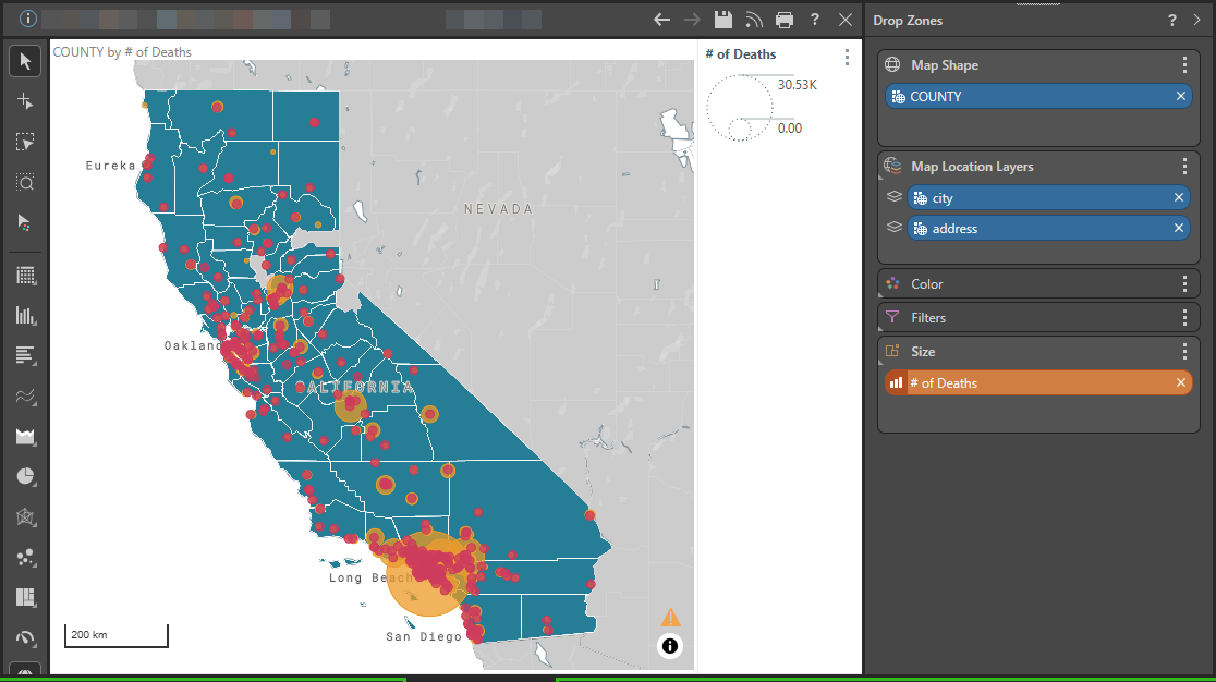
The following Layered map shows:
- The state of California broken into counties.
- The cities and addresses of the hospitals in California shown as bubbles on different layers of the map. In the example, the orange bubbles on layer 1 represent cities and the red bubbles on layer 2 represent hospital addresses.
- The number of deaths in California (the measure selected) affecting the size of the bubbles on the selected layer of the map (layer 1, cities).
This map allows you to visualize your data relating to deaths in California. It also allows you to visually connect the number of deaths to the cities and their institutions (hospitals) on your map.

Tip: You can improve the readability of a map like this using the Design features such as Map Types and Opacity found in the Formatting panel. In the preceding example, the bubbles have 75% opacity (set using the Shapes option), which means that you can read area names such as "Long Beach" on the Flat map despite the bubbles overlaying them.
Step 1: Adding a Map Shape
Drag your map hierarchy into the Map Shape drop zone. You can only add geographical hierarchies, such as counties, countries, or states into this zone. For more information, see Shape Maps.
In our example, we added COUNTY. Since our hierarchy includes details of the counties in California, those counties are shown on the map as shapes.
Step 2: Creating Map Layers
You now need to create the layers that contain locations that are relevant to your map:
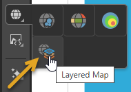
- If your Visualization Type is not currently Layered Map, you need to select that option in the Toolbox (orange arrow below).
- You need to drag the dimensions that you want to add onto your layers into the Map Location Layers drop zone as either New Layers or GeoCodes:

Selecting this option adds the Map Location Layers drop zone. Tip: When you are creating a New Discovery there is a Layered Map option that you can drag and drop measures or hierarchies onto, if you want to create a new Layered Map.

You can see the new layers on the map as bubbles. In our example, we added Address, marking the address of the hospitals, and City, marking the cities.
Step 3: Add your measures
Lastly, you need to add the measures to your map that you want to visualize. In the example, the Number of deaths was visualized by dragging the measure onto the Size drop zone. By default, if the Size drop zone's sub-menus are not used, Linear logic is used to drive the size of the bubbles on layer 1 and a Size Legend is added to the visual.
The initial image on this page shows that the bubbles on layer 1 are indeed resized according to the number of deaths, with the bubbles for each city shown in orange. You can also hover your cursor over the bubbles to open a tooltip that shows the city name and measure value for that city.
For a Layered map, you can add measure chips to the drop zones as follows:
Color
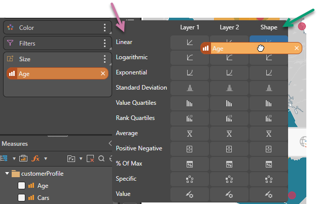
Measures only. You can drag your measure onto the Color drop zone and drop it onto the sub-menu grid in a position that indicates (1) the color logic you want to apply and (2) the target to apply your color to. Note that the sub-menu opens when you hover your cursor over the Color drop zone header:
- The color logic options (purple arrow below) indicate the type of logic that should be used to drive the color component of the visual.
- The target options (green arrow) indicate the target that the color should be applied to. For a Layered Map, the color targets can be one of your map's Layers (affecting the bubbles on the different layers of the map) or Shape (affecting the shapes of the relevant geographical areas).
For more information, see Color Drop Zone.

Size
Measures only. You can drag your measure onto the Size drop zone and drop it onto the sub-menu grid in a position that indicates (1) the size logic you want to apply and (2) the target to apply your size to. Note that the sub-menu opens when you hover your cursor over the Size drop zone header:
- The size logic options (purple arrow below) indicate the type of logic that should be used to drive the size component of the visual.
- The target options (green arrow) indicate the target that the size should be applied to. For a Layered Map, the size targets can only be Layers affecting the bubbles on the different layers of the map.
For more information, see Size Drop Zone.

Filters
You can create Filters on your visual using any chip. There are no limitations for layered maps. For more information, see Filters.
Related information
Formatting Layered Maps
As noted previously, formatting your layered map can help your reader to get the most out of their visualized data. For more information, see Layered Map Formatting.