Which type of visual is used to visualize your data is determined by the AI-driven Smart Visualization engine. When you build your visual (in Discover Pro or Lite), the Natural Language interfaces will automatically select the most appropriate type given the data in your question. You can change or override this selection by changing your question or redrawing the visual after you've changed its data. This is even possible when you are just exploring your visual at runtime!
Note: Natural Language Querying does not support custom visualizations.
Visualization Picker
By default, all NLQs are resolved by drawing the resulting data into a visual that best suits the data selected. This process uses an AI-driven heuristic that takes numerous factors into account when drawing data, as described in more detail here.
The engine takes into account the measures and number of measures requested; the number of hierarchies and types of hierarchies requested; the size of the data set that will be generated as well as data types (like time, geospatial, proper nouns) and any filtering and sorting used.
Sometimes, the automated result is not what you are after, so you can also manually specify the visualization you want to see within the question text and the NLQ question will return the specified visualization. Note: The LAYOUT of the data elements will still be automatically handled by the Smart Visualization engine.
Overriding a Visual
To change the selected visual, you need to use the plain English description for that visual in your text. This simply means appending the visual name like "grid", "pie", "column chart", "line chart", "bar chart", "area chart", and so on.
Chatbot
The Chatbot does not change the selected visualization automatically as you add different measures and so on. Instead, it draws the results of the changes using the currently selected visual, unless a new chat session is triggered, you explicitly ask to change the visual, or you ask it to \redraw.
Redrawing the Visualization
If users want to see the information in the most appropriate visualization, asking the Chatbot to \redraw will trigger the Visualization Picker to select the most appropriate visualization given the current content of the visual. You would typically use this keyword if you are making additive changes to your visual.
Override Examples
Note: It is important to note that the responses to your prompts / questions may not exactly match those described below. Exactly what happens depends on your data, and on the underlying LLM engine that is in use to create your visuals. For more information, see Multiple LLM Engines.
Asking "sales by promotion and gender" (using the sample database) will typically draw the following result:
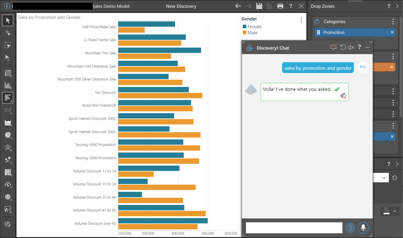
Notice that the visualization engine determined that the best layout for the selected data and visual was to plot the Promotions as the category axis and use Gender to drive the series (legend).
Additive visualization change
Add a follow up prompt to specify that you want to see this data as a grid visualization "show as a grid", the result is changed to:
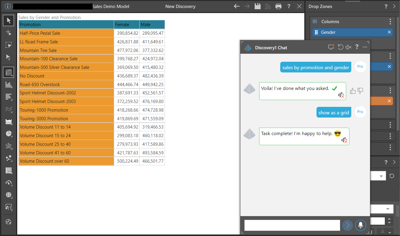
Notice, the visualization engine determined that the best layout for the selected data and visual was to plot the grid columns using Gender, and use Promotion to drive the rows.
Reset and change visualization
You can also change the initial question to include the pie visualization "show sales by promotion and gender in a pie". In this case, I clicked Reset (red arrow), changed the question, and got the result:
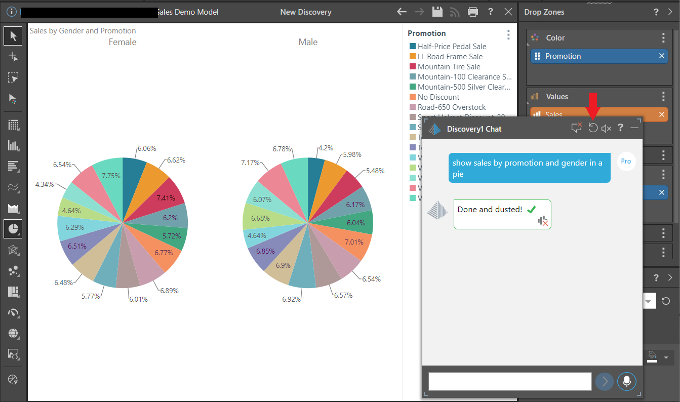
Notice that the visualization engine determined that the best pie chart layout was to trellis the chart using Gender, and show the Promotions using colors (shown in the legend).