From the Axis Options dropdown list, you can manage the axes of trellised charts. You can apply a common scale or common x-axis or y-axis to the trellised charts, and you can change the labels that are shown on the axes.
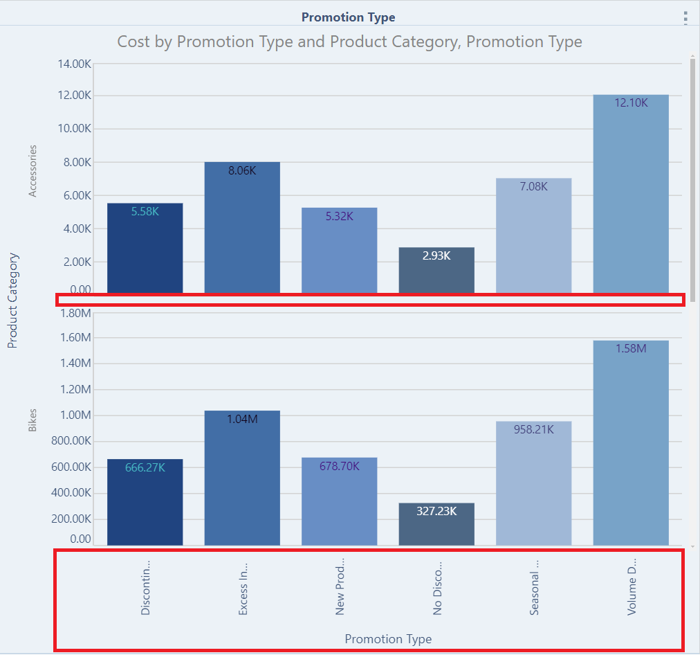
In this Discover Lite example, the chart is trellised by the Product Category hierarchy, with the default axis options applied:
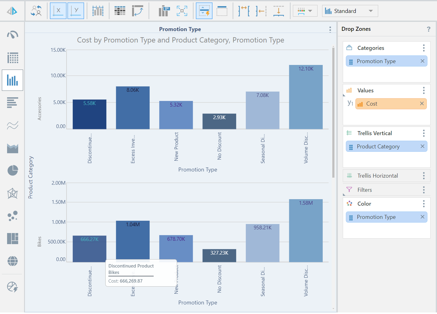
Axis Label Options

Toggle to show and hide the X- and Y-Axis labels:
Axis Scale Options

- Common Scale: when working with trellised charts, the Common Scale option can be used to apply a common scale to multiple charts containing the same measure.
- Shared Y-Axis: apply a common y-axis to all trellised charts.
- Shared X-Axis: apply a common x-axis to all trellised charts.
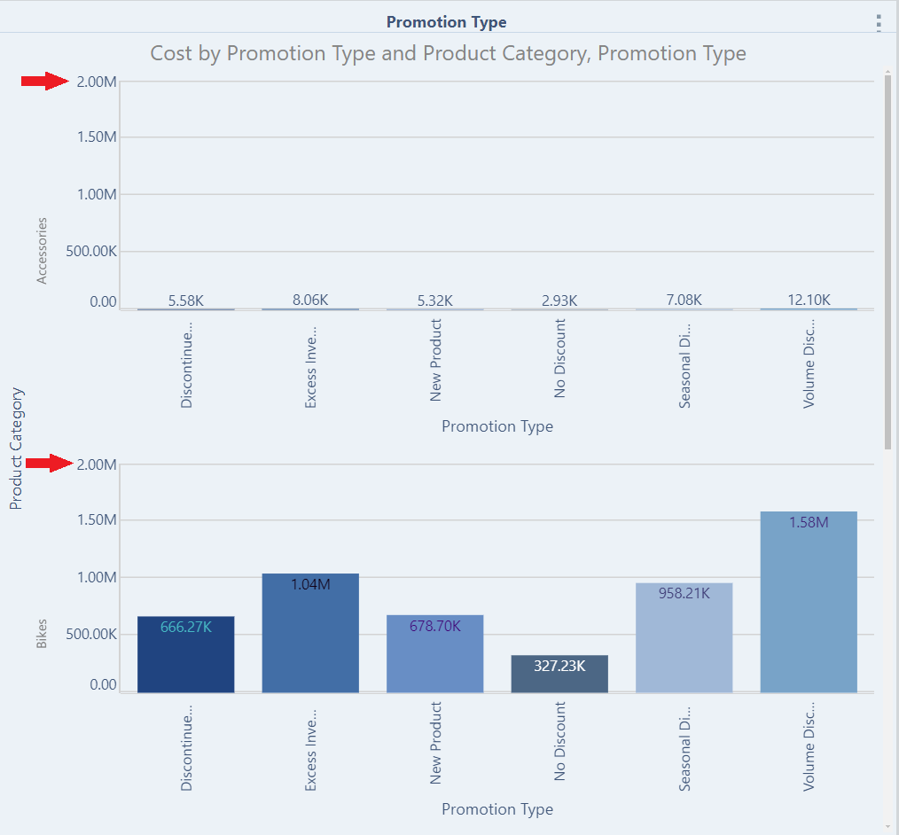
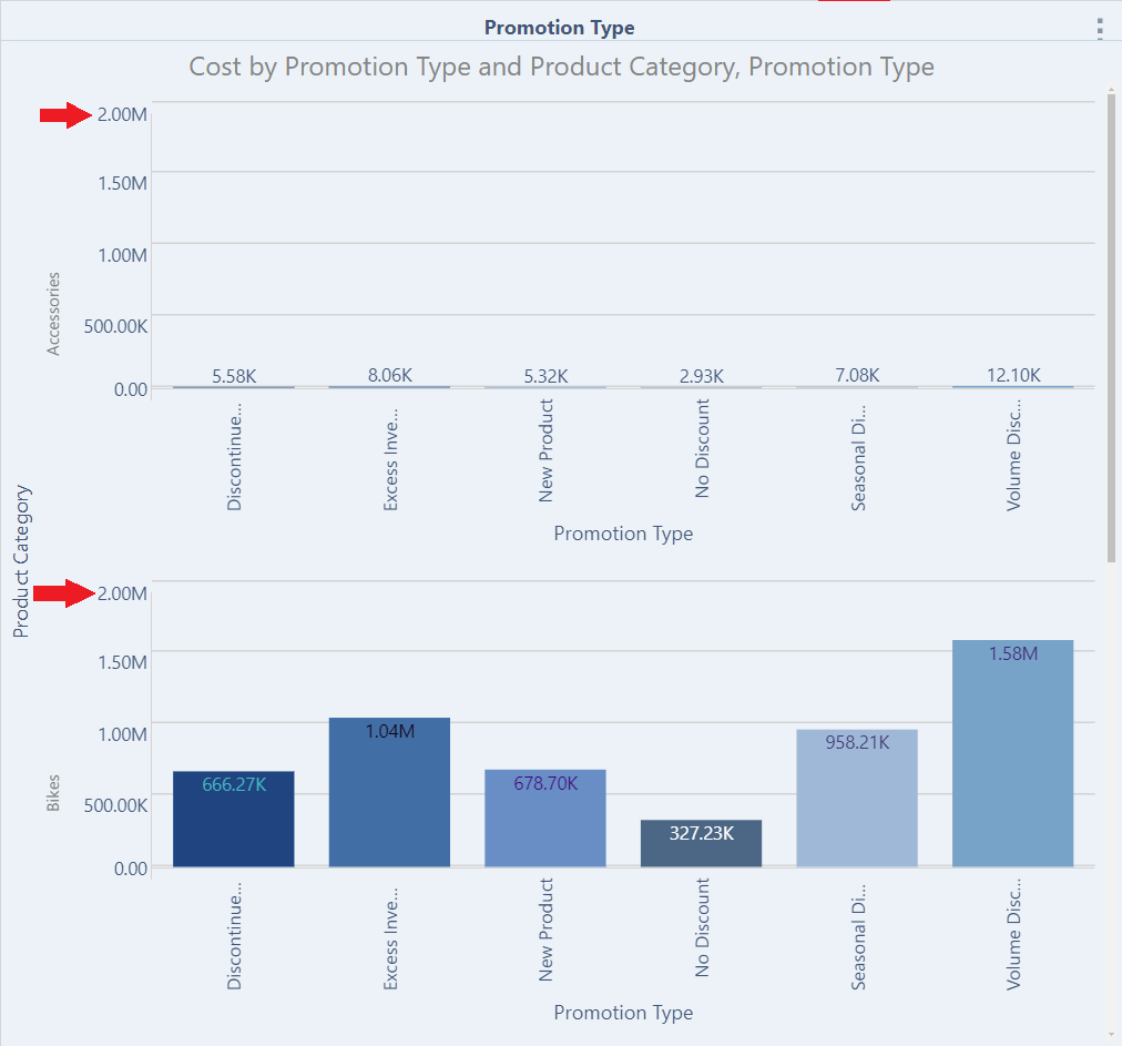
Common Scale
Here, the previous example was taken, and a Common Scale applied. We can see that the scale on the y-axis is now the same for every chart:
Shared Y-Axis
Here, a Shared Y-Axis was applied:
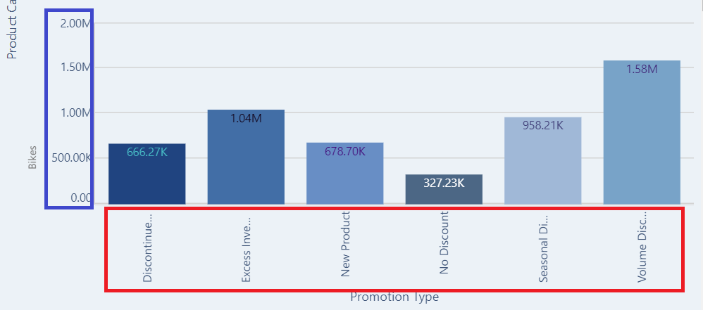
Shared X-Axis
Here, a Shared X-Axis was applied: