The Pareto function allows users to create a context calculation that accumulates a target metrics as a percentage across a range of items or elements. The Pareto principle posits that often 80% of the output of a given system is produced by 20% of the input. As such, Pareto shows values in decreasing order of relative frequency - where the values on the left have the highest frequency and those on the right have the lowest. This makes a Pareto analysis a powerful tool in understanding which variables in a given system have the greatest cumulative effect on that system. While Pareto analysis is usually shown as lines in combo column charts, the function is materialized as a series of calculated values for each item in the data set and can be viewed in almost in visualization context - like any other measure.
Using the Pareto Function
To use the Pareto functions:
- From the Query ribbon, click Pareto > Add > <Metric> (orange arrow below). Where <Metric> is a target metric from the dropdown list.
Note: Each of the values or measures in the current query are present on this submenu.

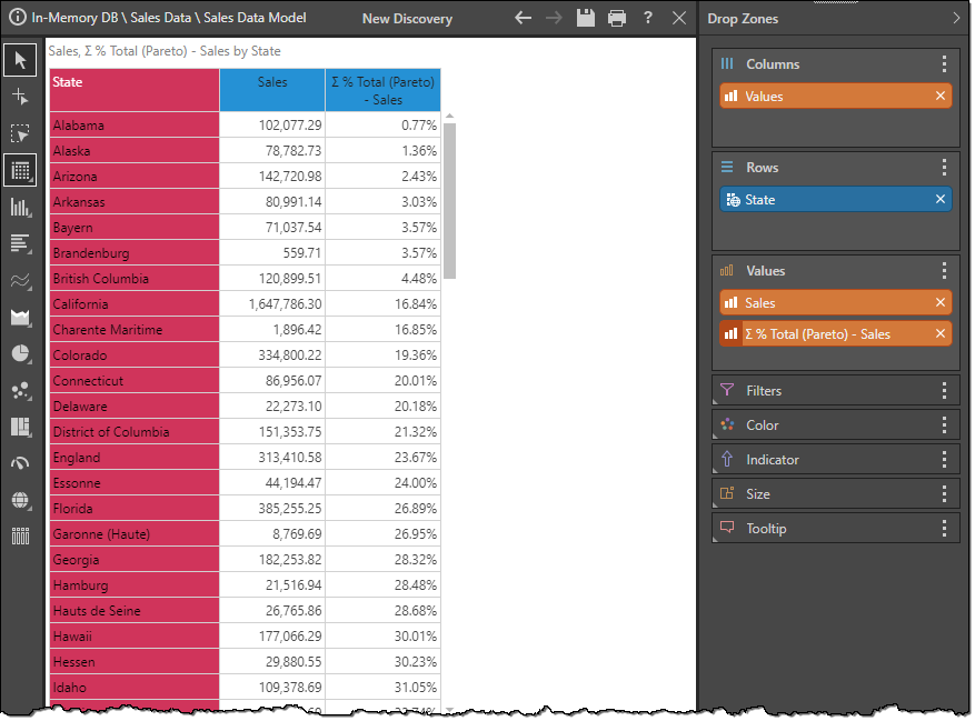
Select one of the value measures to generate a new value chip that builds a Pareto calculation of that measure in the context of your query and auto-adds it to the drop zones for visualization. The following visual shows the calculation added as a column to a grid.
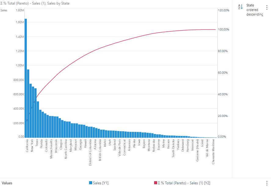
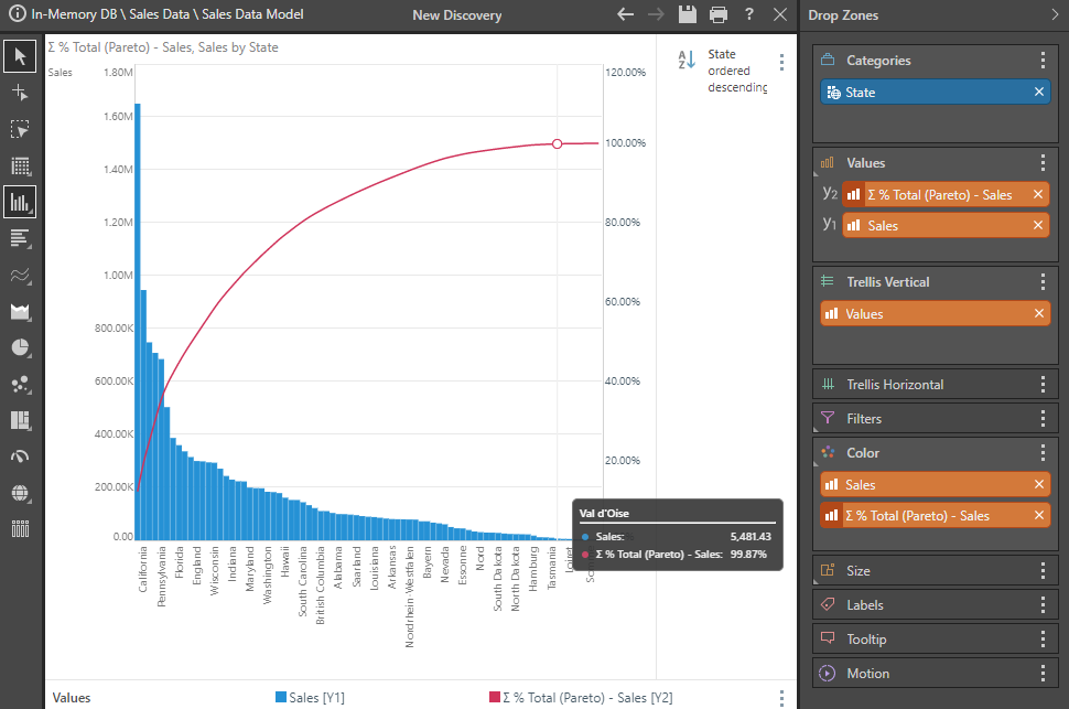
Once you have that chip, you are free to move it to any other drop zone like all other metrics in your data model. Using the same data, we can show this in a combo chart - the traditional way of looking at Pareto analysis - with the actual metric in blue, the Pareto values in red - accumulating to 100%.
Removing Pareto Values
To exclude Pareto logic from your query simply remove the orange value chip from the relevant drop zone.
Context Menu driven Pareto
Instead of using the ribbon Pareto tool, you can also use the context calculation menus to build Pareto logic on a given value (measure) chip. See here for more.
Example
These are the steps needed to build the Pareto combo chart shown above.
Step 1
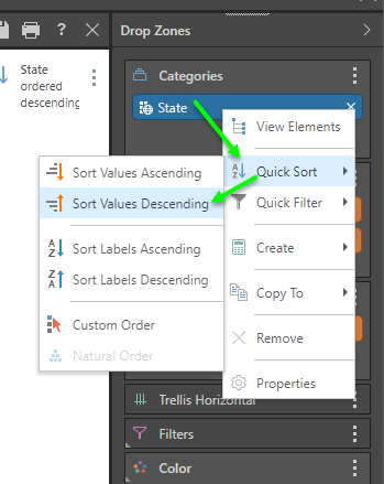
Start by adding a hierarchy and a measure to a column chart, ensuring that the hierarchy is placed in the Categories drop zone. In this example, the State hierarchy and the Sales measure are added. Right click on the State blue hierarchy chip and choose Quick Sort. Then choose 'Sort Values Descending' to order States from high to low using sales.
Step 2
Go to the Query ribbon and click Pareto > Add > Sales.
The Pareto calculation is added to the report as a new orange values chip, placed in the secondary axis as a line chart: