While Explain provides insights into a single data point, Explain the difference aims to determine the factors behind a difference between two data points. For example, you might want to know what factors are driving the increase or decrease in sales in a particular region, between two months. Explain the difference automatically decides whether to look for factors that drive the increase or decrease based on the order in which you select the two points:
- If you select the larger point first, then it looks for factors (segments of the data) that are driving increases in the difference.
- If you select the smaller point first, then it looks for factors that are driving decreases in the difference.
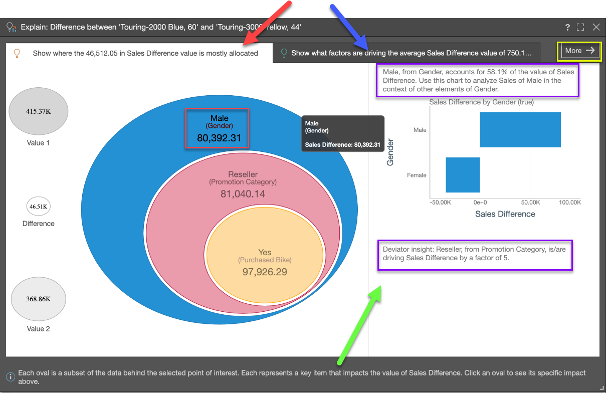
A similar graphic to Explain is displayed for Explain the Difference. In this example, the difference between sales values for two different types of bike is being analyzed:
Tab 1
Tab 1 (red arrow above) shows where the value of the difference in data values is mostly allocated across other categorical items from other hierarchies. This is the Dominant Drivers analysis - and is akin to a dice into every other hierarchy looking for the items that best explain the difference in values.
The "eye ball" diagram shows the items that MOST explain where the difference in values is categorically allocated - starting with the highest difference (in the biggest oval), then the next biggest difference in the context of that previous comparison, and so on (i.e. subsets of the previous item). The labels highlight hierarchical member elements, the hierarchy itself and the difference attributed or allocated to it (red box above). The amount is, by definition, a subset of the previous parent node or data point (red box above).
Click on any oval in the eye ball to trigger a "context analysis" on the right (green arrow above) showing the hierarchy's other members, for that selected difference. This can be very useful when trying to see other impacting elements and more context to the analysis.
Further, AI-generated explanatory text insights are provided in the context analysis to explain the item and its impact on the difference in values (purple boxes above).
So, in the above example, we can see that the biggest contributor to the difference between the values we have identified is whether the customer is male - the text insight confirms that this factor contributes to 58.1% of the value of the difference.
Tab 2
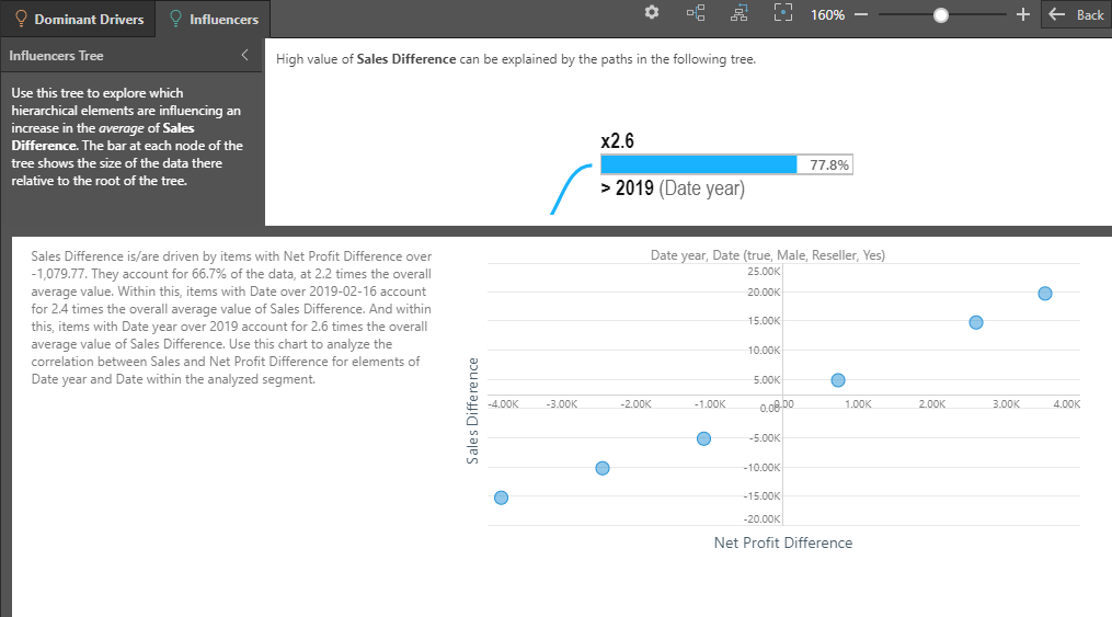
Tab 2 (blue arrow above) shows what factors are pushing the average value of the difference in values higher, based on other categorical items from other hierarchies AND other metrics in the data set. This is the Influencers analysis.
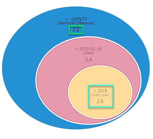
The "eye ball" diagram shows the items that MOST explain why the difference in values is high, using either categorical items or other metrics. However, it uses average values in determining the impact, rather than simple summation. It starts with the highest impact item (biggest oval) and then the next biggest item in the context of that previous item and so on (i.e. subsets of the previous item). The labels highlight either: hierarchical member elements and the hierarchy itself, or the metric and its trim point (teal box below). Importantly, the impact factor of the item on the difference we are analyzing is shown (green box below). "2.6" means this item's average value is 160% higher than the selection - thus driving it upwards.
- Factors over 1.0 contribute to increasing average values.
- Factors below 1.0 contribute to decreasing average values.
As with the first tab, click on any oval in the eye ball to trigger a "context analysis" on the right showing more details around the hierarchy's other items. If the impact is driven by a metric, the context analysis will show scatter plots comparing the metric to other metrics in the analysis. Again, AI-generated explanatory text insights are provided to explain the item, and its impact on the difference in values, in more depth.
Advanced Explanations
Click More (yellow box, top diagram) in the top right corner to expose the more advanced Explain analysis - complete with the full tree of nodes that explain the value of the difference.
The Advanced explanation interface is broken into the Dominant Driver and Influencer tabs, like the simplified interface. However, the eye-ball visualizations are replaced with trees that show all the nodes that produced the analysis (not just the top branch). This allows users to learn more from the analyses, showing second, third and fourth order explanations for values.
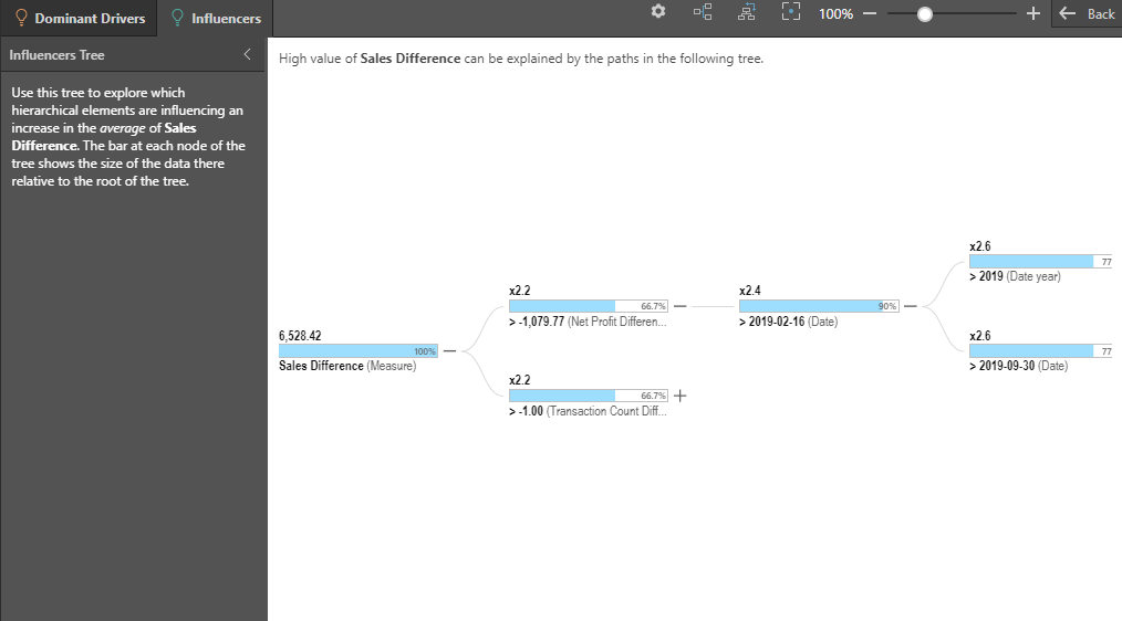
Click on a node to expose a larger set of contextual reports and written explanations for each selected node, again providing a more in-depth analysis: