The stream chart is a type of area chart, but rather than plotting the data points along a static x-axis, they are displaced around a varying central baseline. Each stream is stacked from the middle of the chart, rather than the zero point. The position of the stream is based on the middle value of the largest bar, or curve. Pyramid determines the middle value of the largest peak, and positions the stream along that value.
Stream charts are used to show the changes in the numeric value on the y-axis over time on the x-axis. The width of each stream is proportional to its value.
If you want to see the actual values in the cart, use the tooltip to do so. Otherwise, examine the peaks and troughs and try to pinpoint patterns or outliers in the query.
Building a Stream Chart
Before you begin
Create a new discovery from the User Hub, App Tabs, or on the right-click in the Content Explorer. As part of this process, you will need to open the appropriate Data Model for your analysis. For more information, see Access Discover Pro.
Step 1: Create your Basic Visual
To set up the basic visual:
- Add at least one measure by double-clicking or selecting it in the Measures panel.
- From the Toolbox, right-click the Area Chart option and select one of the Stream charts (green highlight below) from the submenu options.
- Add at least one hierarchy by double-clicking it in the Dimensions panel.
The measure is added to the Values drop zone.
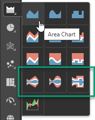
Tip: You can view the names of the available visualization types by hovering your cursor over the items in the submenu.
The hierarchy is added to the Categories drop zone.
If you selected Stream Chart, a basic stream chart is created.
Step 2: Add More Hierarchies
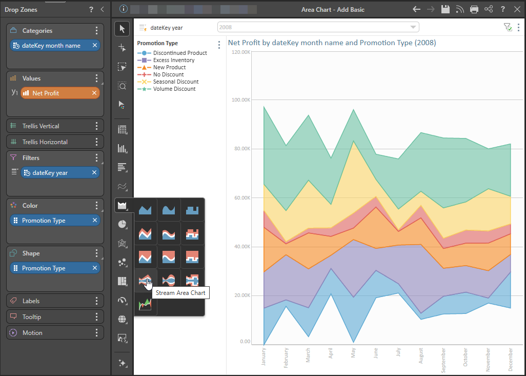
You can plot multiple hierarchies in your Stream Chart by adding hierarchies to the Color and Shape drop zones. In this example, the Stream Chart shows the changes in net profit over time, for the different Promotion Types:
Examples: Other Stream Charts
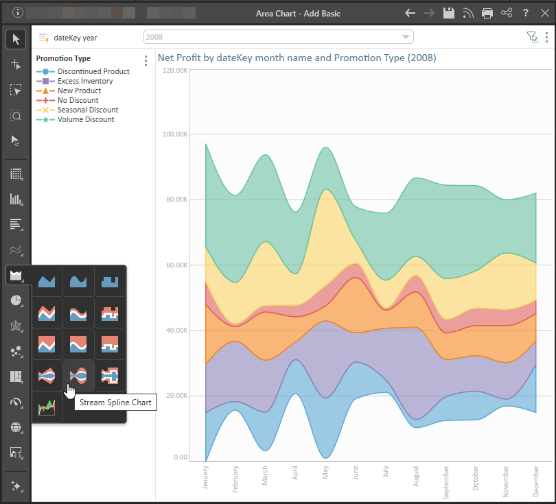
Stream Spline Chart
The spline stream chart connects data points with a curved line:
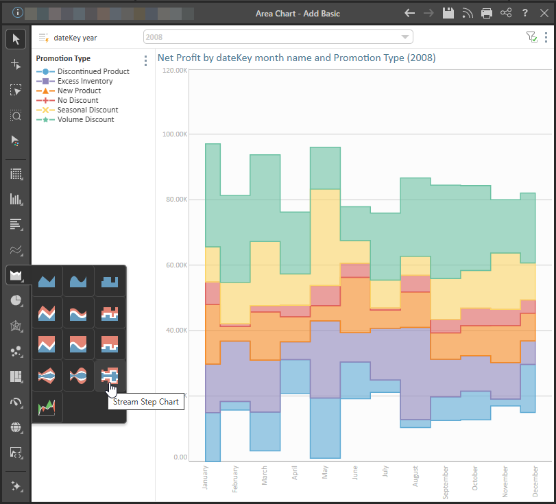
Stream Step Chart
The stepped stream chart connects data points with a series of steps, which can make it easier to read exact values.
Related information
Area Charts
An area chart is very similar to a line chart, in that it plots data points across Cartesian coordinates, connecting each data point with a line. However, unlike a line chart, the area between the data points and the x-axis is shaded or colored for emphasis.