Radar charts are used to plot one (or more) series of values across multiple quantitative variables. These quantitative variables are represented on axes extending from a central point. These axes are often referred to as spokes or radii. The angle, position, and length of these axes are uniform. The query must contain at least quantitative variables to produce enough axes to draw the chart.
The spread of values is marked on the upper middle axis, with concentric grid lines expanding from the central point outward. One or more series of values is overlaid on the chart, with the data points for each series plotted on each axis. Typically, the data points are joined together by straight lines or shaded to create polygons. Pyramid offers additional variations on the standard radar chart.
Basic Radar Chart
Radar charts are typically used to see the spread of values in a series, or to see the variation between multiple series of values.
Building a Radar Chart
Before you begin
Create a new discovery from the User Hub, App Tabs, or on the right-click in the Content Explorer. As part of this process, you will need to open the appropriate Data Model for your analysis. For more information, see Access Discover Pro.
Step 1: Create your Basic Visual
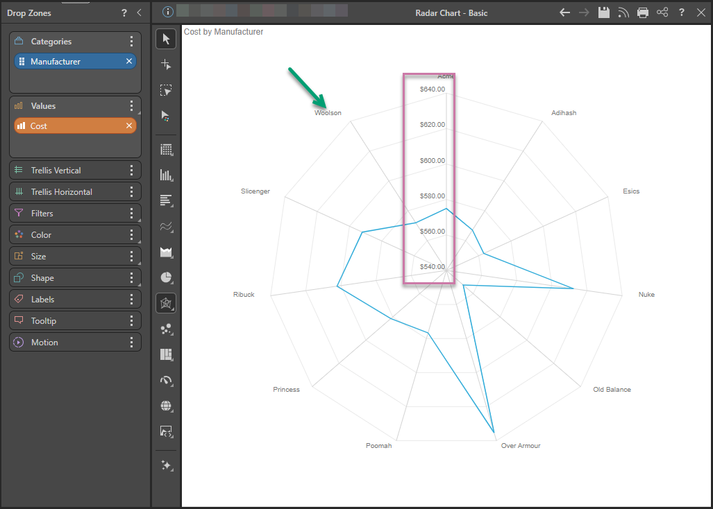
To build a radar chart, you must add a measure to the Values zone and a hierarchy to Categories.
To set up the basic visual:
- Add a hierarchy to the Categories drop zone.
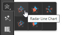
- From the Toolbox, right-click the Radar Chart option and select the chart type you require from the submenu.
- Add a measure to the Values drop zone.
The hierarchy determines the number of axes in the chart, with each axis representing a category (green arrow below).
The measure drives the values in the chart (purple highlight).
At this point, the chart shows the cost for each manufacturer. To plot another series on the chart, a second hierarchy must be added to the Color drop zone.
Step 2: Add a Second Series
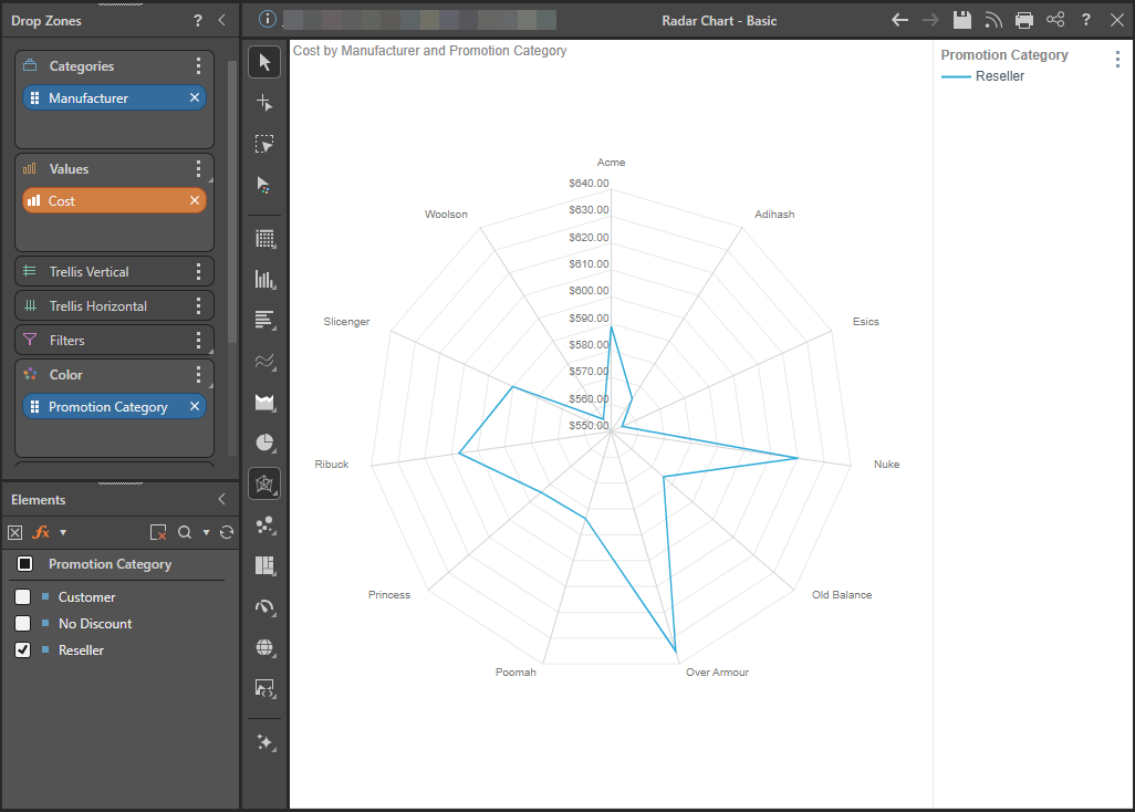
To plot another series across the axes, add a member element to the Color zone.
Adding a Single Element
In this example, the Reseller element from the Promotion Category hierarchy was added. The chart now shows cost for the Reseller promotion by each manufacturer.
Filtering by Promotion Categories
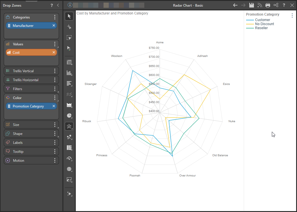
To plot multiple series across the axes, add a hierarchy or multiple member elements to the Color zone. The hierarchy added to Color drives the number of series (lines) in the chart and their color.
Here, the entire Promotion Category hierarchy was added, plotting three series across the axes. So, the radar chart below displays Cost for Promotion Category for each Manufacturer; we see that the cost for the Customer promotion for Old Balance was below $500,000, while for Esics it was above.
Types of Radar Charts
Pyramid offers several types of Radar charts, depending on your preferences.
Radar Line Chart
The radar line chart is the basic example, shown above. It plots the series data points on each axis and connects them with a straight line.
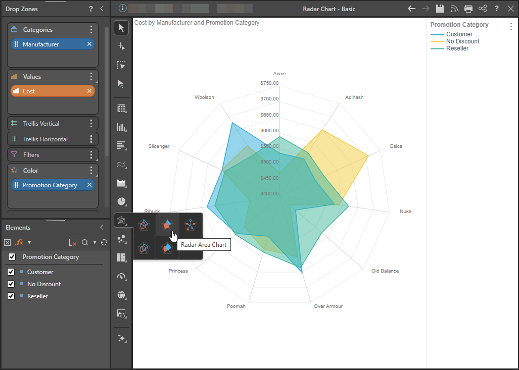
Radar Area Chart
The radar area chart plots the data points of each series on each axis and connects the points to draw a shaded polygon for each series. Each polygon is overlaid one over the other, with reduced opacity enabling you to see the variations.
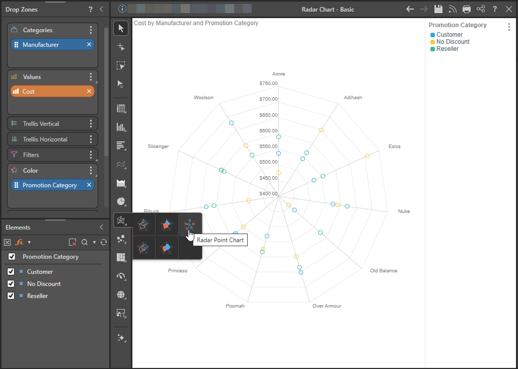
Radar Point Chart
The radar point chart plots the data points for each observation along each axis but does not connect the data points.
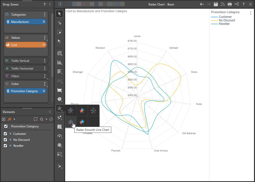
Radar mooth Line Chart
Radar smooth line charts plot the data points for each series and connect them with a curved line. The difference between the radar line chart and the radar smooth line chart is cosmetic, although if there are many axes and observations, it may be easier to differentiate the data points when a straight line is used.
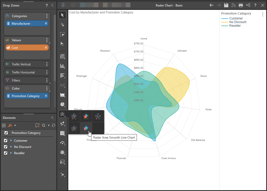
Radar Area Smooth Line Chart
Radar area smooth line charts plot the data points of each observation on each axis, and connect the points with a curved line, filling in the area to draw a curved shape for each observation.
Examples
In the example below, a Radar Line Chart is used to plot the cost for Promotion Categories for each Manufacturer. The Product Category hierarchy was then added to Trellis Horizontal, producing a separate radar chart for each product category. In this way, the user can easily compare each series across different categories in each hierarchy.
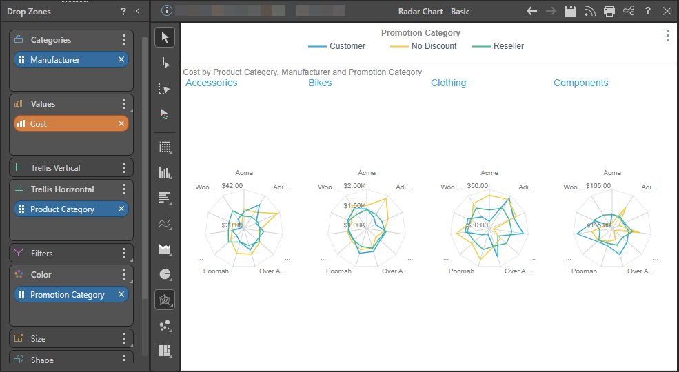
Tip: To show each of the Product Titles on the visual, you need to enable the Multi Chart Title option in the Formatting Panel.
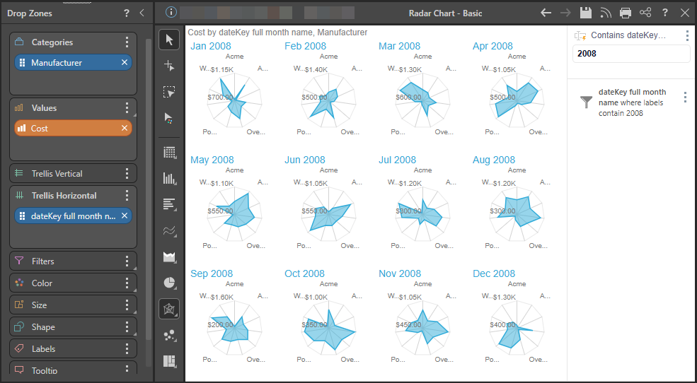
In cases where you need to plot many series of values, the radar chart can quickly become illegible. In these instances, it's best to avoid "overplotting" by making use of the trellis function; rather than adding the second hierarchy to Color, add it to Trellis to produce multiple charts, with each chart plotting a single series.
In the example below, Cost by Month is shown for each Manufacturer. Rather than overlaying 12 months in a single chart, the chart was trellised by month, so that each chart represents a single month.
Related information
Quick Styles
Radar Quick Styles are preset formatting options that let you change the look and feel of a Radar chart with one click. Applying a Quick Style updates multiple settings at once, including data point transparency, data labels, and legend placement.
- Click here to learn more about Radar Quick Styles