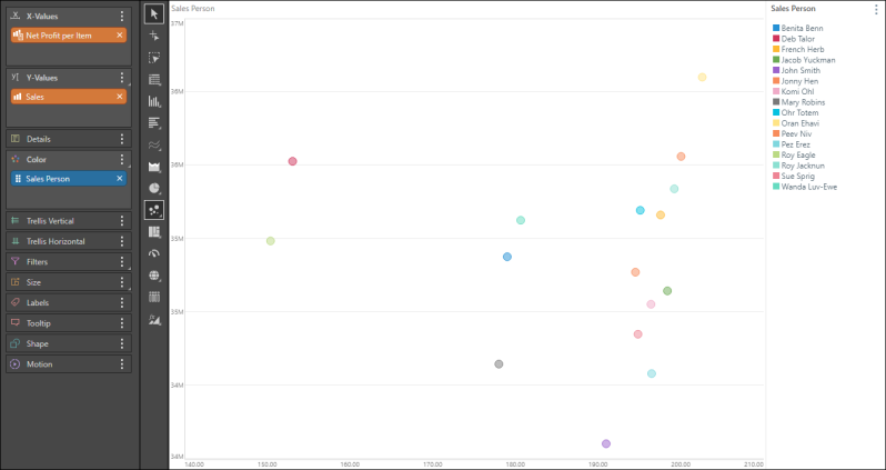
Use a scatter chart to see the correlation between two variables (measures) in the chart in relation to a given member hierarchy. The closer the data points are to forming a straight line, the stronger the correlation between the two variables.
The scatter chart requires a measure in the X-Values drop zone, a second measure in the Y-Values drop zone, and a member hierarchy in the Color drop zone.
Building a Scatter Chart
Before you begin
Create a new discovery from the User Hub, App Tabs, or on the right-click in the Content Explorer. As part of this process, you will need to open the appropriate Data Model for your analysis. For more information, see Access Discover Pro.
Step 1
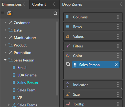
Add the required member hierarchy to the Color drop zone.
Step 2
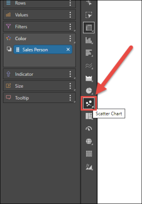
Select Scatter Chart from the visualization menu.
Step 3
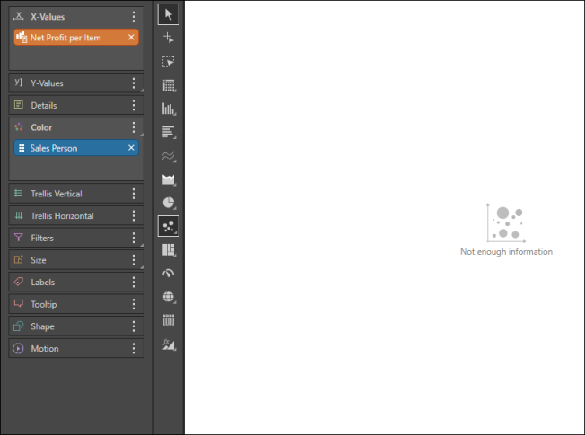
To the X-Values drop zone, add the measure that should be on the x-axis.
Step 4
To the Y-Values drop zone, add the measure that should be on the y-axis.