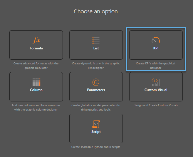
Key Performance Indicators (KPIs) are powerful analytic tools that can be leveraged to identify the status of outcomes in an organization's business goals.
KPIs can be configured in the Formulate module using the KPI designer by defining an actual value (the value to be measured), a target value (your goal), and a status value (how actual performs against the target). KPI's can also be created using the "Quick KPI" wizard directly in Discover (see below).
The KPIs can then be added to queries in Discover to visualize results, which can then be consumed in Present dashboards or Publish publications (see Using KPIs for details).
All KPIs (including the quick KPIs) are edited in the Formulate KPI designer. And when deployed, their settings can be tweaked in Discover through the Conditional Formatting dialog.
Quick KPIs in Discover
Users can create KPIs from within Discover, without building a KPI in Formulate, through two main avenues:
- Basic KPI assembly through conditional formatting by simply adding measures to the Indicator and Color drop zones. (see below).
- Quick KPI function assembly that builds the color and indicator logic through a single click action. This also injects sophisticated math with time options.
KPI's as Conditional Formatting
KPI's are, in effect, an advanced form of conditional formatting - adding and adjusting both an icon and color based on values to highlight information in the visual beyond its own visible values. As such, KPI functionality can be built manually with the conditional formatting capabilities in Discover directly. However, these lack the mathematical sophistication of formulated KPI's and are usually viewed as part of a matrix grid or in a specialized form known as gauges.
Anatomy of a KPI
KPIs are composite calculations that drive the way a data point is visualized (typically in a Grid or Gauge). They are used to show the status of outcomes using three core metric values and banding:
- Actual Values - The current value of a data point (for example, US Sales in 2023, Sales for each Quarter).
- Target Values - A value that measures what the goal metric should be for the corresponding actual values (for example, Expected Sales for each Quarter).
- Status Values - A mathematical comparison between the actual and target values (usually a ratio of some type).
- Banding - A series of values to delineate between good and bad status outcomes.
Using all four layers, designers can construct graphic representations of how the core metric (the "actual" value) is performing in contrast to the other figures. Importantly, each metric in the framework (including the bands) can be structured independently, with its own logic, inputs and even parameters. This goes a long way to resolving the problem of building KPIs, which typically need different data selections from a data model to operate efficiently. The use of these elements drive the visualization and are in effect advanced settings for conditional formatting.
Building and Using KPIs
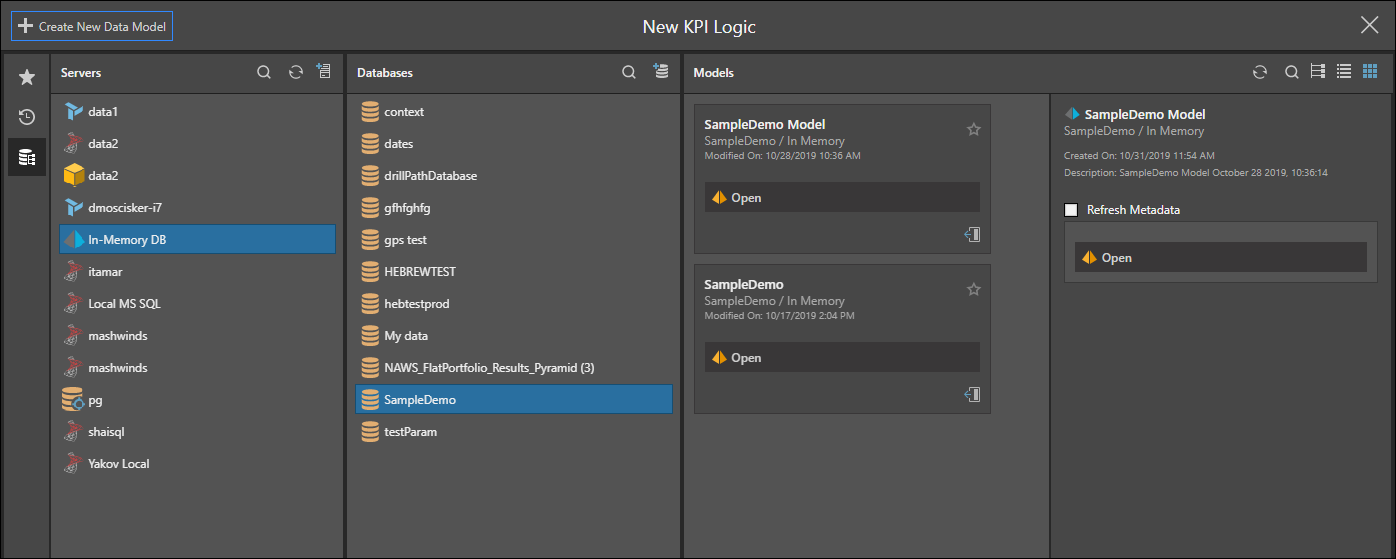
To launch the formal KPI designer, open Formulate and click KPI:
Select the server, database, and model that the KPI will operate against:
Once this is complete, the KPI 'wizard' is presented to the user, where the logic and design elements can be chosen to drive the way the KPI will look, behave, and resolve.
- An outline of the KPI builder / wizard interface is covered here.
- The process of building the KPI is covered further in this topic.
Once built, users are then able to deploy and consume they KPIs using all the visualizations in Discover. However, KPIs are tightly coupled with Gauges and Matrix grid visualizations.
- Click here for more on using KPIs