Aside from the common formatting options, there are several formatting capabilities that are specific to Cartesian charts. These functions give users a lot of control over the design of Cartesian charts and enable optimization of the chart according to the user's preferences.
Cartesian Chart Formatting
This page describes the formatting options available for Cartesian Charts (where, for example, Column Chart or Bar Chart is selected from the dropdown list). Other formatting options that can be selected include Report Title, X-Axis or Y-Axis, Data Labels, Legend, Plot Area, and Color.
Fill
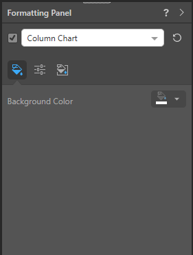
- Background Color: Change the color of the Report Background using the Color Picker tool. This change does not affect the chart background.
Settings
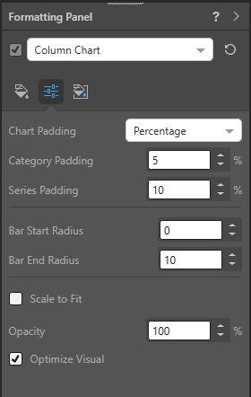
Padding
Chart Padding: Add padding to the chart elements using a Percentage or Fixed value:
- Category Padding: add padding between categories in the chart.
- Series Padding: add padding between each data series in the chart.
Radius Settings
Where applicable, the Radius settings curve the corners of a bar or column to make it appear rounded. Where the Radius is set as zero, the bars or columns have sharp corners. For any other radius value, the affected corners curve to a greater or lesser degree:
- Bar Start Radius: This radius setting affects the corners of the shape at its start point. For a bar chart, this is where the bar meets the y-axis. For a column chart, this is where the column meets the x-axis.
- Bar End Radius: This radius setting affects the corners of the shape at its end point.
Note: These Radius options do not apply to IBCS Charts.
Basic Settings
- Scale to Fit: scale the chart to fit onto the canvas - this is useful when working with trellised charts.
- Opacity: adjust the opacity of the chart segments.
- Optimize Visual: the visual optimization engine in Pyramid is a heuristic that automatically redacts certain parts of a graphical visualization based on the amount of space provided.
- Show nulls as zeros: Line and Area charts only.
Miniature
 Miniature Color 1, 2, and 3 set the text colors for miniature visuals, which appear automatically when a visual is scaled down due to legibility limits. These miniatures show measure values and labels for quick reading in limited space. Use the Color Picker to set the color for each miniature tile.
 Example: Miniature Colors
Miniature visuals are created automatically when you scale a visual down to a size that makes its content illegible. These tiles typically display the measure as a number with its name underneath:
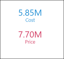
Note: The purpose of a miniature visual is to provide a way to easily view and interpret important data at a glance, even where there is a lot of information and limited space.