An area chart is very similar to a line chart, in that it plots data points across Cartesian coordinates, connecting each data point with a line. However, unlike a line chart, the area between the data points and the x-axis is shaded or colored for emphasis.
Area charts are often used to display a trend in quantitative data over time. They are particularly useful when comparing trends across multiple hierarchies, as the contrasting shaded areas make it easy to spot trends.
- On the ribbon, click the Components tab to see Chart Design.
Basic Area Chart
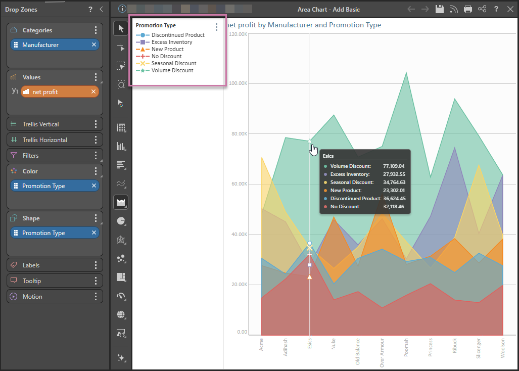
The following example shows a basic area chart that plots Categories by Values and can use Color and Shape to filter the visual and create a combined color and shape legend (purple highlight below):
Building an Area Chart
Before you begin
Create a new discovery from the User Hub, App Tabs, or on the right-click in the Content Explorer. As part of this process, you will need to open the appropriate Data Model for your analysis. For more information, see Access Discover Pro.
Step 1: Create your Basic Visual
To set up the basic visual:
- Add at least one measure by double-clicking or selecting it in the Measures panel.
- From the Toolbox, right-click the Area Chart option and select the chart type you require from the submenu.
- Add at least one hierarchy by double-clicking it in the Dimensions panel.
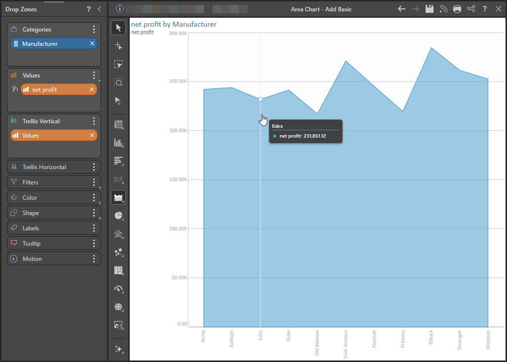
The measure is added to the Values drop zone.
Tip: You can view the names of the available visualization types by hovering your cursor over the items in the submenu.
The hierarchy is added to the Categories drop zone.
If you selected Area Chart, a basic area chart is created that plots the data points representing the value for each hierarchy element:
Step 2: Add More Hierarchies
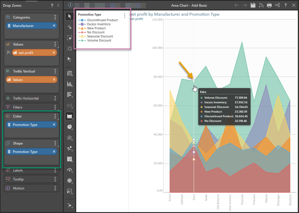
You can plot multiple hierarchies in your area chart by adding a second hierarchy to the Color or Shape drop zones. In this example, a second hierarchy is added to both Color and Shape (green highlight below). This produces a combined color and shape legend (purple highlight) and adds shapes to the data points that can be seen on hover (orange arrow):
Tip: If you want to see the data points all the time, as in the example at the start of this topic, you can enable them from the Components ribbon or in the Shapes Formatting panel. For more information, see Data Points.
Examples: Other Area Charts
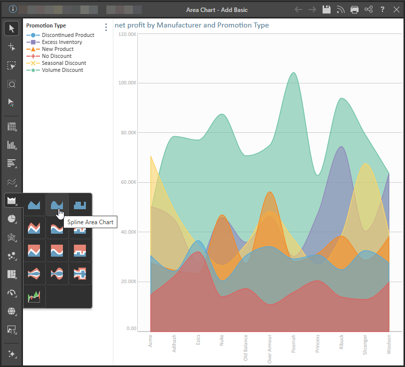
Spline Area Chart
The spline area chart is functionally identical to the area chart. The difference is that each data point is connected by a curved line instead of a straight line.
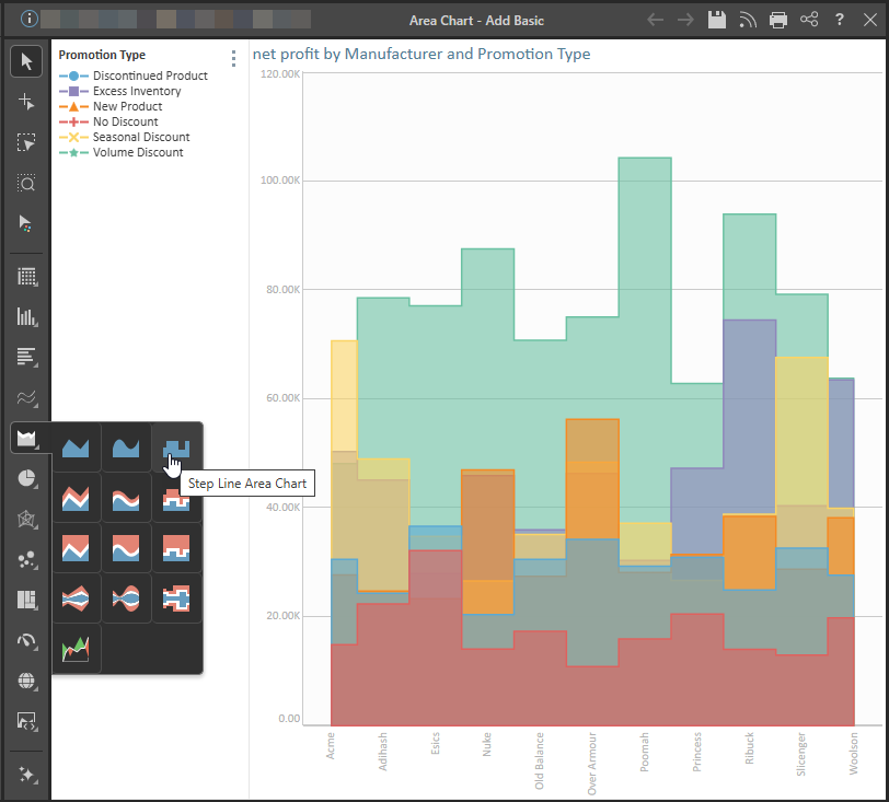
Stepped Line Area Chart
The stepped line area charts connect each data point with steps. This can make it easier to read the chart accurately.
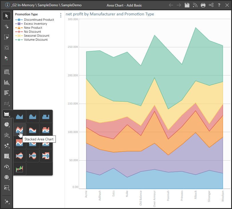
Stacked Area Chart
The stacked area chart is an extension of the area chart, but rather than each shaded area starting at the x-axis, each area is stacked one on top of the other. The chart shows the cumulative values based on absolute totals. That is, each area represents a portion of the total.
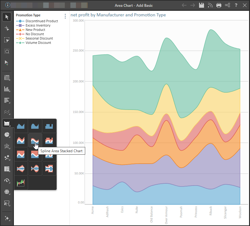
Spline Area Stacked Chart
Spline stacked area charts connect the data points in the stacked area chart with a curved line instead of a straight one.
Step Line Stacked Area Chart
Step line stacked area charts connect the data points with a series of steps, making it easier to read accurately.

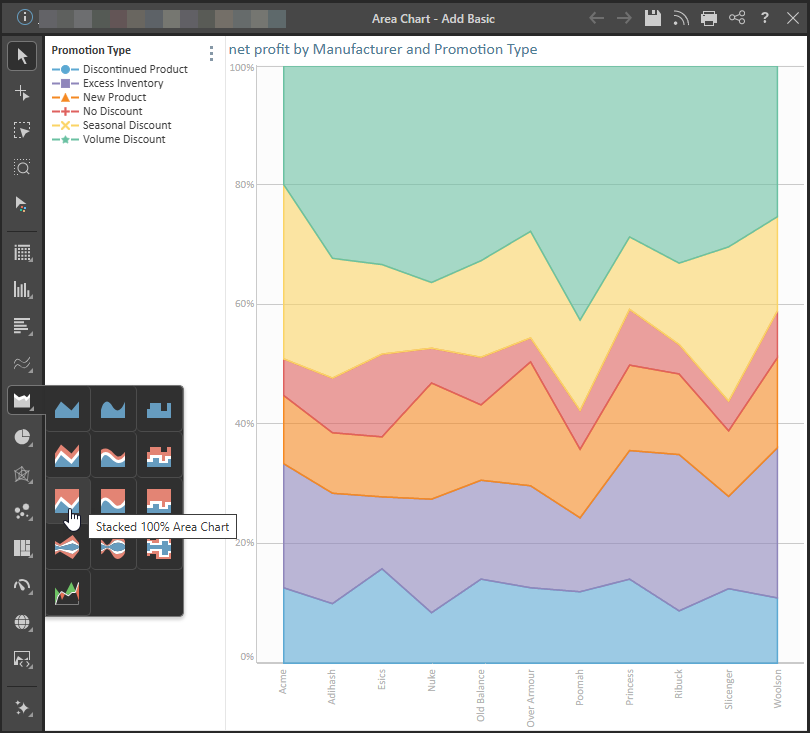
Stacked 100% Area Chart
The stacked 100 are chart is similar to the stacked area chart, in that each shaded area represents a segment of the total. However, here the total is based equal to 100%, rather than an absolute value.
So, the stacked 100 area chart represents cumulative values relative to a total of 100%. The y-axis measures from 0-100%, with each stacked area representing a percentage of the total.
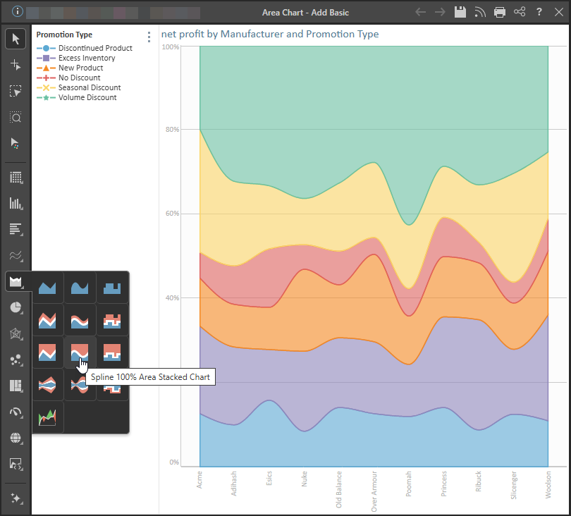
Spline 100% Area Stacked Chart
The spline stacked 100 area chart connects the data points with a curved line.
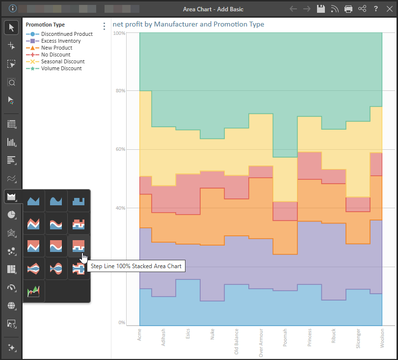
Stepped Line Stacked 100% Area Chart
The stepped line stacked 100 area chart connects the data points with a series of steps. This is useful if accuracy in readying the values is needed.
Related information
Stream Charts
The stream chart is a type of area chart, but rather than plotting the data points along a static x-axis, they are displaced around a varying central baseline. Each stream is stacked from the middle of the chart, rather than the zero point.