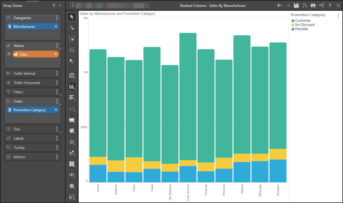
The Stacked Column Chart displays accumulated series values based on absolute totals. One member hierarchy is represented on the x-axis, and a second member hierarchy drives the color of the chart. Each column on the x-axis is divided according the second hierarchy that drives the color; the colors represent the member elements in this hierarchy. The segment height within the columns is driven by the measure in the Values zone.
Note: To learn how to make a stacked measure chart, with each column showing multiple measures, click here.
Building a Stacked Column Chart
Step 1
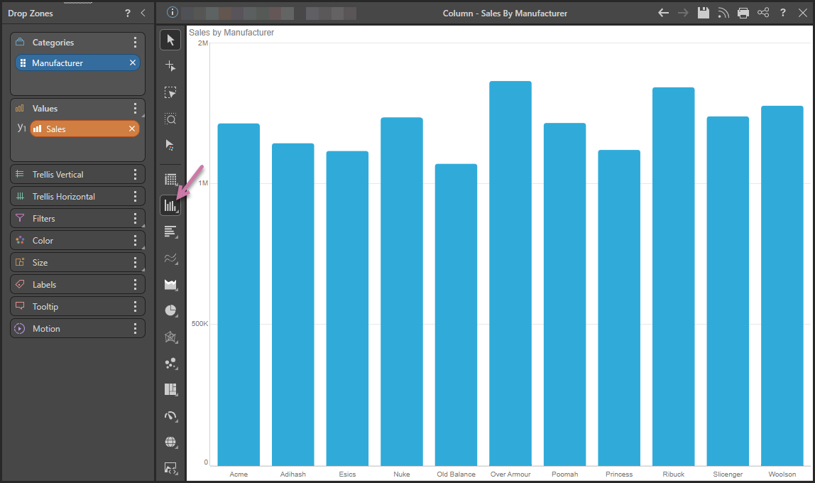
Add the hierarchy that should sit on the x-axis to the Categories drop zone, and add the required measure to the Values drop zone:
Step 2
Right-click Column Chart (purple arrow above) and then select Stacked Column Chart in the flyout panel.
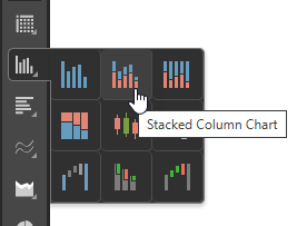
Tip: Hover your cursor over the options to view the name of the visualization type in a tooltip.
Step 3
Add a second member hierarchy to the Color zone:
Tip: You can add data labels to your chart, either a total for each color or an overall total for the column. For more information, see Data Labels.