Custom visuals can be configured from Formulate, and then shared with other users. Report-builders can then use those custom visuals to present data in Discover. Which specific custom visuals are available to you depends on the visuals that have been configured and shared from Formulate.
Using Custom Visuals
Where custom visuals have been configured for the data model that you're querying, and you belong to a user role that has access to those custom visuals, you will see the Custom Visual menu in the Toolbox (visualization picker):
Right-click Custom Visual (green arrow above) and then select the required visual from the submenu options. Depending on the way the visual was configured, you may see a description of the custom visual when you hover your cursor over its icon:
Marketplace Custom Visuals
When a Custom Visual is built using Formulate, the user has the option to base their own custom visual on a custom visual downloaded from the Marketplace. The Marketplace visuals that are currently available for download are described below.
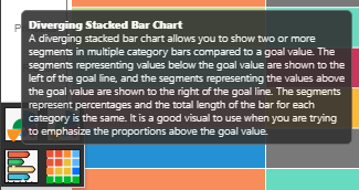
Diverging Stacked Bar Chart
The diverging stacked bar chart is used to display two or more member elements as segments in each bar, compared to a goal value. The segments representing values below the goal value are shown to the left of the goal line, and the segments representing the values above the goal value are shown to the right of the goal line.
Each segment in each bar represents a percentage of the total, with the total length of each bar being equal. It is a good visual to use when you are trying to emphasize the proportions above the goal value:
For an example of the Diverging Stacked Bar Chart, see above.
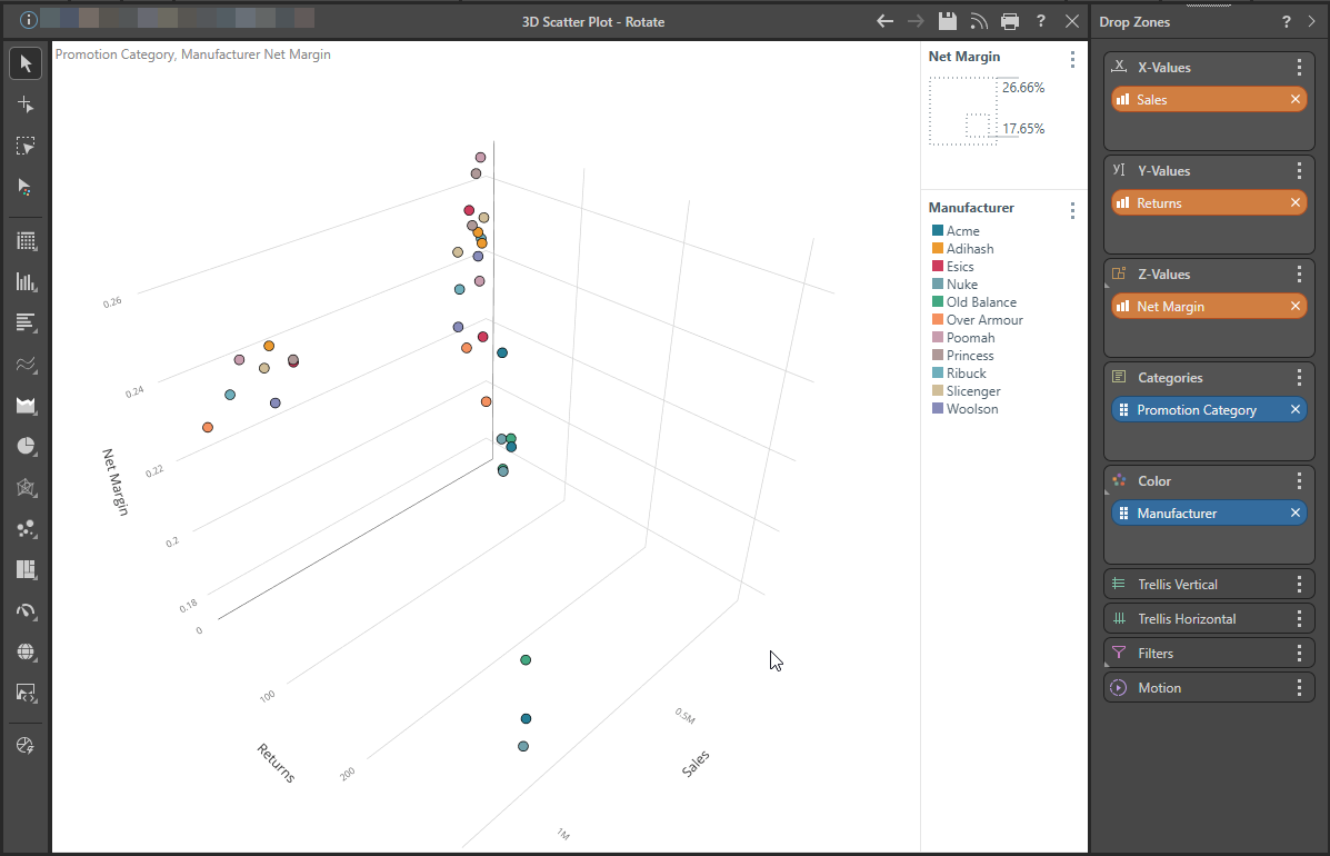
3D Scatter Plot
The 3D Scatter Plot is used to plot data points on three axes to show the relationship between three measures for the given Dimensions.
The following example shows the measures Sales, Net Margin, and Returns, and the Dimensions Promotion Categories and Manufacturers. A plot like this helps you to visually explore relationships and trade-offs between the measures. You might do this to distinguish between promotions / manufacturers where sales or net margin are optimized, and returns are reduced. You might also do this to investigate the reverse, or to make decisions about trade-offs you are willing to make.
Note: To facilitate this analysis, you may also rotate the 3D plot by dragging the canvas and you may also view the details of each data point in a tooltip. For an example, see below.
Play the following video to view the 3D Scatter Plot being rotated and interrogated:
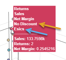
When you hover over the data points in the plot, a tooltip opens. Note that the orange arrow below indicates the Promotion Category and the blue arrow (and the color of both the dot and the tooltip) indicates the Manufacturer:
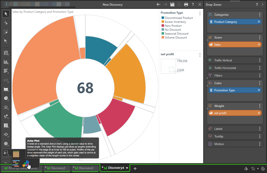
Aster Plot
The aster plot resembles a doughnut chart, but with weighted values. The length of each segment is determined by the score value for the corresponding element in the hierarchy placed in the Categories zone. The width of each segment is driven by the weight value. A second hierarchy can be added to drive the colors of the visual.
The Aster Plot is a good way to visualize data as a proportion of a whole, while seeing more detail and nuance than is offered by other segment charts.
As with other visuals, the drop zones will automatically present the zones that are supported for the selected custom visual. In this example, the selected visual (an Aster Plot), requires one measure in the Score zone, a second measure in the Weight zone, one hierarchy in the Categories zone, and a second hierarchy in the Color zone:
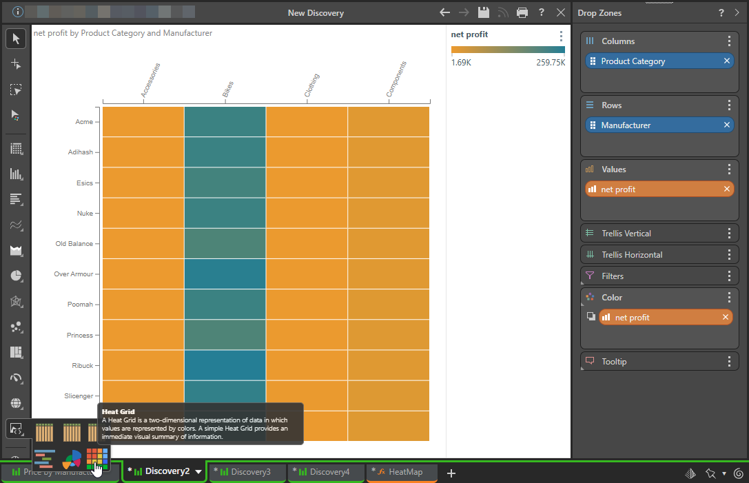
Heat Grid
A Heat Grid represents values by color, rather than text. To populate the grid with colors, a measure must be added to the Color zone.
In this example, the Net Profit measure was added to the Color zone; the grid displays a range of colors according to the range of values for the data points in the grid:
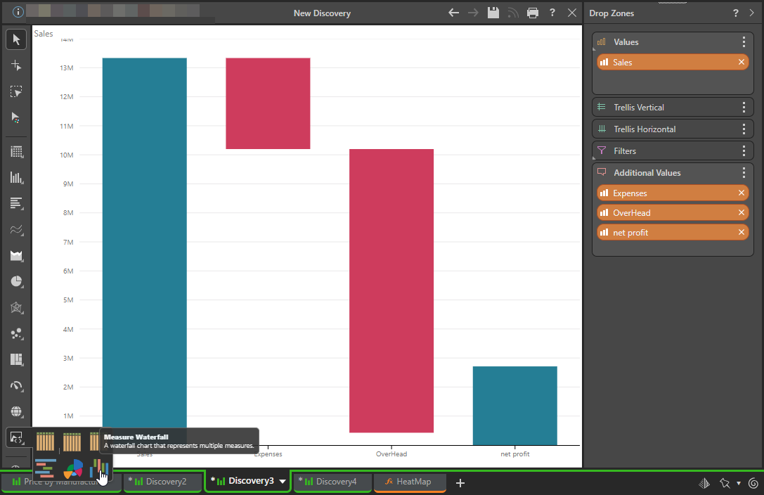
Measure Waterfall
The Measure Waterfall presents multiple measures as a waterfall, which is useful for comparing differences between measures.
This visual requires one measure in the Values zone, and multiple measures in the Additional Values zone. No hierarchy is required, but hierarchies can be added to the Trellis or Filters zones.
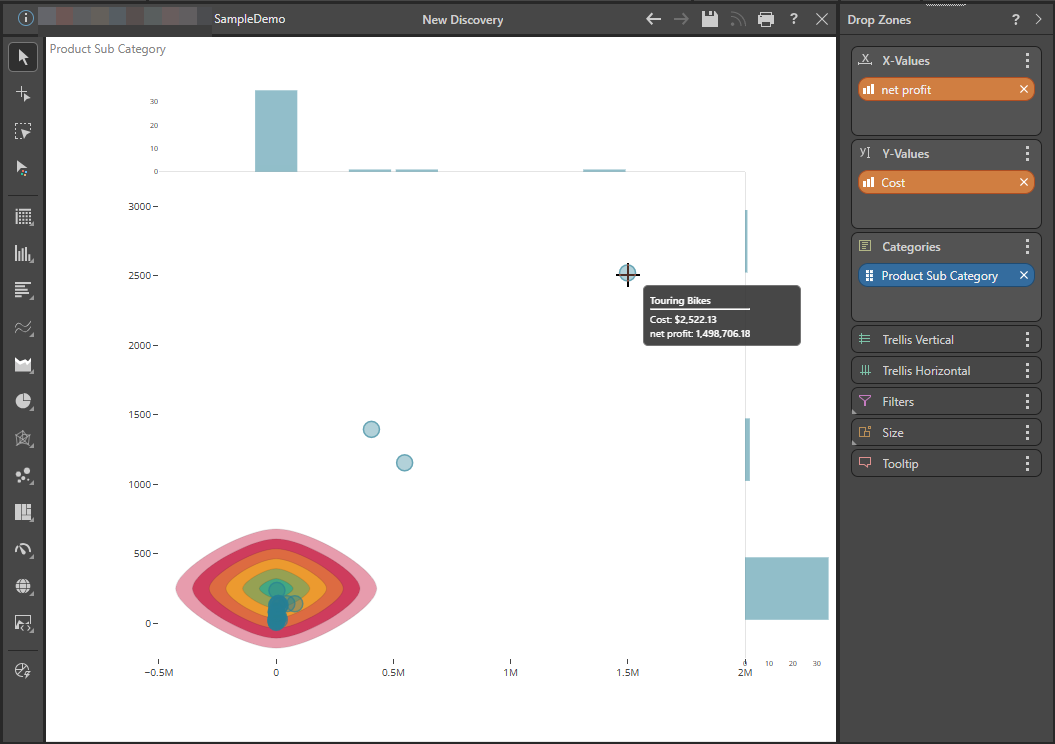
2D Density Plot
The 2D Density Plot is a 2D histogram that shows the relationship between measures at the exact position in the same category at the same time as the data points, and 1D histogram of each measure.
The following example shows net profit on the x-axis and cost on the y-axis of the graph. It then indicates a data point for each Product Sub-Category, so that you can see how they are distributed. The "target" in the bottom-left shows where most Product Sub-Categories appear, given these measures. At the top-right is "Touring Bikes," with its tooltip (shown on hover) indicating its name, cost, and net profit. The plot helps us to see that this data point is an outlier, where cost and net profit are both unusually high:
AG Grid
High-performance data grid for building responsive and interactive tables, with advanced features like sorting and filtering. AG Grid is a fast, customizable JavaScript data table that is typically used to work with very large datasets.
The following example shows how you can interact with a large dataset relating to promotions information:
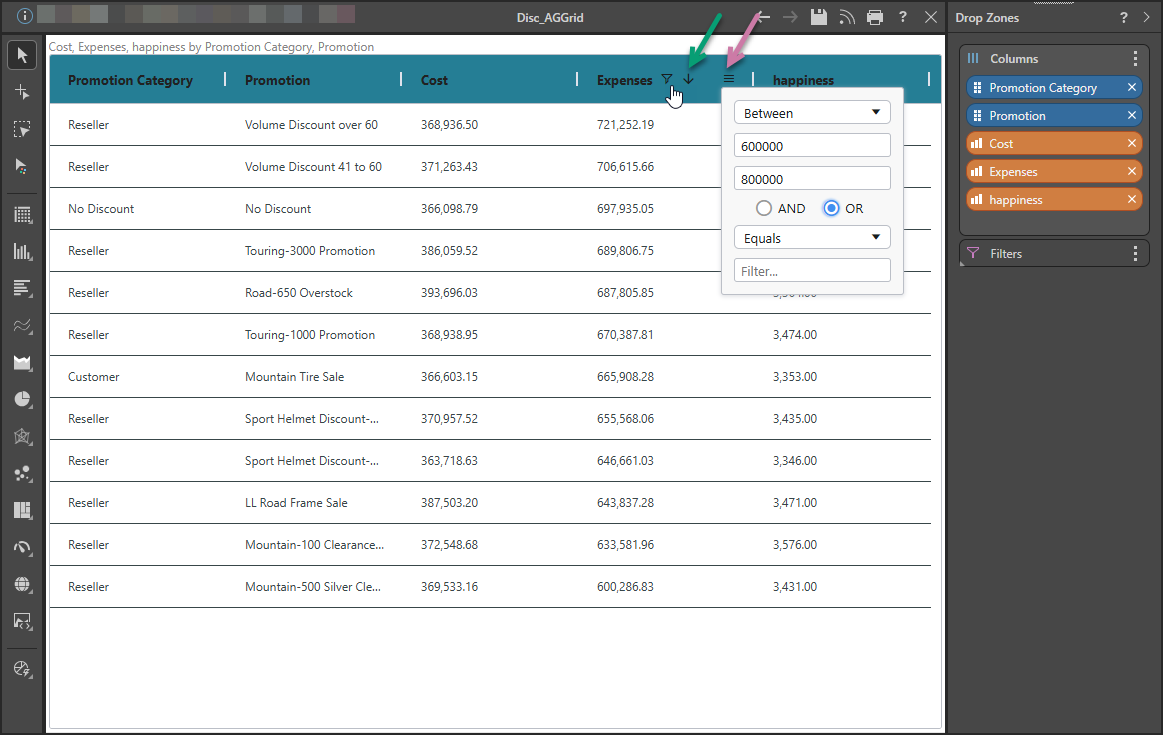
Sorting and filtering
Sorting (green arrow above) and Filtering (purple arrow) are supported on hover in the header row. The filter options open in a pop-up when you click the Hamburger menu.
Note: The Filter icon is also shown in the header once a filter has been applied.
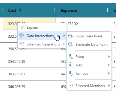
Context menu
The data in the grid can also be explored using the right-click context menu options as per a standard Grid. For example, right-clicking a measure value opens the following menu:
Tabular Grid
Responsive table that adjusts the cell content to the cell size without cutting any of it.
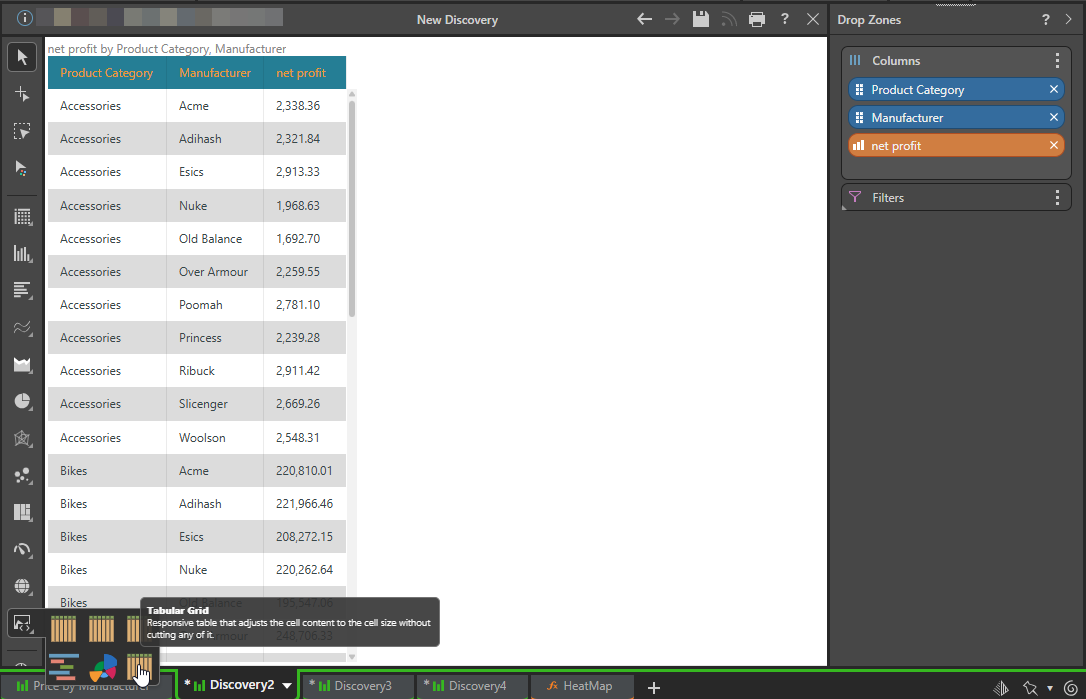
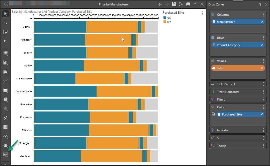
Tip: You do not need to use a Custom Visual to create a Tabular Grid. You can simply select Tabular Grid from the Visualization Toolbox. For more information, see Tabular Grids in Discover Pro.
Scroller
A dynamic, horizontal, ticker-style, real-time data feed, similar to news or stock tickers, that you can use to grab attention in presentations. The Scroller is ideal for monitoring fast-changing metrics, displaying scrolling text or KPIs, and optimizing space by enabling continuous data display without the user needing to scroll through tables.
Note: The data will not change until the query is refreshed, either manually or through automatic changes to the slide.
The following Scroller example shows the quantity per customer by manufacturer and sales team:
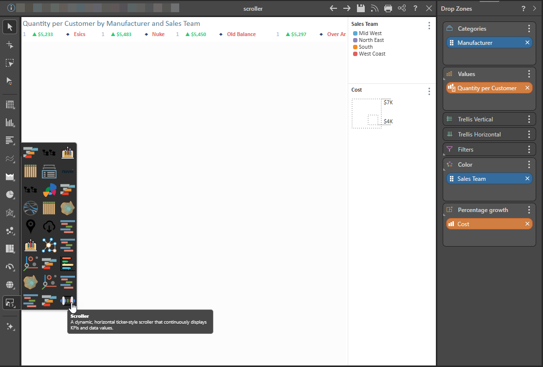
Tip: When you are configuring your custom visual, you can customize the appearance of your scroller at the top of the script section. The configuration section allows you to control several display properties (font, size, color, and so on).
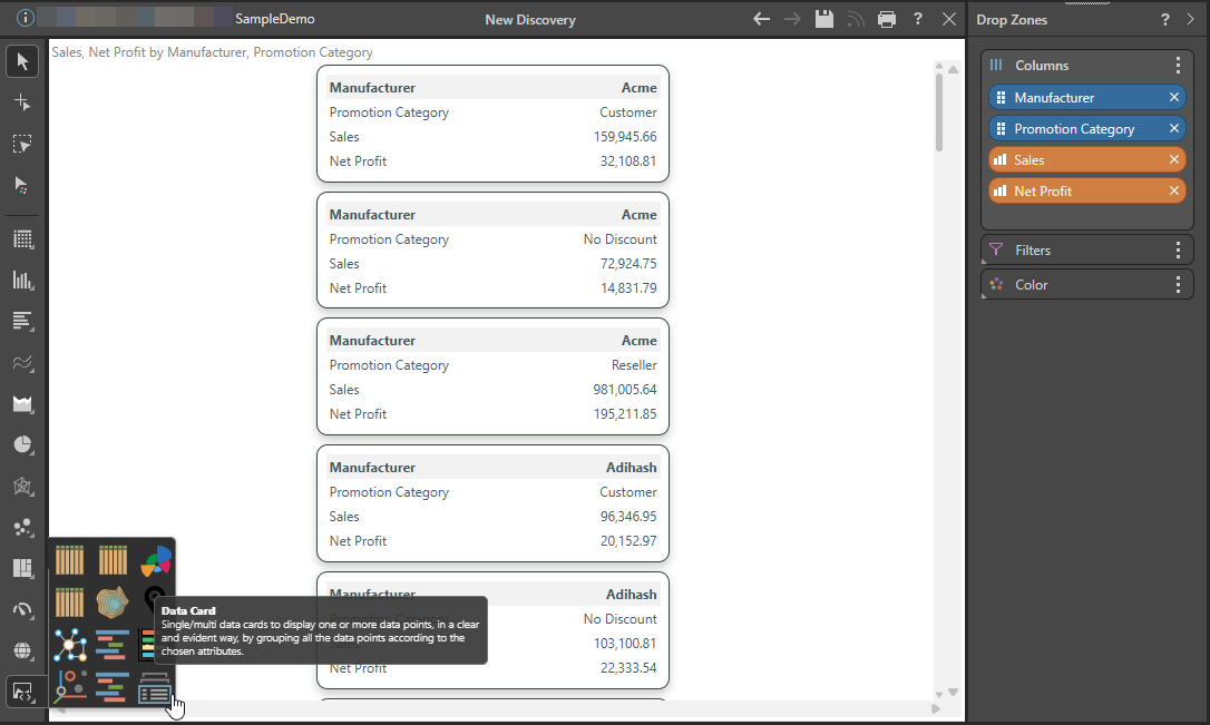
Data Card
Single or multi-value data cards that display one or more data points in a clear and evident way, by grouping all the data points according to the chosen attributes.
The following Data Cards example shows the level of Sales and how much Net Profit there is for each Manufacturer given a particular Promotion Category:
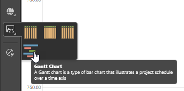
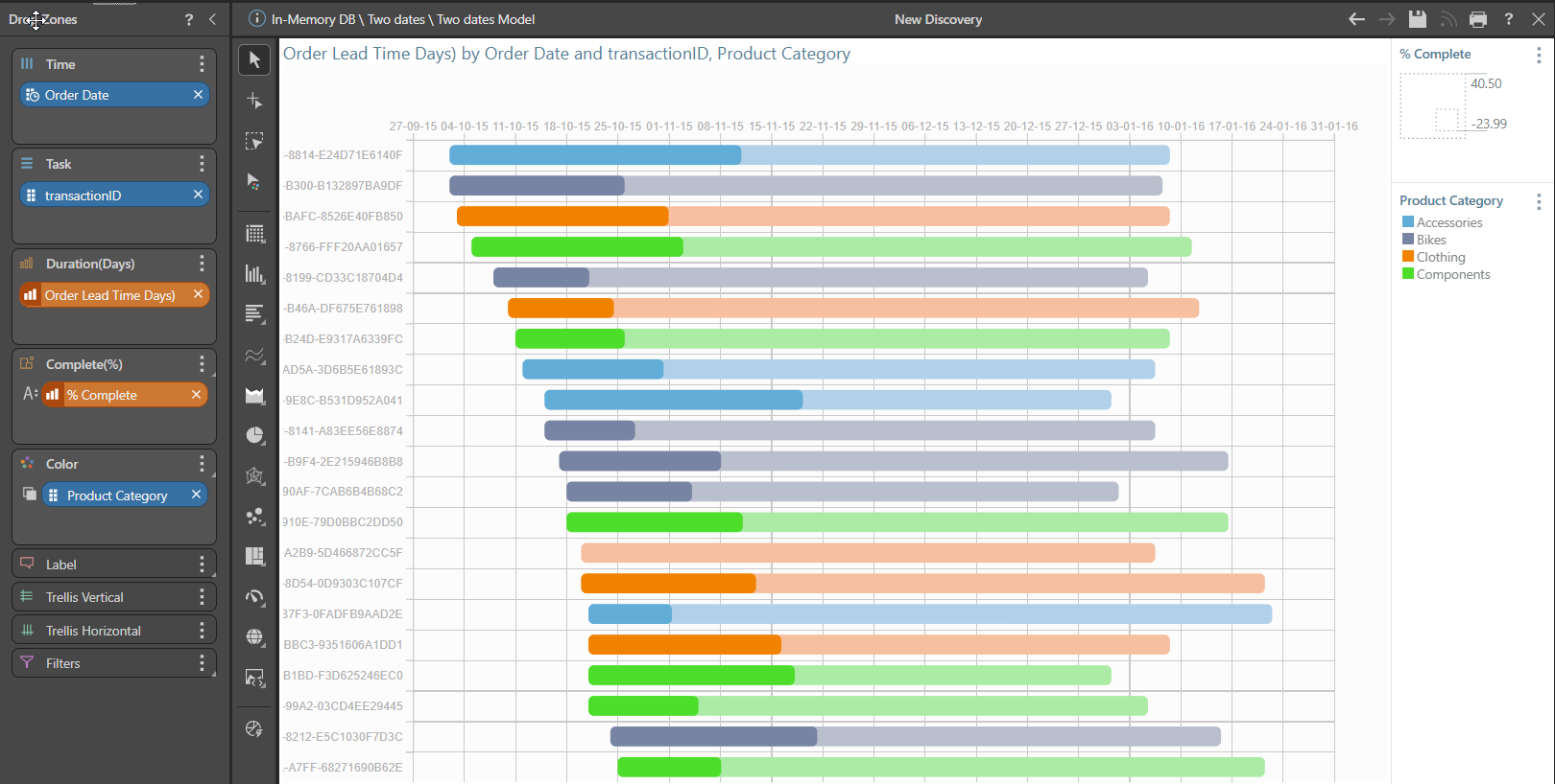
Gantt Chart
The Gantt chart is a type of bar chart that illustrates a project schedule over a time axis.
The following example shows the timelines for completion of orders, each of which is referenced by its transaction ID on the y-axis. The bars then indicate the passage of time for each order on the x-axis, with the chart showing both the Order Lead Time (in Days) and % Complete for each transaction. Lastly, the bars are colored to indicate the Product Category associated with each of the orders.
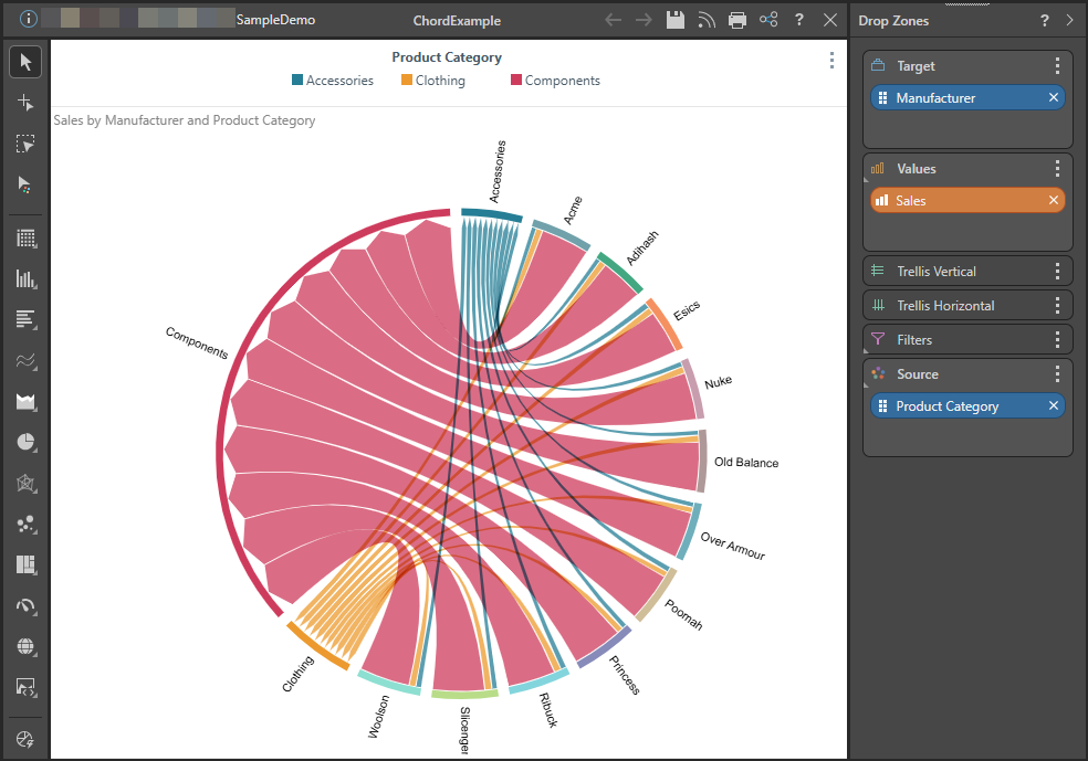
Chord Diagrams
The Chord diagram is a graphical method of displaying relationships within a "square matrix." Usually, the matrix shows a transfer from one state to another state.
The following example shows how different Manufacturers (the targets in the chart) contribute to sales across various product categories (source). It indicates that Component sales have a value that is higher than Clothing or Accessories, and that all Manufacturers contribute to Sales of Components, Clothing, and Accessories.
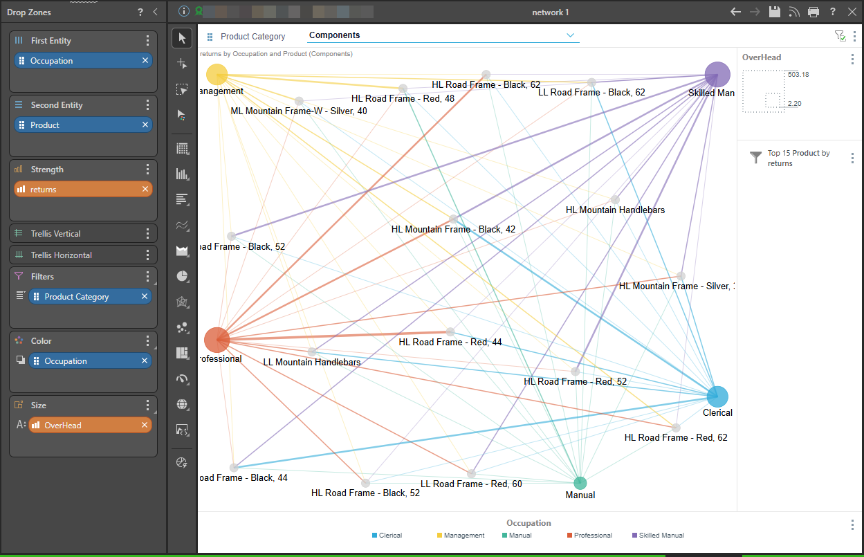
Network Diagram
The Network Diagram shows the relationships between a group of entities, which is useful for visualizing networks or graphs, typically when performing a network analysis.
In a Network Diagram, nodes are derived from attribute members, while edges are measured by the strength of the interconnecting measures. Edge thickness is determined by the measure's weight / value. Node sizes can be independently sized using another measure. Node colors and edge colors can also be set using the same or different attributes.
Note: Direction is not represented. The base network and chord charts use a pathfinder algorithm. However, customers can edit the logic for each of these aspects in the custom visualizations using their own algorithms.