KPI's may be visualized using any of the visualization types in Discover:
- Gauges are specifically designed to complement the capabilities of KPI measures, making them a particularly useful method of visualizing KPIs.
- Matrix Grids also have unique capabilities for showing KPI's in a more compact manner.
- All other visuals can utilize the mathematical elements and values of the KPI to drive different effects (like any other value or metric). This includes colors, size, labels, tooltips, and so on.
Accessing KPIs
Formulate Ribbon
Custom KPI measures can be directly opened in Discover by clicking the Quick Discovery button from the KPI designer:
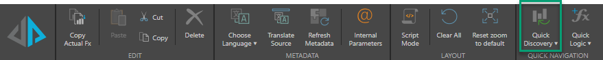
Note: This example shows the Ribbon from the Target Values page of the KPI designer, although this option is available from any of the pages. For details of all KPI ribbons, see KPI Ribbons.
Discover
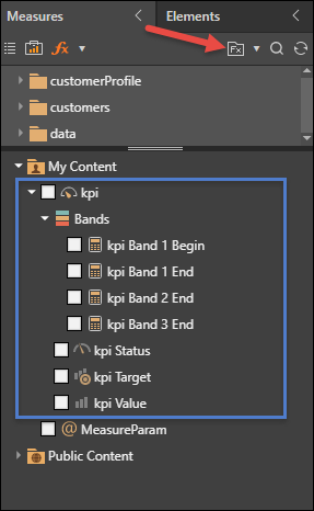
Alternatively, open the relevant data model in Discover, and open business logic (red arrow below) from the Measures panel; select the required KPI (blue highlight) to add it to the query. Note that the KPI measure can be expanded to view or select specific measures contained in it: status, target, value, and bands (if relevant).
KPI 'Chips'
In order to best leverage your KPI measures, it's important to understand how KPI measures relate to the drop zones and drive the visual components of the query.
When added to the query, each measure within the KPI is represented by a chip in the drop zone. The placement of these chips drives the look and feel of the KPI's visualization.
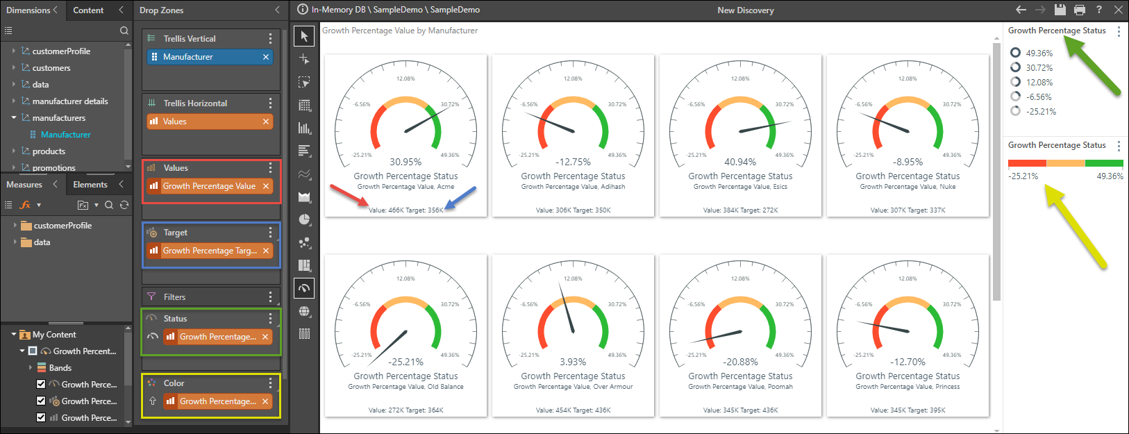
Gauges
When using a gauge visualization, the standard visual for KPI's, users are presented with 4 key drop zones for constructing the visual. These align tightly with the 'DNA' of the KPI itself.
Value Drop Zone
The value chip (red highlight above) is automatically added to the Values drop zone, where it drives the values in the visualization (red arrow).
Target Drop Zone
The target chip (blue highlight) drives the target labels in the visualization (blue arrow). When visualizing the query as a gauge, the target chip is added to the Target drop zone; if using another type of visualization, the target chip is added to the tooltip zone.
Status Drop Zone
The status chip (green highlight) drives the status indicators in the visualization, and is also visualized in the status indicator key (green arrow). When using a gauge, the status chip is added to the Status zone; otherwise, it's added to the Indicator zone.
- The status indicator type and logic can be customized from the Status drop zone.
Color Drop Zone
The status chip (yellow highlight) also drives the color indicators in the visualization; as such, a second status chip is added to the Color drop zone. The color indicator key (yellow highlight) shows the breakdown of the KPI bands used to color the visualization.
- The color type and logic can be changed from the Color zone.