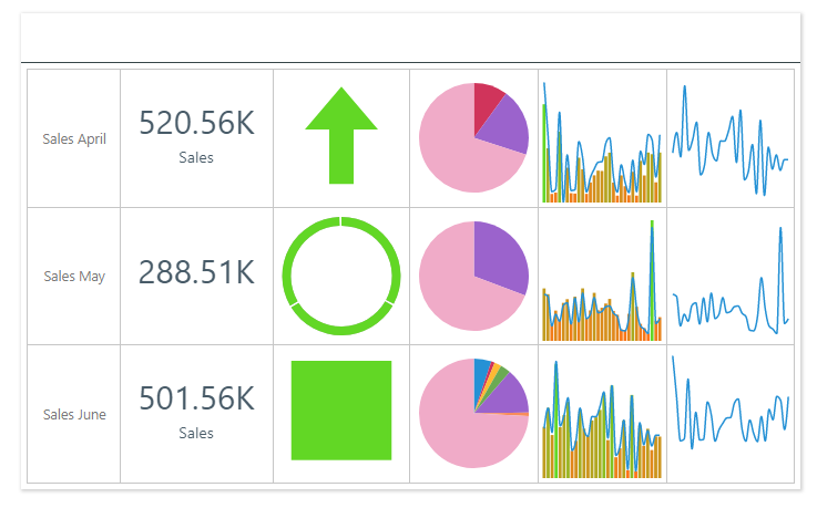
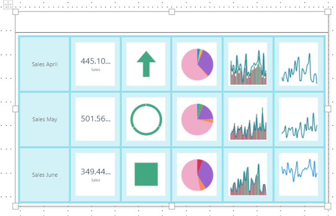
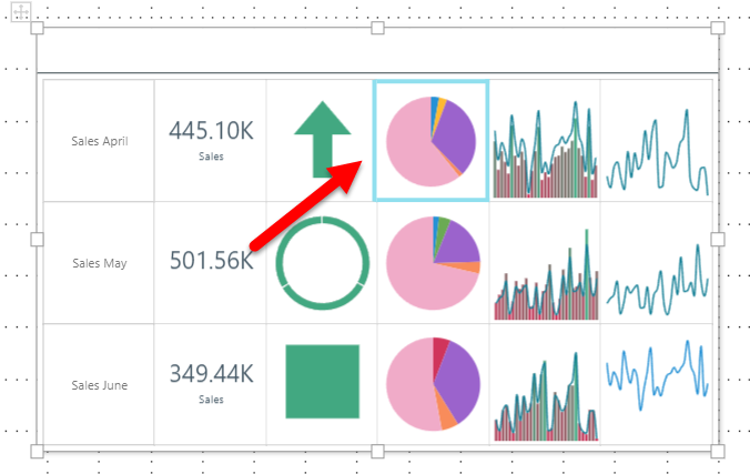
The Matrix Table is a layout container used to display multiple visuals and assets within tiles in a tabular construct. The table can be used to display visuals, illustrations, images, text, slicers, buttons, images, and web panels. However, the matrix table is commonly used to create KPI scorecards. Typically, KPIs, mini visuals, and text labels are displayed across several rows, to easily compare these details within a single formatting structure. For example, the matrix table below compares sales during April, May, and June.
The following video provides an example of how to create Matrix Tables:
Note: This feature is not available in the Community Edition.
Example: Matrix Table
Creating a new Matrix Table
Step 1: Add a table to your canvas
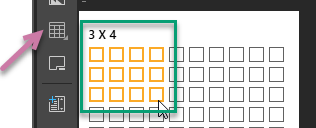
Do either of the following from the Toolbox:
- Click Add Table to add a table of the default size (three columns by three rows; nine tiles in total).
- Right-click Add Table and specify the table size by selecting rows and columns (green highlight below).
Then click anywhere on the canvas to place the container there.
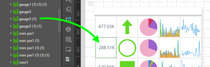
Step 2: Add assets into the cells
Drag any assets onto the required tile in the table.
Editing an existing Matrix Table
Remove assets from the table
To move an asset out of the table, drag it and drop it elsewhere on the canvas.
To delete an asset that is in the table, right-click on it and click Delete from the context menu.
Add or remove rows or columns
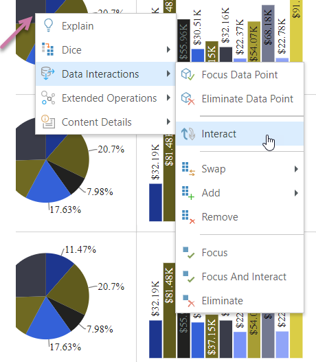
To access the Matrix Table's context menu:
- Right-click the borders of the Matrix Table container (green highlight below).
- Right-click a visual inside the Matrix Table. In this case, the context menu is shown inside a Matrix Table submenu.
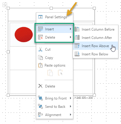
Tip: In addition to the matrix table items, you can also access other items from the context menu. Where the border is selected, this includes the Panel Settings (orange arrow above) which opens the Formatting Panel.
|
Function |
Description |
|---|---|
|
Insert |
Insert columns before or after, or rows above or below, the current selection. If you have the table selected, the column or row is added before or above the first column or row in the table or after or beneath the last. |
|
Delete |
Delete selected columns or rows or cell content. |
Tip: You can also resize the table's columns and rows by dragging a row or cell border vertically or horizontally.
Table Formatting
When the table container or cell is selected, various formatting options are enabled from the Component ribbon (orange arrow below). You can also adjust the Table Settings for either your selected cell or whole table, and, for the whole table only, the Panel settings and Size and Position.
- To adjust the table settings for all cells in the table, select the table container.
- To adjust settings for a specified cell within the table, select only the required cell.
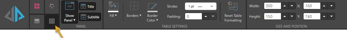
Panel
Table only. Use the options in the Panel section to format the panel associated with the table. For more information about these options, see Panels in Present Pro.
Table Settings
- Fill: Change the color of the cells. (Note that this is the color of the table cells BEHIND the visual inserted into the cell.)
- Borders: Show all or no cell borders, or show borders only at the top, bottom, left, or right of the cell or cells.
- Border Color: Set the border color.
- Stroke: Set the thickness of the border.
- Padding: Increase the padding between the cell borders.
- Reset Table Formatting: Revert to the default table formatting.
 Examples: Table Settings
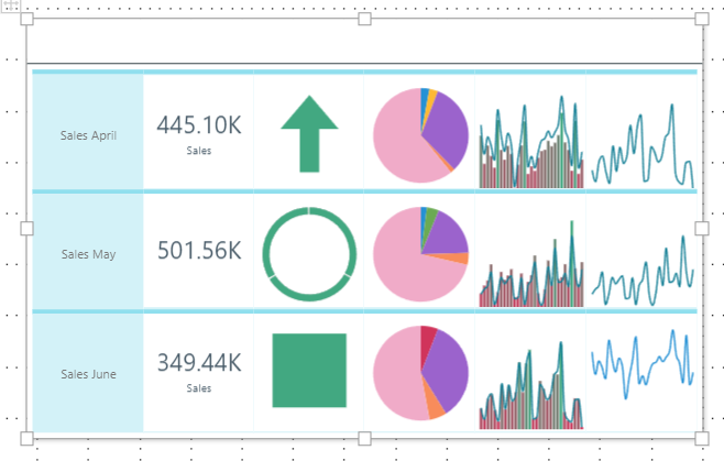
Here, the background color was set to light blue, all borders were shown, the border color was set to blue, and the border width and padding were both increased:
Here, only borders at the top of the cells are shown, and padding is disabled:
Here, the border color and width were adjusted for only one cell:
Size and Position
Table only.
Change the size and position of the selected item:
- Adjust the item size using Width and Height.
- Adjust the item position using X and Y.
Tip: The X and Y coordinates and width and height are displayed underneath each content item when it is selected on the canvas.
Table at Runtime
The assets in the table behave as usual at runtime. Slicer and cross-visual interactions are enabled by default, and other functions are available from the context menu as usual.