The Item Selection Bar, located across the top of the workspace, is where users define their query by adding measures, hierarchies, and filters. From here, users can peruse and search the data model and select which data they want to visualize in the query.
Smart Discover's streamlined point-and-click selection bar makes this process simple and intuitive, supporting users in creating meaningful data visualizations, without the need for complex technical know-how. The Item Selection Bar is an integral piece of the report-making process, and an excellent example of how Smart Discover invites non-technical users into the data analytics space, making BI accessible and straightforward.
Item Selection Bar
![]()
Type your question
In addition to manually selecting your items using the Select Data tab, you can also make use of the Chatbot to "Ask a question" when Smart Discover does not include any selected "chips." For more information, see Ask a Question in Smart Discover.
Adding a Value
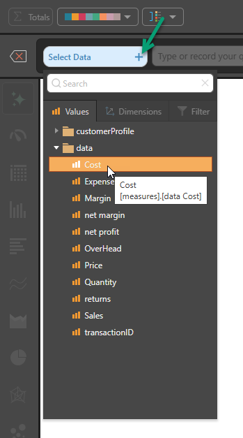
If you do not want to type a question, you can click Select Data + (green arrow below) to open the Data Selection panel, which features three main tabs:
- Values - If your canvas is empty, this is the only enabled tab.
- Dimensions
- Filters
Double-click one of the Values to add it to your canvas:
Note: You can select any Custom Measures that you have access to from the Custom Measures folder at the bottom of the Values tree. The behavior is the same as for standard measures.
When a single value (measure) is added, Auto Recommend (green arrow below) typically selects a Gauge as the visualization type (blue arrow):
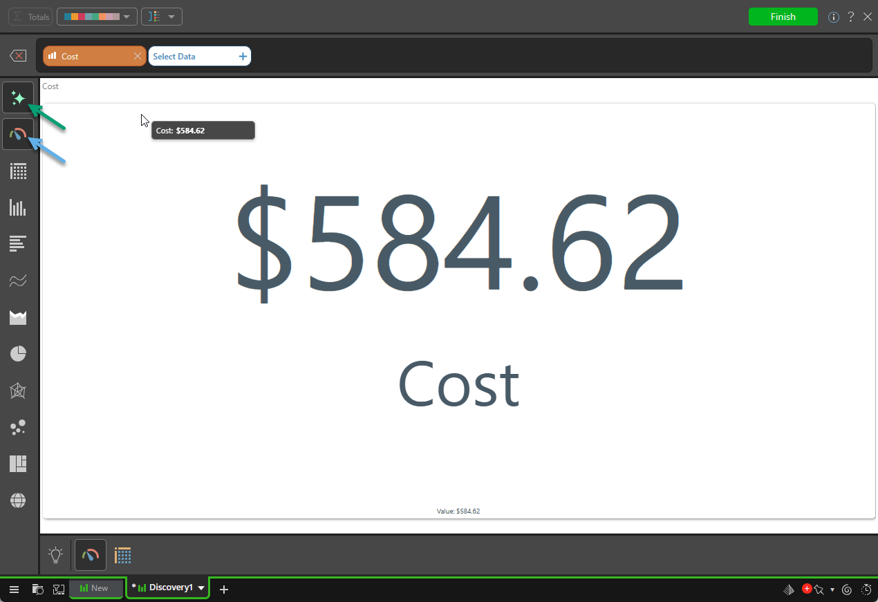
To learn more about visualizing your data and the Auto Recommend option, see Visualization Picking in Smart Discover.
Adding Dimensions or Filters
You can continue adding metrics to the query by clicking Select Data and selecting the data you want to add. Since an initial measure has been added, the Dimensions and Filters tabs are now also enabled in the Data Selection panel. You can now add measures, hierarchies, and filters as needed.
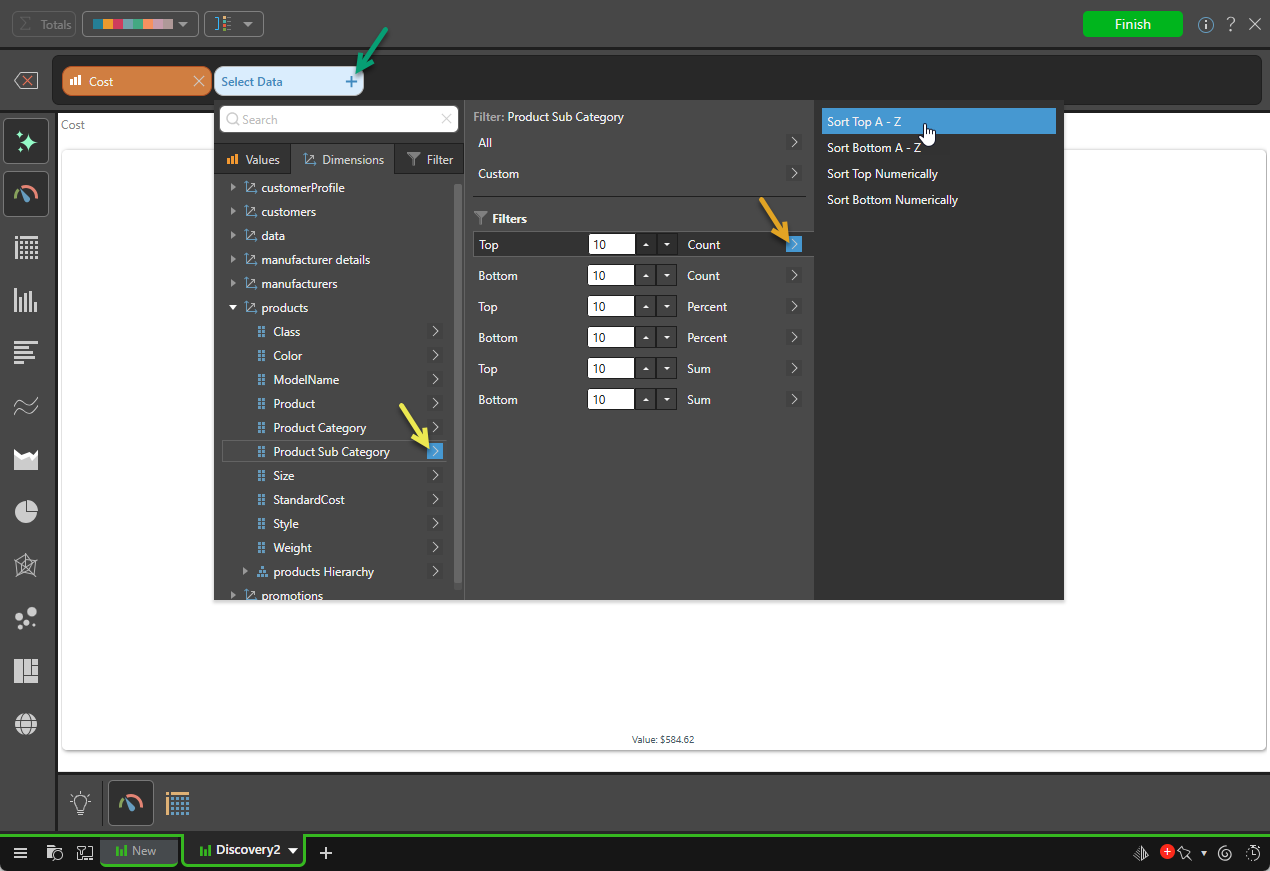
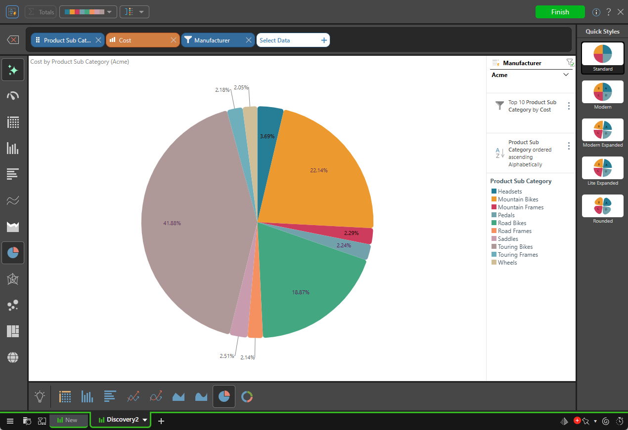
Note: To add all Product Sub Categories, select the name in the initial Dimensions panel. The preceding configuration shows how to select the Top 10 Product Sub Categories (yellow arrow), sorted alphabetically (orange arrow). For more information, see Advanced Selections.
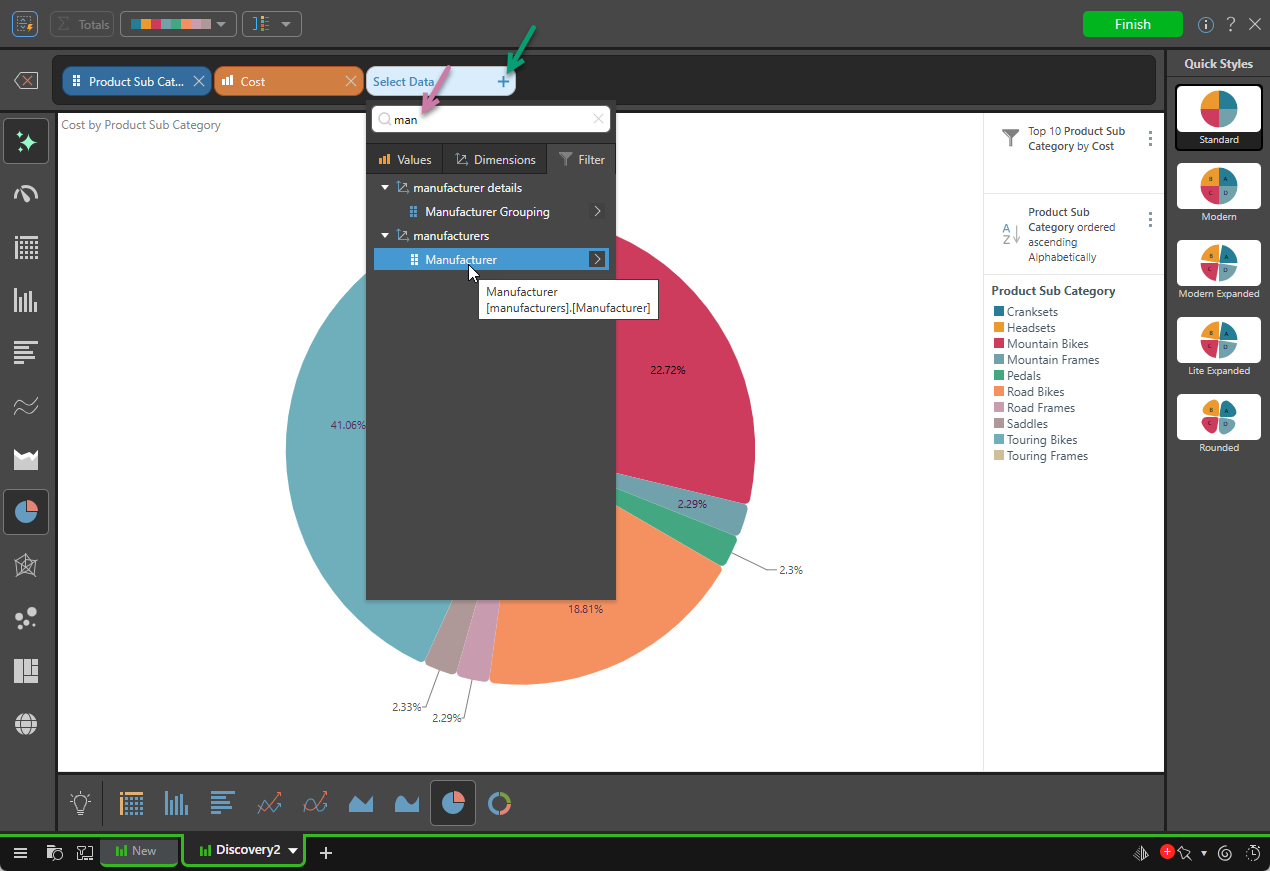
Search
Note that the Data Selections panel features a search bar, where you may enter a search term (purple arrow below) to look for a required item. The following shows the search bar applied to the Filter tab:
Auto Recommend
Since Auto Recommend is selected in the Visualization Picker (this is the default), the visual is updated automatically to reflect your selected items:
Managing Data Selections
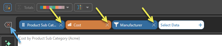
Each data selection in the query is displayed in the Item Selection Bar as a chip. Chips are color-coded according to the data type they represent; measure chips, representing quantitative data, are orange, while hierarchy and filter chips, which represent qualitative data, are blue.
Removing Data Selections
- To remove a data selection from the query, click the X (yellow arrows above) of the chip you want to remove.
- To remove all data selections from the query, click Reset (blue arrow).