When working with gauges, you can show labels so that users can easily understand which measures are being compared, and what the value of each measure is in each gauge.
Gauge Labels
When you add a Gauge to your discovery, its Gauge Labels provide detailed information to your reader. You can customize the appearance of the following components:
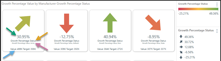
- Primary Label: The primary label is the main numeric value (green arrow below).
- KPI Name: This is the label directly underneath the value (orange arrow):
- If the gauge was built on the fly in Discover, the default name will be the label for the measures in the Values drop zone, the measure in the Status drop zone, and the member elements from the given hierarchy or hierarchies.
- If the gauge is based on a custom KPI built in Formulate, the KPI Name will be the name that the KPI was saved as.
- Data Point Name: This label (purple arrow) displays the member elements represented by the gauge. (The member elements from the hierarchies in the Trellis drop zones.)
- Secondary Label: This label displays the values that are not set as the primary label (blue arrow).
Text KPI Styling
If your KPI only contains text, you can also change the Alignment and Vertical Position of that text using some additional Gauge Label settings (described below). For example, the following shows a tile where all the labels have been left aligned and the vertical position of each has been configured to lay the different labels out as needed:
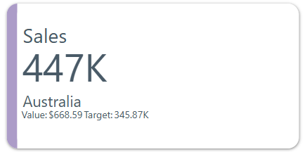
Note: In this example, the Sidebar option in the Color drop zone has also been used to add a color driven by the expenses measure. For more information, see Color Drop Zone.
Access Gauge Labels
Component Ribbon
The Gauge Labels button (orange arrow below) and the Gauge Value button (purple arrow) are shown on the Component ribbon when working with gauge labels:
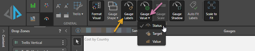
- Click Gauge Labels to Show or Hide the Gauge labels.
- Click Gauge Value and one of Status, Target, or Value to change the text used as the value on the gauge. For more information, see Gauge Value.
Additionally, you can click Auto Fit Labels to Enable or Disable the Auto Fit functionality that makes your label text resize automatically to fit the available space. Note that, where the Auto Fit Labels option is enabled, the sizes of your labels (entered in this panel) still affect the size of the text in the gauge; instead of them setting the exact size of the text, they allow the Auto Fit function to find a relative size for the different parts of the label. For more information, see Auto Fit Labels.
Formatting Panel
Open the Formatting panel and select Gauge Labels from the dropdown list:
Primary
From the Primary tab, set the gauge values and adjust the gauge's style.
- Click here to learn more about gauge values.
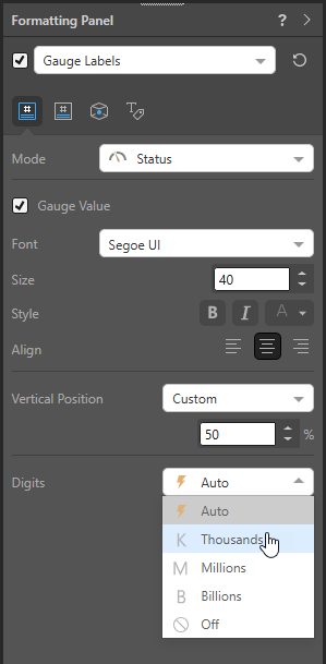
- Mode: Select which gauge value to show in the middle of the gauge - status, target, or value.
- Gauge Value: Show or hide the gauge value.
- Font: Change the font type for the KPI value.
- Size: Change the size of the KPI value.
- Style: Change the style (bold, italics, or color) of the KPI value.
- Digits: Change the units for the KPI value.
Text KPIs only
- Align: Align the text to the left, center, or right of the tile.
- Vertical Position: Specify the vertical position for the primary value:
- Select Automatic to allow Pyramid to set the vertical position.
- Select Custom to manually specify the vertical position using a value between 0 (indicating the top of the tile) and 100 (indicating the bottom of the tile).
KPI Name
From the KPI Name tab, show or hide the KPI name and set styling for it.
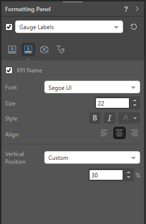
- KPI Name: Show or hide the KPI name.
- Font: Change the font type for the KPI name.
- Size: Change the size of the KPI name.
- Style: Change the style (bold, italics, or color) of the KPI name.
Text KPIs only
- Align: Align the text to the left, center, or right of the tile.
- Vertical Position: Specify the vertical position for the KPI name:
- Select Automatic to allow Pyramid to set the vertical position.
- Select Custom to manually specify the vertical position using a value between 0 (indicating the top of the tile) and 100 (indicating the bottom of the tile).
Data Point
From the Data Point tab, show or hide the Data Point Name and set styling for it.
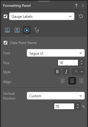
- Data Point Name: Show or hide the data point name.
- Font: Change the font type for the data point name.
- Size: Change the size of the data point name.
- Style: Change the style (bold, italics, or color) of the data point name.
Text KPIs only
- Align: Align the text to the left, center, or right of the tile.
- Vertical Position: Specify the vertical position for the data point name:
- Select Automatic to allow Pyramid to set the vertical position.
- Select Custom to manually specify the vertical position using a value between 0 (indicating the top of the tile) and 100 (indicating the bottom of the tile).
Secondary
From the Secondary tab, show or hide the secondary values and set styling for them.
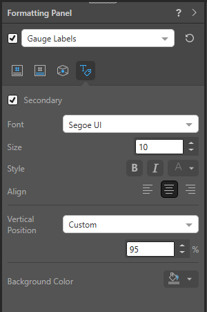
- Secondary: Show or hide the KPI secondary values (the values that are not set as the KPI value).
- Font: Change the font type for the secondary values.
- Size: Change the size of the secondary values.
- Style: Change the style (bold, italics, or color) of the secondary values.
- Background Color: Use the color picker to change the color of the report background, without affecting the gauges.
Text KPIs only
- Align: Align the text to the left, center, or right of the tile.
- Vertical Position: Specify the vertical position for any secondary values:
- Select Automatic to allow Pyramid to set the vertical position.
- Select Custom to manually specify the vertical position using a value between 0 (indicating the top of the tile) and 100 (indicating the bottom of the tile).