Formatting adjustments can be made to the plotting area of Cartesian, gauge, segment, radar, and plotted charts. This includes changing the color, adding borders, and changes to the axes.
Basic Plot Area Formatting
Fill
Select this tab to change the background color of the plotting area. Choose the desired color using the color picker.
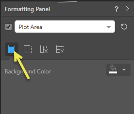
- Background Color: Use the color picker to change the color of the plot area's background:
- Gauges: For a gauge, the color means the background of each gauge (the tile). If you have a hierarchy or measure in the Color drop zone, this overrides the gauge background color selected from the Formatting panel.
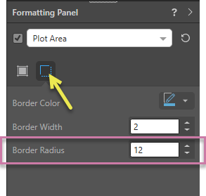
Border
Choose this tab to add borders around the plot area. Select the border color and adjust the border width.
- Border Color: Adjust the border color; the border color will only be visible if the border width is above 0 or the shadow is on.
- Border Width: Adjust the border width.
- Border Radius: (Gauge Charts.) Apply a curve to the corners of the gauge. Where the radius is 0, the items have right-angles for corners. Increasing the radius adds a curve to the corners, making each gauge into a rounded rectangle. The larger your Radius is, the more pronounced the curve is.
Component Ribbon
The border width can also be changed from the Component ribbon. If you've changed the border color and don't see any changes in the visual, you should change the border width:

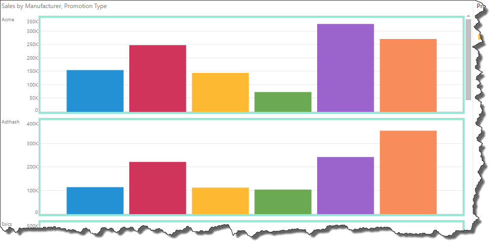
Formatting Example
The following example shows a Column chart where the Plot Area Border width is greater than 0 and the Border color is blue; this configuration adds a border around each trellised column chart:
X-Axis Lines
This option appears for Cartesian, radar, and plotted charts. X-axis lines are disabled by default.
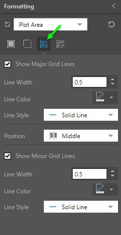
- Show Major Grid Lines: show or hide x-axis grid lines.
- Line Width: change the width of the x-axis major grid lines.
- Line Color: change the color of the major grid lines.
- Line Style: choose solid (the default line style), dotted, or dashed.
- Position: position the major grid lines in the middle of each data series (default position), or in between each series.
- Show Minor Grid Lines: add minor grid lines in between the major grid lines.
Y-Axis Lines
This option appears for Cartesian and plotted charts. Y-axis lines are enabled by default.
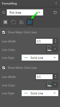
- Show Major Grid Lines: show or hide y-axis grid lines.
- Line Width: change the width of the y-axis major grid lines.
- Line Color: change the color of the major grid lines.
- Line Style: choose solid (the default line style), dotted, or dashed.
- Show Minor Grid Lines: add minor grid lines in between the major grid lines.
Examples
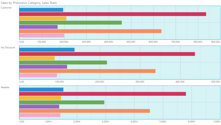
In this example, the back ground color was changed to blue, and a darker blue border was added. Major and minor grid lines were enabled for both x- and y-axes.