When working with Sankey charts, you can change the report background color and scale the chart down from the Formatting panel.
Sankey Chart Formatting Panel
Fill
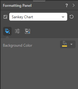
- Background Color: Change the color of the Report Background using the Color Picker tool. This change does not affect the chart background.
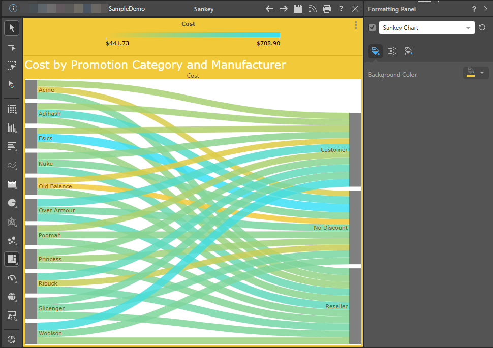
In this example, the background color was changed to mustard yellow:
Settings
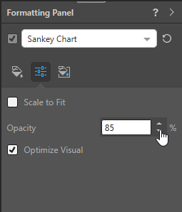
- Scale to Fit: Scale the chart to fit onto the canvas. Note: This is useful when working with trellised charts.
- Opacity: Change the "opacity" (as opposed to the transparency or "see-throughness") of the Sankey chart's links. Remember: 100% is completely solid and not see-through at all; dropping the opacity from 100% makes the links increasingly transparent, which allows you to see them crossing over more clearly.
- Optimize Visual: The visual optimization engine in Pyramid is a heuristic that automatically redacts certain parts of a visual based on the amount of space provided.
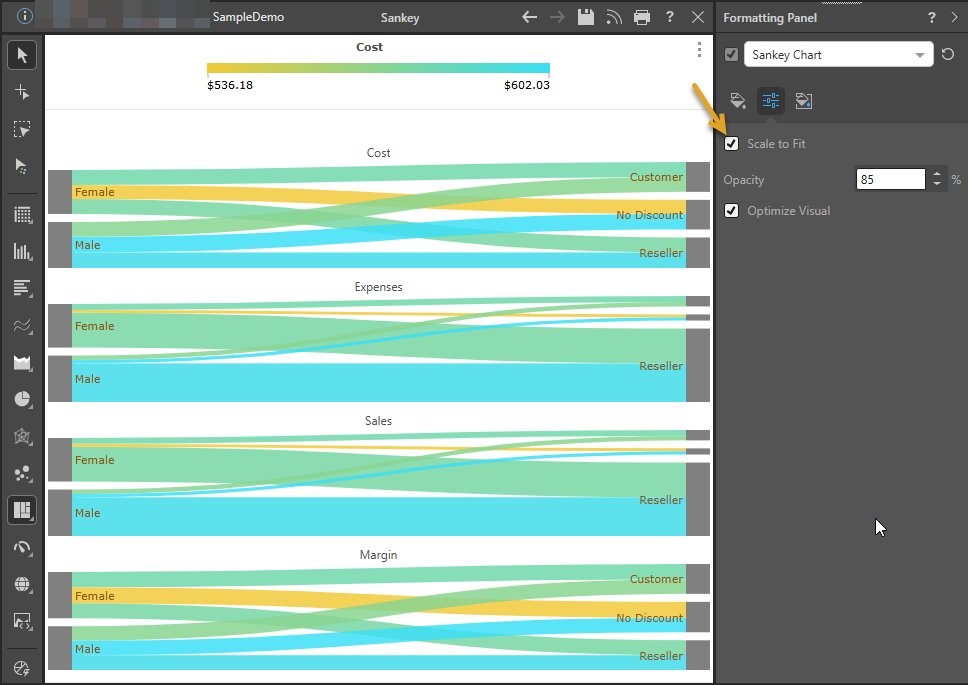
In this example, the Sankey chart has been trellised using four measures (Cost, Sales, Expenses, and Margin).
By default, the Scale to Fit checkbox is not selected in the Formatting panel and the Trellised visual does not fit the canvas (note the scroll bar):
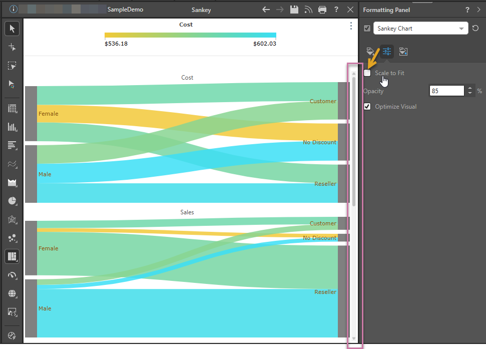
Selecting the Scale to Fit checkbox in the Formatting panel causes the Trellised visual to shrink to fit the canvas:
Miniatures
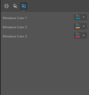
Click Miniature (purple arrow below) to specify the colors used for the text content when your visual is represented as a Miniature Visual:
Miniature visuals are created automatically when you scale a visual down to a size that makes its content illegible. These tiles typically display the measure as a number with its name underneath:
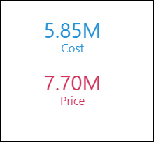
Note: The purpose of a miniature visual is to provide a way to easily view and interpret important data at a glance, even where there is a lot of information and limited space.
You can use the Color Picker to set the text colors used when Miniatures are displayed in a visual:
- Miniature Color 1: Select the color for the first tile in the miniature visual (blue in the preceding example).
- Miniature Color 2: Select the color for the second tile in the miniature visual (red in the preceding example).
- Miniature Color 3: Select the color for the third tile in the miniature visual (not shown).
Other Settings for Sankey Charts
The following formatting options can be edited by making the required selection from the main dropdown list in the Formatting panel:
- Report Title: Customize the report title.
- Data Labels: Show or hide data labels and customize data label fonts, colors, formats, and more.
- Legend: Change the formatting associated with the legend.
- Plot Area: Customize the plot area by changing the color, adding borders, and changing the axes.
- Color: Customize the color and font for a given legend item and the analogous data point.
- Y-Trellis Axis: Show or hide trellis labels and edit fonts.
- Multi Chart Title: Show the relevant title for each trellised chart.