Building a visualization is a simple process which requires you to add a hierarchy and measure to the drop zones, and then select a visualization type. The drop zones change according to the requirements of the selected visualization. The process of building visualizations is fluid and designed to enable the user to easily change the selected visual as needed. This allows you to find interesting ways in which to present your data.
Drop Zones
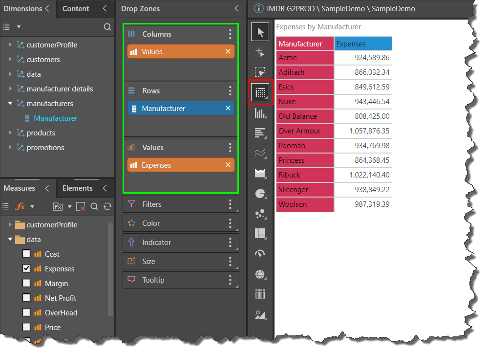
The drop zones are updated dynamically according to the chosen visualization. Start by adding a hierarchy and a measure to the drop zones. Your default visual will automatically be generated and populated with the given data:
Selecting a Visualization Type
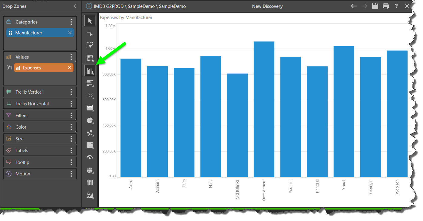
Choose a visualization from the visualization picker (Toolbox):
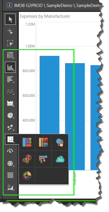
Each visualization icon can be expanded to show its sub-menu, which contains additional visualization types:
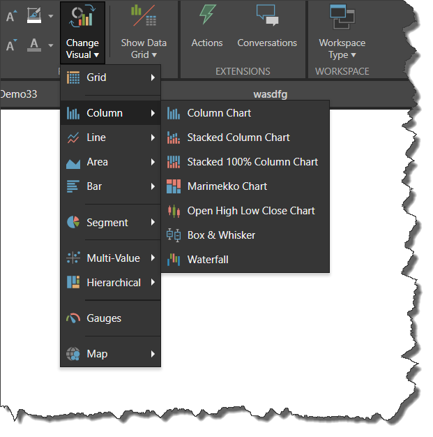
You can also change the visualization using the Change Visual drop-down on the Report ribbon:
Visualization Types
Follow the links below to learn about the various visualization types available in Pyramid, and how to build them:
KPI charts
KPI charts are used to visualize your KPIs as a gauge or bullet chart. You can typically choose from two KPI chart types:
- Gauges
- Bullet chart (Discover Pro only.)
Grids
Grids are used to present data in rows and columns. You can typically choose from three grid types:
- Matrix Grid
- Tabular Grid
- Raw Grid (Discover Pro only.)
Cartesian charts
Cartesian charts plot data across two axes (a y-axis and an x-axis), which meet at 0.
Column charts
Not available in Smart Discover (Discover Pro and Lite only):
Bar charts
Line charts
- Line chart
- Spline chart
- Step line chart
- Point chart
- Lollipop chart
- IBCS-like line chart (Not Smart Discover)
- IBCS-like lollipop chart (Not Smart Discover)
Area charts
- Area chart
- Stacked area chart
- Stacked 100% area chart
- Stream area chart
- IBCS-like area chart (Not Smart Discover)
Segment charts
Segment Charts display each element of the given hierarchy as a different segment of the chart, with each element represented as a proportion of the whole, based on its value.
Radar charts
Radar charts are used to plot one or more series of values across multiple quantitative variables, which are represented on axes extending from a central point.
- Radar line chart
- Radar area chart
- Radar smooth line chart
- Radar area smooth line chart
- Radar point chart
Plotted Charts
Plotted Charts (or Multi-Variable charts) plot two hierarchies across Cartesian coordinates. They are useful in finding correlations in the data set.
Advanced Charts
Advanced Charts plot multiple hierarchies in ways that can be more interesting than a typical Cartesian chart.
- Tree Map Chart
- Hierarchical Tree Map Chart
- Circle Packing Chart
- Hierarchical Circle Packing Chart
- Sankey Chart
- Word Cloud
- Sunburst Chart
Maps
Maps plot data geographically and are an excellent way to visualize the spread of data across geographical locations.
Custom Visuals
Custom Visuals in Discover Pro - Present data in visuals there were custom-made by you or another Pyramid user.
Auto Recommend
Auto Recommend in Discover Pro - Click Auto Recommend to prompt Pyramid to select the most appropriate visualization type for the data that is currently added to your visual. Right-click to select from a set of recommended visualization types.
Conditional Formatting
In addition to building visuals via hierarchy and measure selections and by selecting a visual type, users can also employ conditional formatting to adjust things like color and indicator graphics based on query values. Although these enhance the basic visualization capabilities, rather than act as a visualization in their own right.
Note: Conditional formatting is a critical part of building data-driven visualizations that impart more information than simple charts or grids alone. For more information, see Conditional Formatting.