Matrix Grid
The matrix grid organizes members and measures into columns and rows with headers. Users may determine which members and measures will be displayed as columns or rows. The matrix grid is highly customizable in terms of formatting, enabling users to tailor the grid's look and feel as required.
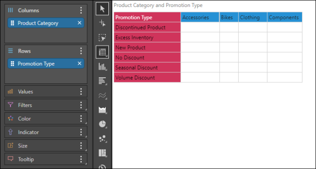
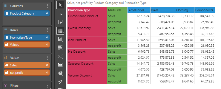
Unlike tabular grids and raw results grids, each member element in the given hierarchy is displayed as a header in the matrix grid. For instance, in the image below, the Country hierarchy was added to the Columns drop zone, and Promotion Type to Rows. Each member element within the Country hierarchy is displayed as a column in the grid, while each element under Promotion Type is displayed as a row:

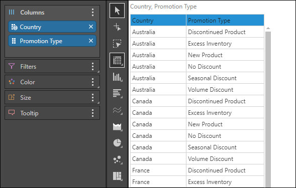
In the tabular grid below, the same 2 hierarchies are displayed as columns; however, the column headers are named according to the hierarchy name, and each row within the column contains an element from that hierarchy:
Step 1
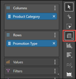
Add the required hierarchies and elements to columns or rows, depending on your requirements.
Step 2
Step 3
Add the required measures to the Values drop zone. If multiple measures are added, a single Values chip will be generated and automatically added to the Columns drop zone; you may move the Values chip to the Rows zone if preferred.
Step 4
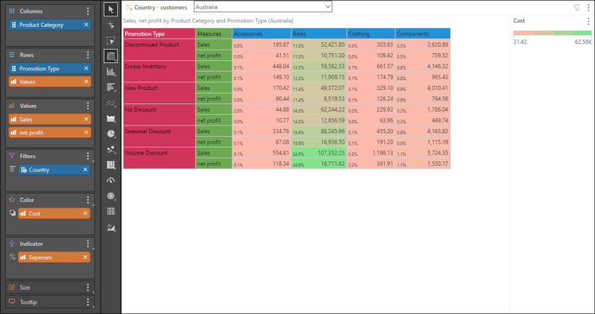
Add metadata to the other drop zones as required. In the image below, the Country hierarchy was added to the Filter zone to create a country slicer; Cost was added to Color to display color-coding based on the cost measure; Expenses was added to Indicator to display increases and decreases in expenses, Price was added to Size so that the size of the indicators is driven by price, and Quantity was added to Tooltip so that the quantity is displayed in the tooltip for each data point.
