Visual layout options offer various tools to set the layout for visuals within the presentation. This includes things like optimizing your presentation for different devices; setting the scaling behavior for visuals when the slide size is changed; adding text that auto-scales with its text box; customizing the visual panels (the container in which the visual resides in the presentation), and more.
Devices
Pyramid's responsive presentation design ensures that presentations are always loaded in the format appropriate to the device used to access them. Optimizing your presentations for the required device type ensures that the content placement and visibility is suited to the device being used to access it. You can optimize presentations for desktop, table, or mobile phone.
- Click here to learn about Devices
Visual options
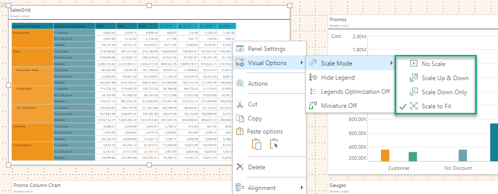
Scale Mode
Each visual is contained in a bounding box; whenever the slide size is adjusted, the bounding box is scaled up or down in response. Scale modes let you set the scaling behavior for the visual inside the bounding box.
- Click here to learn about Scaling
Auto Fit Labels
The Auto Fit Labels option lets you toggle between "auto fitting" the labels to the space available on KPI Gauge Labels and using fixed sizes for the Label text. By default, the labels displayed on a gauge "auto fit" to the space available using the font settings in the determine the relative proportions of the auto-fitted labels. When Auto Fit is off, the font sizes are determined using the Gauge Labels settings only.
- Click here to learn about Auto-Fit Labels
Legends
When adding a visual that has a legend, that legend can be added either within the visual container, or separately as a standalone legend. You can then show or hide legends in the visual, change the panel style for standalone legends, and adjust the formatting of the legend content and title as needed.
- Click here to learn about Legends
Range Slider
The Range Slider is used to zoom in and out of Cartesian charts that contain large amounts of data. A Cartesian chart that contains many elements on the x-axis can be very difficult to navigate and read. Such a chart can be quite challenging to interpret. While sometimes the solution may be to reduce the amount of data in the chart (for instance, by looking at months instead of dates), other times this isn't desirable.
- Click here to learn about Range Sliders
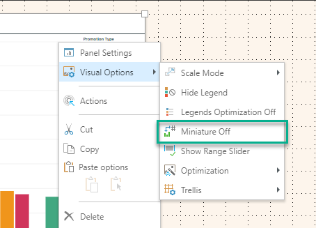
Miniature visuals
Miniature visuals may be created automatically when you scale a visual down to a size that makes it illegible. These tiles typically display the measure in the visual as a number and its name, providing a way to easily view and interpret the most important data at a glance. Miniature visuals are particularly useful when creating mobile presentations, where they allow you to fit more visuals into a smaller space.
- Click here to learn about Miniature visuals
Panels
Panels are the containers used to "frame" your visuals in Present and Publish. Depending on the style chosen, your panel may include a title, breadcrumbs, a border, shadowing, and so on. When viewed at runtime in Present, each panel also contains Panel Tools that are shown when hovering over the visual, regardless of whether or not panels are shown or hidden.
- Click here to learn about Panels
Graphic Text
Graphic text is shrunk and increased in size according to the size of its text box. When the text box is re-sized, the text contained within it is re-sized accordingly.
- Click here to learn about Graphic Text