The Discover Lite ribbon is dynamically updated according to the selected visualization.
Example Ribbons


Tip: Hover your cursor over an icon to view a tooltip describing the feature. See More (orange arrow above).
Function Descriptions
|
Function |
Icon |
Description |
|---|---|---|
|
|
Toggle this button to indicate whether you want to Auto Run the query whenever you edit your visual (default) or manually run the query only once you have made all your changes.
|
|
|
Bookmarks |
green arrow (above) |
Create Bookmarks to "remember" your favorite or frequently-used slicer selections. Apply bookmarks to reset all slicers to those bookmarked selections. |
|
Chart Grid Lines |
|
Show or hide grid lines. |
|
Chatbot |

|
Open the Chatbot from the overhead ribbon. This icon is only shown when Discover Lite has no bottom-right menu, for example, when you select Analyze Further from a runtime presentation. |
|
Common Scale |

|
Use the same scale for all trellised charts. For more information, see Common Scale. |
|
Data Labels Inside |

|
Display data labels inside the chart's segments. |
|
Data Labels Optimized |

|
Let Pyramid decide how to display data labels. |
|
Data Labels Outside |

|
Display data labels outside the chart's segments. |
|
Fill / Empty / Semi-Filled |
Change the opacity of data points when working with line and area charts. |
|
|
Forecasts |

|
Add best fit forecasting. |
|
Hide / Show Tooltips |
|
Show or hide tooltips that are used to expose detailed properties of member elements. |
|
Legend Position |
|
Change the position of legend on the canvas. For more details, see Legend Position (below). |
|
New Report |

|
Create a new visual (on a new Discover tab) with the currently selected data model. |
|
Pivot |

|
Auto-switch the positions of hierarchy or value chips in two drop zones, to pivot the visual in a way that could be more interesting or easier to consume. |
|
Blue arrow (above) |
Select one of the Quick Styles to apply a set of formatting and design options to your visual. Note that Quick Styles are style and formatting "presets" that are appropriate to your visual type. Applying a Quick Style allows you to change several aspects relating to the look-and-feel of your visuals with one click. |
|
|
Run Query |
|
Click to manually execute the query. Alternatively, click F2. |
|
Scale to Fit |
|
Use to scale large grids and trellised charts down to canvas size. |
|
Shared Y-Axis |

|
Use the same Y-Axis for all trellised charts. For more information, see Shared Y-Axis. |
|
Shared X-Axis |

|
Use the same X-Axis for all trellised charts. For more information, see Shared X-Axis. |
|
Show Empties |
|
Show empty rows and columns. |

|
Smart Insights use AI to analyze your query and return a natural language analysis. Depending on your selections, insights may represent a Summary overview of your visual or a Light, Advanced, or Categorical analysis. In Discover, you can also show visuals that illustrate the trends, forecasts, and so on that your analysis returns and explore those visuals in a pop-up. |
|
|
Themes |
Purple arrow (above) |
Select a theme to change the color scheme and styles used by your visual. |
|
Totals |
|
Add grand totals to a grid. Select the dropdown list to configure totals rows and/ or columns from the dialog. |
|
Workflows and Conversations |
|
Open the Workflows panel and either create a new conversation or view workflows and conversations that are relevant to the current visual. |
|
X-Axis |
|
Show or hide x-axis labels. |
|
Y-Axis |
|
Show or hide y-axis labels. |

 If you choose to disable Auto Run, you can manually run your queries by clicking the main Pyramid button, Run Query, in the top left-hand corner or by pressing F2 on your keyboard.
  When the query needs to be run, the "lightning bolt" alert appears.


Status Bar
The status bar options to the right of the ribbon allow you to: undo and redo actions, save, subscribe (for discoveries, tabulations, and publications), and share your discovery.
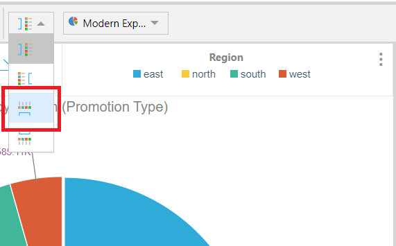
Legend Position
Change the position of legend on the canvas. The following example shows the legend positioned at the top (red) of a pie chart. Note that the legend is presented alongside a filter that is also positioned at the top of the canvas.