Regression functions allow users to compare two or more metrics across a range of items to see the relationship of one (dependent) metric against the other metrics. The Pyramid regression functions have been designed to calculate trend regressions using four 'linear' models using a the data points in the underlying query. While regressions are usually shown as lines in charts (often referred to as 'trend' lines), the function is materialized as a series of calculated values for each item in the data set that can be viewed in almost in visualization context - like any other measure.
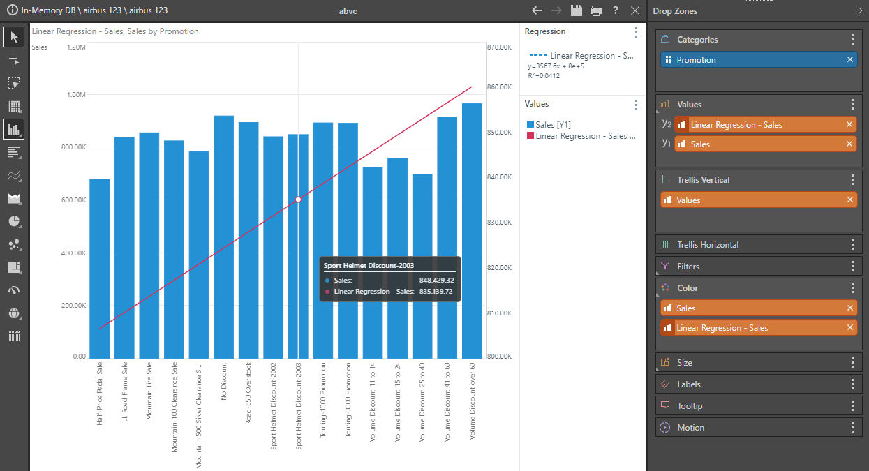
Note: Regression values added to a visualization are also reflected in the legend, which will show the trend's regression equation as well as its R-Squared value.
Types of Regression Functions
The logic used in regression analysis uses the following 4 linear regression models:
- LINEAR using the formulation

- POWER using the formulation

- EXPONENTIAL using the formulation

- LOGARITHMIC using the formulation
Where  is the slope of the trend line,
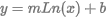
  is the intercept,
  is the independent variable and
  is the dependent variable.
Using the Regression Functions
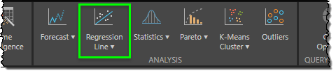
To use the Regression functions, simply click the Regression button from the Query ribbon.
Basic Regressions
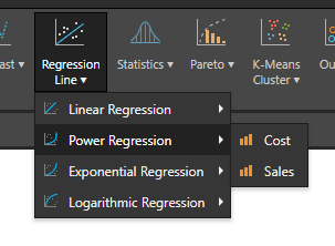
You are then prompted to pick one of the 4 regression models from the drop-down. Each of the values or measures in the current query are then presented in the fly out menu.
Select one of the value measures to generate a new value chip that builds a simple regression of that measure in the context of your query and auto-adds it to the drop zones for visualization.
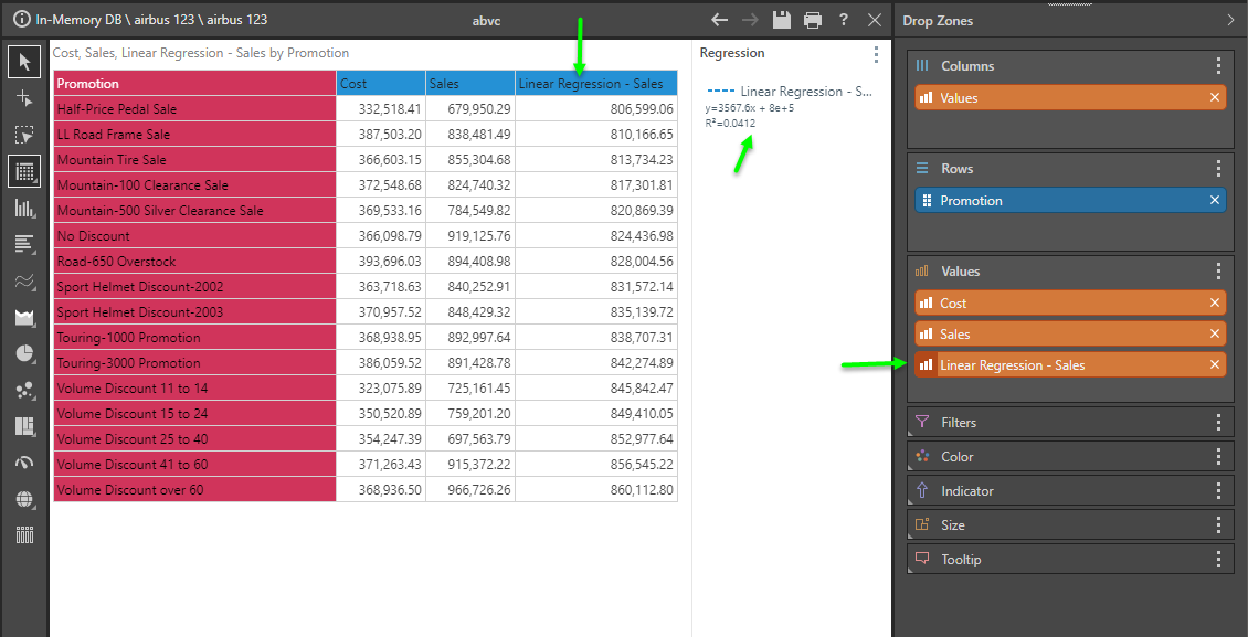
Once you have that chip, you are free to move it to any other drop zone like all other metrics in your data model. In the visual below, the visual has been changed to a bar chart to show actual sales, with the regression chip used in the secondary axis to drive a line chart - effectively showing a basic trend line for the given data set.
Multi-measure Regression
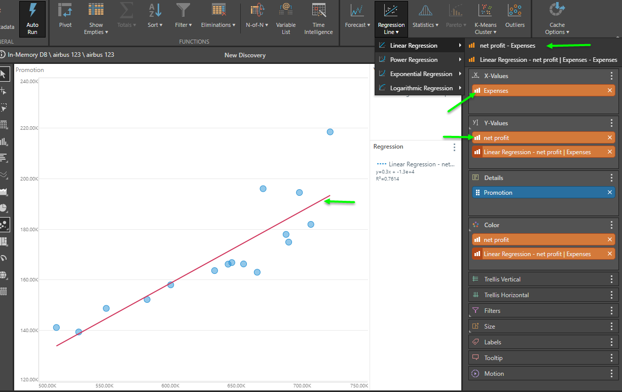
If the visualization is set to scatter or bubble and there are 2 measures drawn in the query (on the X and Y values axis), the tools will allow you to drive a dependent / independent variable regression (shown below). This can also be accomplished using the 'context menu driven regression' tools described below on any visual beyond scatter plots.
Removing Regression Values
To exclude regression logic from your query simply remove the orange value chip from the relevant drop zone.
Context Menu driven Regressions
Instead of using the ribbon regression tool, you can also use the context calculation menus to build regressions on one or more measures. Unlike the basic ribbon technique, the context menu option allows for regressions across two or more measures (dependent and independent variables) - offering more sophisticated logic. This is similar to the scatter plot option described above; except it will operate in any visual format.
- See here for more.
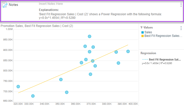
Explanations
Applying a regression calculation to the query auto-generates an explanation in the Notes tool. This explanation describes how the regression was calculated; it contains the calculation name, the regression function used, the formula used to draw the regression, the R² value, and an explanation of what the R² value is (how closely the data matches the regression).
To view the auto-generated explanation, enable Notes from the Design ribbon. The explanations can also be viewed downstream in presentations.
In the example below, the explanation describes how the best fit regression calculation was evaluated for the query: