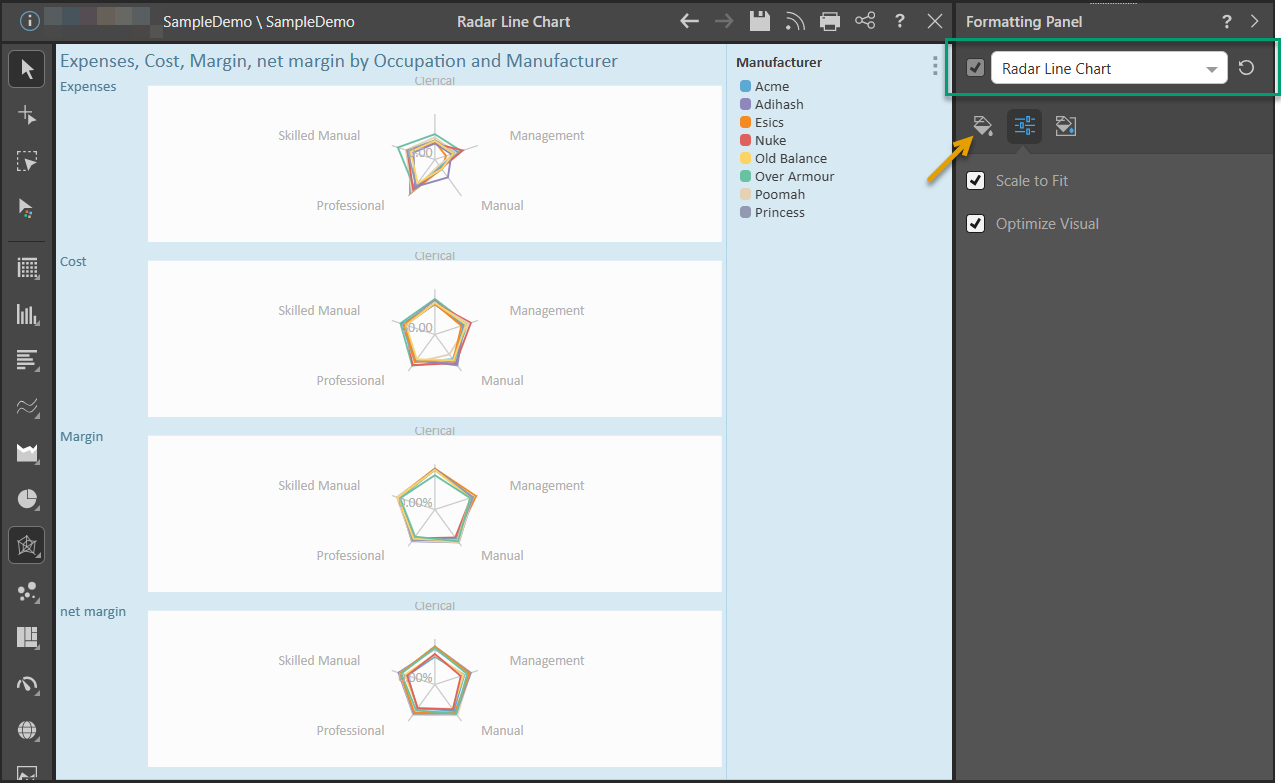
When the Radar Line Chart view of the Formatting panel is selected (green highlight below), you'll be able to change the background color and scale the visual down to fit the canvas.
- Click here for a full list of formatting functions available for radar charts.
Radar Line Chart Formatting
In this example, the trellised radar line chart was scaled to fit the canvas, and the background color was changed to blue:
Fill
- Background Color: Change the color of the Report Background using the Color Picker tool. This change does not affect the chart background.
Settings
- Scale to Fit: When trellised charts are too large to fit on the canvas, you can scale them down.
- Optimize Visual: The visual optimization engine in Pyramid is a heuristic that automatically redacts certain parts of a graphical visualization based on the amount of space provided.
Miniature
![]() Miniature Color 1, 2, and 3 set the text colors for miniature visuals, which appear automatically when a visual is scaled down due to legibility limits. These miniatures show measure values and labels for quick reading in limited space. Use the Color Picker to set the color for each miniature tile.
Miniature Color 1, 2, and 3 set the text colors for miniature visuals, which appear automatically when a visual is scaled down due to legibility limits. These miniatures show measure values and labels for quick reading in limited space. Use the Color Picker to set the color for each miniature tile.
Miniature visuals are created automatically when you scale a visual down to a size that makes its content illegible. These tiles typically display the measure as a number with its name underneath:
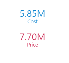
Note: The purpose of a miniature visual is to provide a way to easily view and interpret important data at a glance, even where there is a lot of information and limited space.