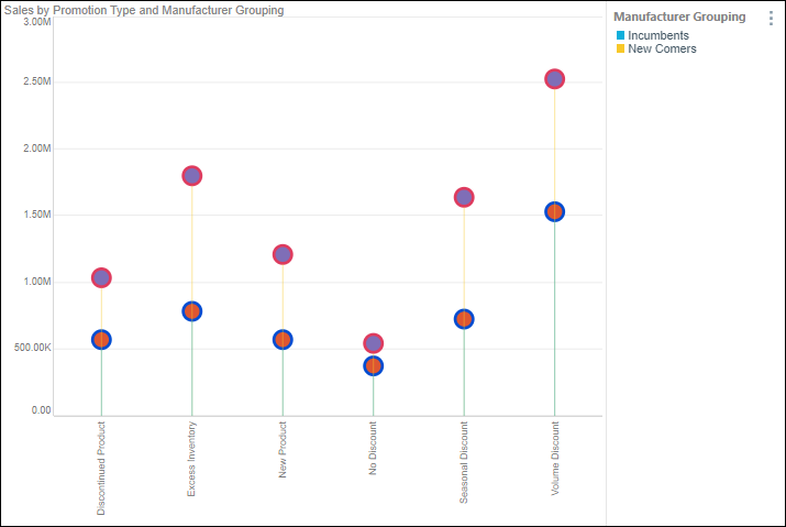
Data points are used in line, point, lollipop, area, stream, plotted, and radar charts to indicate where the x- and y-axis values intersect. Data points can be enabled or disabled but enabling them can make it easier to read the chart. Shapes, meanwhile, can be added to these charts by placing a hierarchy in the Shapes drop zone or by shapifying values.
Shape and Data Point Formatting
To adjust the formatting for shapes and data points, open the Formatting panel and choose Shapes from the dropdown list. Alternatively, enable the formatting selector and select a data point on the visual.
If your query has a hierarchy or measure in the Shapes drop zone, the visual will display several different shapes on the data points.
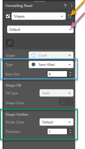
- To adjust the formatting for all shapes, select Default from the second dropdown list (purple arrow below).
- To adjust the formatting only for particular values, select the relevant Value Name from the same dropdown list or click the name of the line in the Legend.
Default Shapes
The Default settings apply to all shapes across a visual. When you select Default from the second dropdown list (purple arrow below):
- You cannot change the Shape or Shape Fill settings.
- You can change the Type and Base Size (blue) and Shape Outline (green) settings.
Important: When you click Reset (orange arrow), you return to the default formatting and lose all your changes.
Basic
- Shape: Disabled when Default is selected.
- Type: Choose the fill type for all data points.
- Base Size: Adjust the size of all data point shapes.
Tip: You can make the Legend reflect the same Type value as above (Fill, Semi-Filled, or Empty) by selecting the Shape Type Icons checkbox on the Legends formatting panel. Click here for more information.
Shape Fill
- Disabled when Default is selected.
Shape Outline
- Stroke Color: Set the color of the shapes / data point outlines. This can differ from the shape color.
- Data Point Color: By default, the shapes / data point outlines are same color as the data series as set from Color.
- Custom: Change the color of the shapes / data point outlines.
- Thickness: Change the thickness of the shape outline.
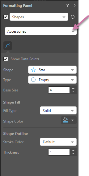
Particular Shapes (Override Defaults)
When a particular value is selected from the dropdown list (purple arrow below) all shape options are enabled. Changing the option changes the formatting for the selected shape, overriding the default.
Basic
- Select or clear the Show Data Points checkbox to show or hide the data points for the selected value. This option is useful if you want to highlight the data points associated with some, but not all, values.
- Shape: Choose the shape that you want to use for data points on this line.
- Type: Choose the fill type for the data points.
- Base Size: Adjust the size of the data point shapes.
Shape Fill
Set the fill color and type for shapes:
- Fill Type: Set the fill type (solid, pattern, or gradient).
- Shape Color: Set the shape fill color from the Color Picker. This can differ from the stroke color.
Shape Outline
- Stroke Color: Set the color of the shapes / data point outlines. This can differ from the shape color.
- Data Point Color: By default, the shapes / data point outlines are same color as the data series as set from Color.
- Custom: Change the color of the shapes / data point outlines.
- Thickness: Change the thickness of the shape outline.
Examples
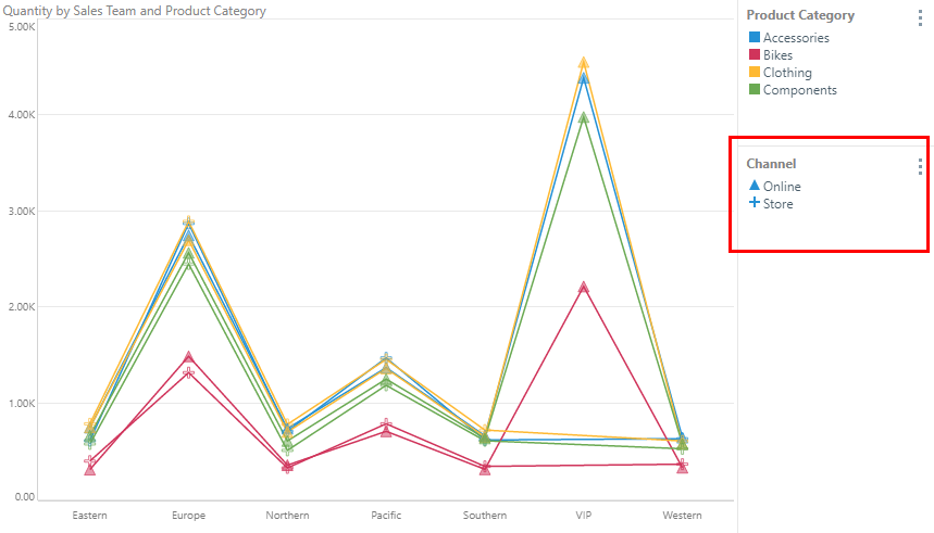
In this example, the elements in the Channel legend (red highlight below) show a triangle for online sales and a plus sign for sales "in store":
In this example, the shape fill and the shape outline are customized for both hierarchies in the visual: