Explain provides insights into the factors driving, or contributing to, a data point of interest from any analysis. Rather than manually drilling into the data, using intuition or educated guesses to choose dimensional elements to explore, Explain automatically determines the elements that contribute to the data point's value using a built-in AI engine that uses a machine learning technique called "partial decision tree segment analysis."
Note: This feature is available with an Enterprise license only.
Explain the Difference
While Explain provides insights into a single data point, Explain the difference aims to determine the factors behind a difference between two data points. For more information, see Explain the Difference.
Dominant Drivers vs Influencers
The Explain engine employs two complementary, but subtly different, techniques:
- Dominant Drivers: which automatically determines which categorical elements from all hierarchies in the data model account for most of value of the data point the user has chosen to analyze. This is based on summation.
- Influencers: which automatically determines which categorical elements from all hierarchies AND other metrics in the data model account for increasing the AVERAGE value of the data point the user has chosen to analyze. This is based on averages.
The best way to explain the difference between the two analyses is to explain it using a simple example.
Let's assume Boston Coffee sells 1m Cappuccinos a day for US$3.00 in the US and 200k Cappuccinos a day for GBP£3.00 in the UK (which is US$3.60). In analyzing total daily sales of Cappuccinos of US$3.72m, the dominant drivers would show that the US is the leading contributor to sales of US$3m. The average cup of a Cappuccino is actually US$3.10 (3,720,000 / 1,200,000), and the leading influencer of that value is the UK, which effectively sells each cup for 20% more in US dollars. Its impact factor is 1.16 (3.6/3.1), wile the US factor is 0.97 (3.0/3.1). Armed with both pieces of information, the CEO of the company might decide to encourage more sales in the UK, which looks more profitable, or might allocate more people to operations in the US, since it is larger. Both analyses offer different insights and need to be used in the right context.
- Click here for a detailed explanation and example of how the logic in Explain works and how to better understand the analysis presented.
The Data behind Explain
The Explain engine triggers a scan of the entire data model for the data point selected and uses every column and metric to drive the analysis. Given that some data sources can be extremely large and/or the underlying technologies may be somewhat slow, this step can take anywhere from a second to almost a minute to execute. The underlying query is also limited to 4 million cells (rows x columns). In the event the selection data point represents a larger payload, the query engine will automatically truncate the results.
How to Use Explain
To launch the Explain tools, you simply need to:
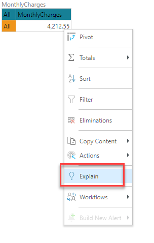
- Right-click a single data point in a visual and choose Explain from the context menu.
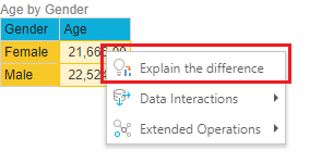
- Select two data points, right-click either of those points, and choose Explain the difference from the context menu.
This triggers the underlying query engine to retrieve all the details for the selected data points across the ENTIRE data model and present those details to the Explain machine learning engine for automated analysis.
Note: The Explain options are only available for base measures that represent sums, counts, or averages. Explain options are, therefore, not available on the context menu when you select semi additive or cumulative measures, or measures based on custom calculations.
Note: Explain does not operate on MDX-based datasources like MS OLAP, Tabular, and SAP BW.
- You can also trigger the explain engine from the Chatbot by typing in a natural language question. For more details, see NLQ: Advanced Intelligence.
Simplified Explanations
When the processing is complete, a simplified explanation of the results is displayed in two separate tabs:
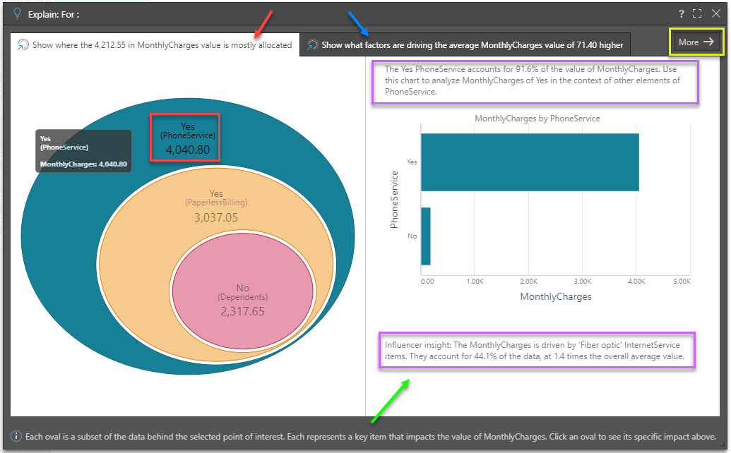
Tab 1
Tab 1 (red arrow above) shows where the value of the data point is mostly allocated across other categorical items from other hierarchies. This is the Dominant Drivers analysis - and is akin to a dice into every other hierarchy looking for the items that most represent the size of the value.
The "eye ball" diagram shows the items that MOST explain where the values in the data point are categorically allocated - starting with the highest values (in the biggest oval), then the next biggest item in the context of that previous item and so on (i.e. subsets of the previous item). The labels highlight hierarchical member elements, the hierarchy itself and the value attributed or allocated to it (red box above). The amount is, by definition, a subset of the previous parent node or data point (red box above).
Click on any oval in the eye ball to trigger a "context analysis" on the right (green arrow above) showing the hierarchy's other members, for that selected data point. This can be very useful when trying to see other impacting elements and more context to the analysis.
Further, AI-generated explanatory text insights are provided in the context analysis to better explain the item and its impact on the data point (purple boxes above).
Tab 2
Tab 2 (blue arrow above) shows what factors are pushing the average value of the data point higher, based on other categorical items from other hierarchies AND other metrics in the data set. This is the Influencers analysis.
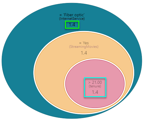
The "eye ball" diagram shows the items that MOST explain why the value of the data point is high, using either categorical items or other metrics. However, it uses average values in determining the impact, rather than simple summation. It starts with the highest impact item (biggest oval) and then the next biggest item in the context of that previous item and so on (i.e. subsets of the previous item). The labels highlight either: hierarchical member elements and the hierarchy itself, or the metric and its trim point (teal box below). Importantly the impact factor of the item on the data point we are analyzing is shown (green box below). "1.4" means this item's average value is 40% higher than the selection - thus driving it upwards.
- Factors over 1.0 contribute to increasing average values.
- Factors below 1.0 contribute to decreasing average values.
As with the first tab, clicking on any oval in the eye ball will trigger a "context analysis" on the right showing more details around the hierarchy's other items. If the impact is driven by a metric, the context analysis will show scatter plots comparing the metric to other metrics in the analysis. Again, AI-generated explanatory text insights are provided to better explain the item and its impact on the data point.
Advanced Explanations
Click the "more" button (yellow box above) in the top right hand corner to expose the more advanced Explain analysis - complete with the full tree of nodes that explain the data point's value.
The Advanced explanation interface is broken into the Dominant Driver and Influencer tabs like the simplified interface. However, the eye-ball visualizations are replaced with trees that show all the nodes that produced the analysis (not just the top branch). This allows users to learn more from the analyses, showing second, third and fourth order explanations for values.
Click on a node to expose a larger set of contextual reports and written explanations for each selected node, again providing a more in-depth analysis:

Advanced Options and Settings
Clicking on the settings button at the top of the advanced interface (red circle above), users can change the settings driving the logic of the partial decision tree segment analysis engine:
- Branches - determines the number of branches to produce per parent node
- Levels - determines the number of levels or depth of each branch
- Branch Threshold - determines how many rows from the underlying data set should be used in determining a node result. A low value makes the engine sensitive to small changes. A high value means only changes backed by many rows int eh data set are included.
- Sensitivity - determines the sensitivity to resulting values and whether they should be included in the results or not.
- Objective - sets if the logic is focused on understanding why numbers are HIGH or why numbers are LOW.
The Tree Visualization
The tree visualization exposes all the nodes in the results for both types of analytical approaches. However, the tree differs subtly between each type. In both trees, clicking the plus sign next to a node will expose further nodes. The expand all button will open all nodes in a single click (blue circle above).
Dominant Drivers
- Each node in the tree presents the largest contributor to the value of the previous node of the same branch. Secondary nodes within the same level (or more if requested), represent the second largest contributor. Importantly the values within a level are mutually exclusive - this means they will not add up to the total. Rather they show how much of the parent node is explained by the category.
- The contributing value of each node is shown above the bar graphic, and the height of the bar represents the node as a percentage of its parent node's value.
- The contributing categorical element and its hierarchy (or column) are shown below the bar.
- The tooltip will expose each node's values. Importantly it shows the percent of the total value for the master data point as well the number of rows from the underlying data set that are included in the node's value.
Influencers
- Each node in the tree presents the largest impacting factors to the AVERAGE value of the previous node of the same branch. Secondary nodes within the same level (or more if requested), represent the second largest factor. Importantly the values within a level are mutually exclusive - this means they will not add up to a total impacting factor.
- The impact factor of each node is shown above the bar graphic, and the height of the bar represents the number of rows supporting the node compared to the total.
- The impacting categorical element and its hierarchy (or column) OR impacting metric and the relevant trim points for that metric are shown below the bar. Directional signs are also included for metrics. It's possible to see the same metric multiple times in the same branch.
- The tooltip will expose each node's average value and impact factor.
Changing Views
Use the menu buttons at the top of the interface (green box above) to change the view to vertical from horizontal (and vice versa). This can be helpful when trying to analyze different parts of the tree. The reset button, zoom tool, and the mouse wheel also make the use of larger trees easier.