Pyramid's responsive presentation design ensures that presentations are always loaded in the format appropriate for the device used to access them. Whether or not a presentation has been optimized for the current device type, it will automatically be opened in the format that is appropriate for the current device.
For example, a presentation that was built and optimized for tablets will be loaded with the desktop layout if it's opened on the desktop; a presentation built for desktops will automatically open with the mobile layout when accessed from the mobile phone app.
It is recommended that you optimize your presentations for all of your required device types, to ensure that the content placement and visibility is suited to the device type. Defining each device type will also ensure that any dynamic assets in the presentation will be visible when the presentation is opened at runtime in the mobile app.
Device types
The supported "device types" are:
- Desktop: The presentation design that is optimized for desktop viewing.
- Tablet: The presentation design that is optimized for tablet viewing. Selecting this option ensures the slide size is optimized for tablet use. For more information, see Tablet Presentations in Present Pro.
- Mobile: The presentation design that is optimized for mobile viewing. Selecting this option enables miniature visuals, text, buttons, and dynamic assets (dynamic images, dynamic text, dynamic URLs, and dynamic jump actions). For more information, see Mobile Presentations in Present Pro.
Choosing your device type
There are two mechanisms for selecting the device types for your presentation:
- When you create a new presentation, you can choose the main device type in the New Presentation wizard.
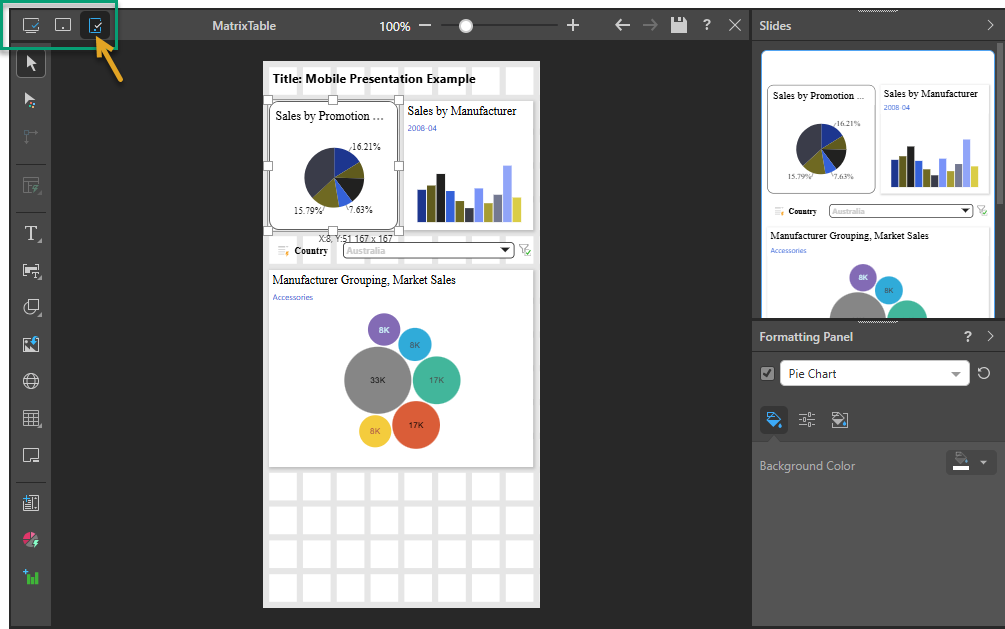
- When you edit an existing presentation in Present Pro, you can select the device type icons above the canvas (green highlight below) to switch between the presentation designs for each of the possible device types. The first time you select a new device type, you will be prompted to optionally "convert" the content for the existing device type into the new device type layout (see below for more details).
Multiple Device Types
If your users might be accessing this presentation from one or more device types (their desktop and their mobile, for example), you should optimize a single presentation for each of those device types. This ensures their view of the presentation contains the most appropriate content and layout for their device type. Whenever the presentation is accessed, it will automatically open with the layout of the device type being used.
To create a presentation that is optimized for multiple device types:
- Create your presentation using the New Presentation wizard, choosing the main device type (orange arrow below):
- Click the icon representing your next device type (green highlight above).
- If you want to copy the main content items into the new layout, select the device type you want to copy from and click Convert. The new layout is created, and the relevant content (depending on the target device type) is copied into it.
- Otherwise, click Don't Convert. In this case, the new layout is still created and opened in the editor, but without any copied content.
- Repeat step 2 if you want to create another layout for a different device type.
- Save the presentation as usual.

Once the presentation is created, add the content items and format the presentation for your main device type as needed.
Tip: It is a good idea to create your entire presentation with one device type and then create your next device type layout afterward. This is because the content from the first device type is copied to the second device type on creation, but the two layouts do not have an ongoing relationship between them.
If there is already an optimized layout for the selected device type, it opens in the editor. (The tick against the device types indicates the device types that currently have layouts.)
If there is not, the Convert Layout dialog opens:
Rearrange the content to fit the optimized canvas for your selected device type.
Your presentation now contains two (or more) layouts, one for each of the device types you have defined. The different layouts have different formatting and incorporate different converted content. For more information, see one of the Optimizing presentations sections below.
Important: Although the content is copied from one device type layout to another on creation (if you select "convert"), any changes made in one layout will not affect the others.
Optimizing presentations for Mobiles
The Mobile device type layout is shown when you view a presentation on your phone. This layout can include text, buttons, and dynamic assets.
- Click here for more information about optimizing presentations for Mobile
Optimizing presentations for Tablets
The Tablet device type layout is shown when you view a presentation on your tablet.
- Click here for more information about optimizing presentations for Tablets