Mini-Tabs use a "tabbed" container to display visuals or other assets in your publication. Although the container features tabs, the tabs cannot be used by the reader to change what they see in their built publication (unlike in presentations); they are instead used by the document designer to either manually select what should be shown in that space on build, or to automatically select a particular option based on slicer selection at build time.
This topic describes how to add Mini-Tabs to your publication, add visuals and other content to the different tabs, and manually select the tab that you want to include in your publication on build. If you want to select different tabs based on different (conditional) slicer selections, you will need to create your tabs as described here and then set up a Jump to Tab Action to conditionally select the appropriate tabs.
- Click here to learn about Conditional Display for Mini-Tabs
Note: This feature is not available in the Community Edition.
Adding Mini-Tabs to a Page
Before you begin
You need to open the page in the publication where you want to add your Mini-Tab container.
Step 1: Add your Mini-Tab Container
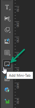
From the Toolbox:
- Click Add Mini-Tab:
- To add your Mini-Tab container to the canvas, do one of the following:
- Click the canvas to draw a default sized container to the canvas.
- Click the canvas and drag your cursor to indicate how large the container should be on creation.
The page is highlighted in blue to indicate that you need to drop your Mini-Tab onto the canvas.
Tip: You can change the container's size and position at any time by selecting it and using its handles to move it, re-size it, re-align it, and so on. For more details, see Publish Pro Canvas.
The Mini-Tab container is added to the canvas. By default, it contains two tabs and no content.
Step 2: Add Content to Mini-Tabs
You can add any asset (visuals, images, shapes, and so on) to your tabs. They can either be added from the Content panel or can be created here and dragged onto the tab from the canvas. In all cases, you need to add the asset to the canvas and then drag it onto the required tab.
- Optionally, select or create a tab to add your asset to:
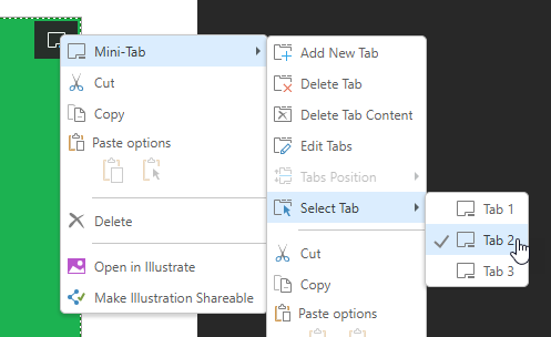
- Right-click Mini-Tab > Select Tab > <tab name> to move to a different tab.
- Right-click Mini-Tab > Add New Tab to create a new tab and move to it.
- Drag and drop your selected asset from the canvas onto the tab.
For more information about the Mini-Tabs context menus, see Editing Mini-Tabs Layout.
The asset is added to the tab and re-sized to fill the available space.
Step 3: Select the Default Tab
When you select the default tab in your publication, you are indicating which tab should be shown by default in the built document. This will be seen in all documents, unless a condition is set up to select a different tab:
- Right-click Mini-Tab > Select Tab > <tab name> to select the tab that you want to be visible by default in a built publication.
What next?
It is not typically the case that you want to create a tabbed container and then manually change your selections before you build your publication. Typically, you will want to change the tab that is selected at build time "conditionally," using a Slicer Action. For more details, see Conditional Display for Mini-Tabs in Publish Pro.
Editing Mini-Tabs Layout
Right-click the Mini-Tab container to open the Mini-Tab submenu:
 .
.
|
Function |
Description |
|---|---|
|
Add New Tab |
By default, the mini-tab container has two tabs. Click this option to add another tab. Note that, by default, the new tab is added after any existing tabs. You will need to Edit the tabs to change its position. |
|
Delete Tab |
Delete the currently selected tab. |
|
Delete Tab Content |
Delete the content item in the currently selected tab. |
|
Edit Tabs |
Open the Edit Tabs panel and edit the settings for the mini-tab container. You can use this panel to change the name of the mini-tab container, add, remove, and move tabs, and change the tab name. |
|
Tabs Position |
Disabled in Publish Pro. |
|
Select Tab |
Indicate which tab to select at build time by default. |
Edit Tabs panel
Open the Edit Tabs panel to edit the settings for the mini-tab container:
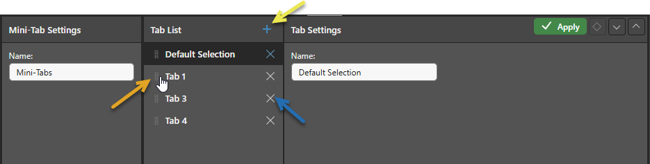
Mini-Tab Settings
- Name: Change the name of the mini-tab container.
Tab List
Add and remove tabs, and change the order of the tabs as they are displayed in the container:
- Handle: Orange arrow. Grab the handle to the left of the Tab name and drag and drop it into its new position.
- Add: Yellow arrow. Create a new Tab.
- Delete: Blue arrow. Delete an existing Tab.
Tab Settings
- Name: Change the name of the selected tab.
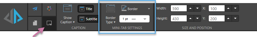
Formatting your Mini-Tab Container
Select the Mini-Tab container and use the formatting options on the Component ribbon to improve its look and feel:
Caption
Manage the design for the panel containing your Mini-Tab container, including its title and subtitle. For more information, see Content Captions in Publish Pro.
Mini-Tab Settings
Update the formatting options that are specific to the mini-tab (blue highlight):
- Border Type: Set the border for the Mini-Tab container. Options are:
- Full Box: Display a border around the entire container.
- Line Only: Only show a line at the bottom of the container.
- None: Disable the border.
- Border: Set the border color using the Color Picker.
- Border Thickness: Adjust the width of the line used for the border.
Size and Position
Change the size and position of the selected item:
- Adjust the item size using Width and Height.
- Adjust the item position using X and Y.
Tip: The X and Y coordinates and width and height are displayed underneath each content item when it is selected on the canvas.
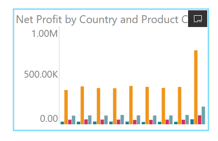
 Example: Formatted Mini-Tab Container
A Full Box border is selected, made blue, and widened:
The border is disabled (None):