The Values drop zone drives the quantitative data in the query. As such, it is arguably the most important drop zone, since almost every visualization needs values or metrics to show useful results.
The Values drop zone is where values (measures) are added to the query. The behavior of the Values drop zone differs according to the visualization type selected; this includes different secondary menu options that drive the handling of the measure chips in the context of the relevant visualization.
Adding and Using Values
Grids
When working with grids, the Values drop zone works in conjunction with the Columns and Rows zones.
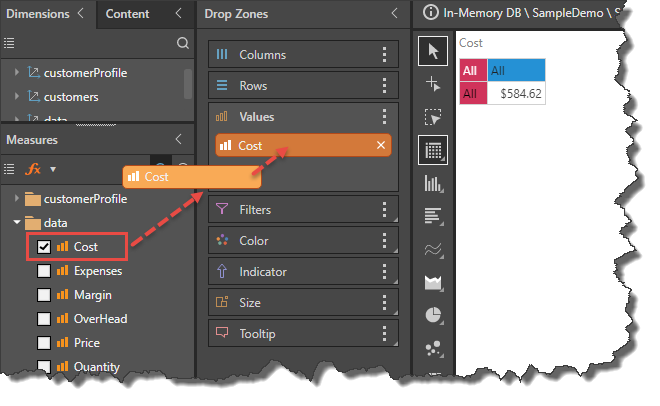
A measure may be added to the Values zone by:
- Dragging and dropping it into the Values zone.
- Selecting its checkbox.
- Double-clicking on the measure.
- Right-clicking on the measure and selecting Add To > Add To Values from the context menu (see image below).
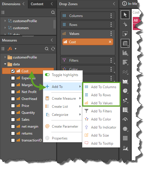
Values Chip
An orange Values chip is automatically generated when a measure is added to Columns or Rows, or when more than one measure is added to the query. The Measure chips remain in the Values drop zone, while the Values chip can be placed wherever required. The placement of Values chip in the drop zones then drives the location of the measures in the visualization.
Multiple Measure Handling
When working with grids, if more than one measure is added to the query, a Values chip is initially generated and added to the Columns drop zone. The Values chip determines the location of the measures in the grid.
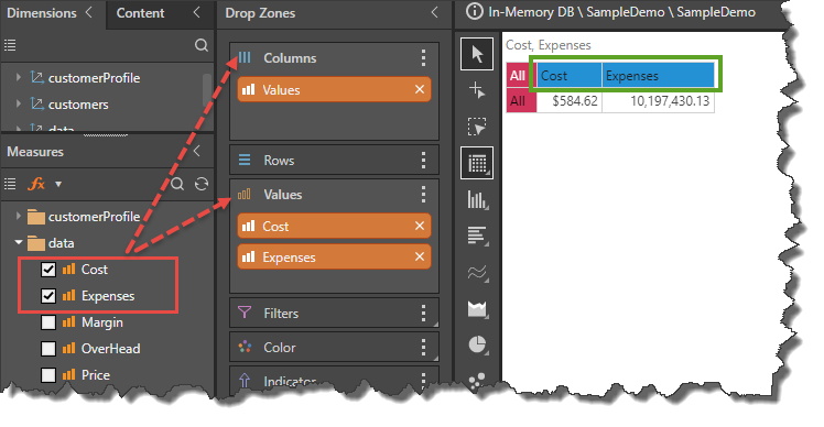
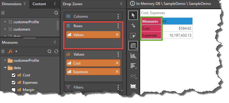
The Values chip can then be moved to another drop zone (such as Rows) to position the multiple measures differently within the visualization. In this example, the Values chip was moved from Columns (image above) to Rows (image below):
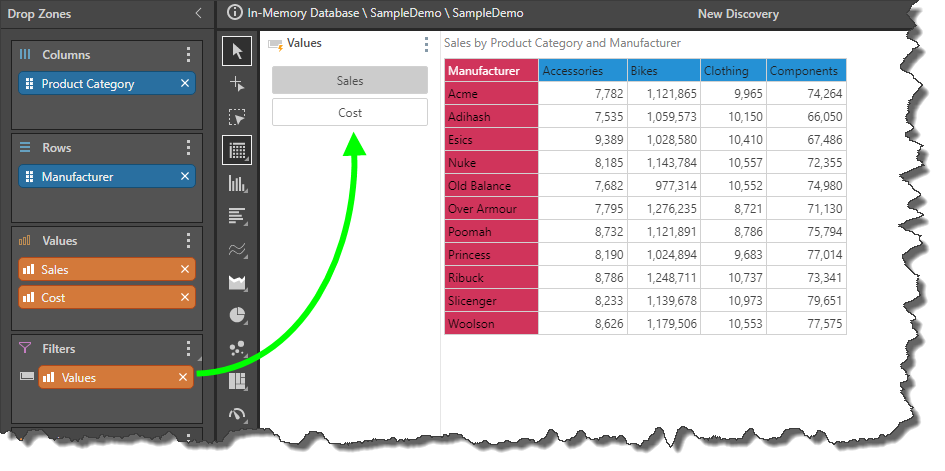
The Values chip can also be moved to the Filters drop zone to generate a measure slicer that you can use to select the required measure. This doesn't show a classic "slice" (or data filter) of the data model; instead it switches out the measure being used in the visualization.
Single Metric Charts
When working with most charts at least one measure must be added to the Values drop zone. For other chart visualizations (like scatter and map charts), two or more measures may be needed.
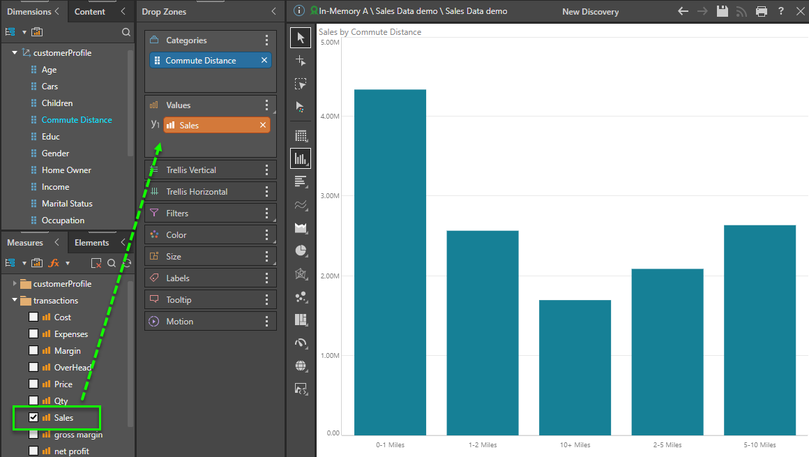
In the example below, the measure drives the column chart's values and is effectively shown in the height of the columns and the chart's y-axis. Depending on the chart type, the measure graphically drives the size, height, angle or length of the chart's data points.
Values Chip
If the measure chip is moved to one of the Trellis drop zones, or to the Filters drop zone, a Values chip is automatically generated. By default, the Values chip is also generated if more than one measure is added to the Values drop zone (where the base chart visual only needs one measure). If the second (and subsequent) measure chips are instead added as "primary axis" or "secondary axis" chips, the Values chip is not generated. (See below for more on Multi-Measure Handling). The given measures will remain in the Values drop zone, while the Values chip can be placed wherever required. The placement of the Values chip drives the location of the measures in the chart.
Multi-Measure Handling
When a chart contains multiple measures, you can use several display options to present them effectively. There are four different effects: Standard Trellising (default), Primary Axis, Secondary Axis and Differentiated Trellising. The last three are mainly relevant to Cartesian charts, such as column, bar, line, area, and point charts.
Standard Trellising
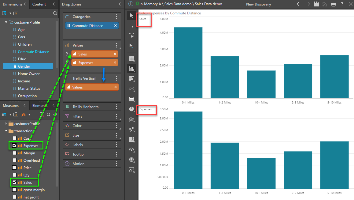
By default, if more than one measure is added to the Values drop zone, the Values chip is generated and added to the Trellis Vertical drop zone, resulting in multiple plotted charts. In the example below, two column charts are created for Cost and Expenses, with the charts being vertically trellised (so the Values chip is placed in the Vertical Trellis drop zone).
Tip: You can move the Values chip to Trellis Horizontal or Filters to change the effect and report.
Primary Axis - Multi-Measures
When working with Cartesian and Segment charts, it's possible to create multi-measure charts that use the SAME y-axis. This includes standard charts, stacked charts, or multi-measure segment charts.
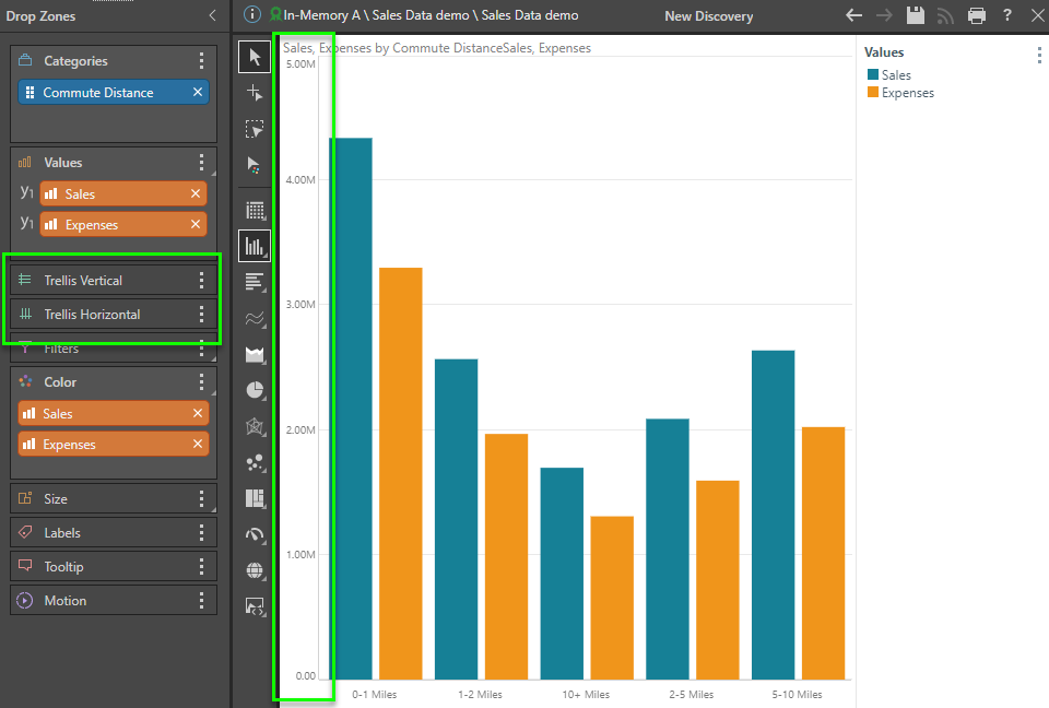
In the example below, the Expenses measure is dragged to the Value drop zone and then using the Primary Axis secondary menu.
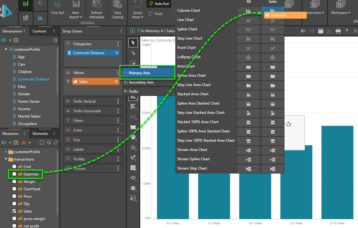
In this scenario, the resulting chart (below) shows both metric values shown in the same plot area, sharing the same common y-axis. Note there is no Value chip and no trellising. The measures are also auto-colorized so each one has its own distinct color.
 More multi-measure examples
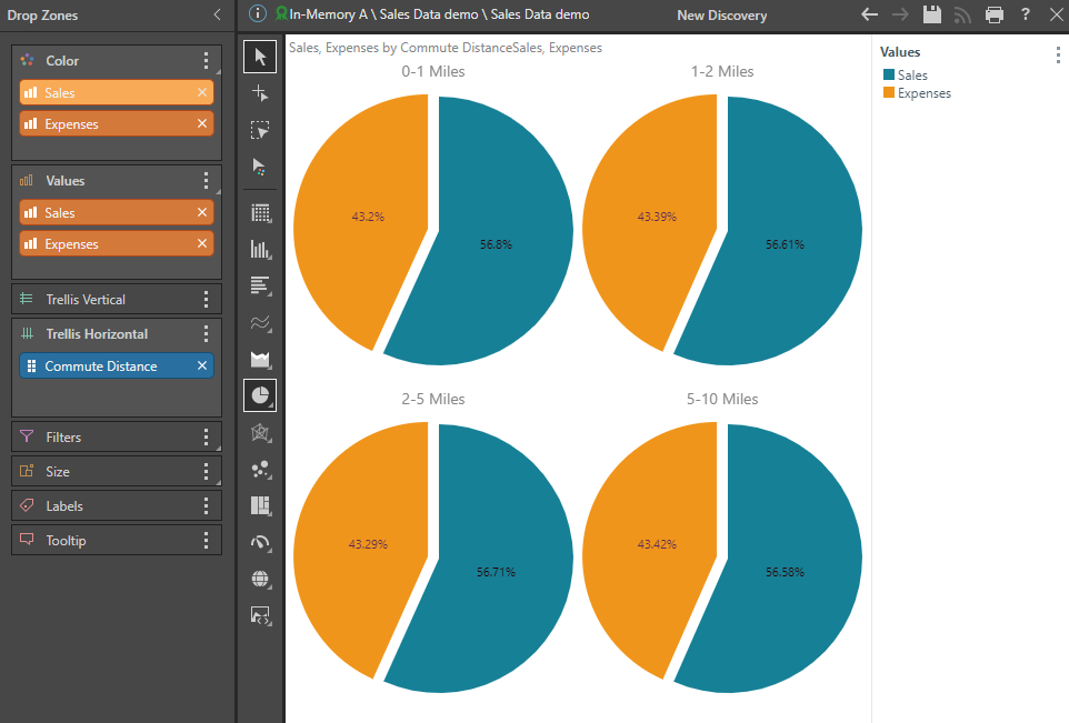
Below are other examples of using the primary-axis approach, with stacked measure charts, and multi-measure segment (pie) charts.
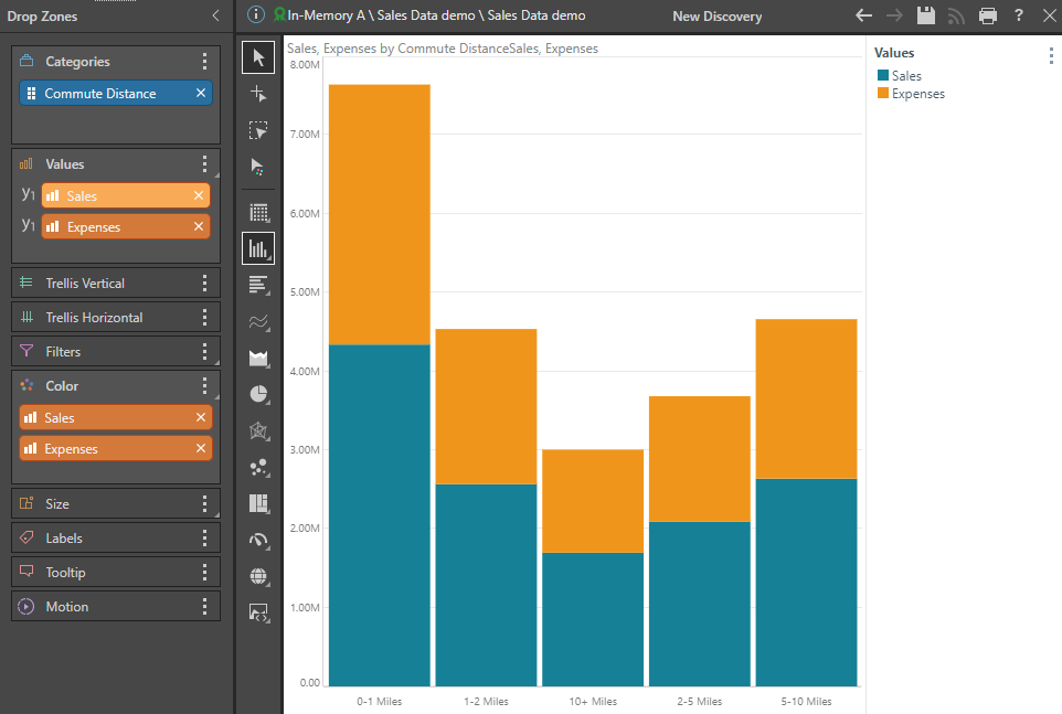
- Click here for more on stacked measure charts
- Click here for multi-measure segment charts
Secondary Axis - Combo Charts
When working with Cartesian charts, it's possible to create multi-measure charts that use the different y-axes in the same plot area. Generally referred to as Combo Charts, one measure is typically plotted on the primary y-axis (on the left), and the second measure is plotted on the secondary y-axis on the right. They are also typically different chart types (but do not have to be).
In the example below, the Margin measure is dragged to the Values drop zone and then, using the Secondary Axis submenu, created as a Spline on the existing Sales chart:
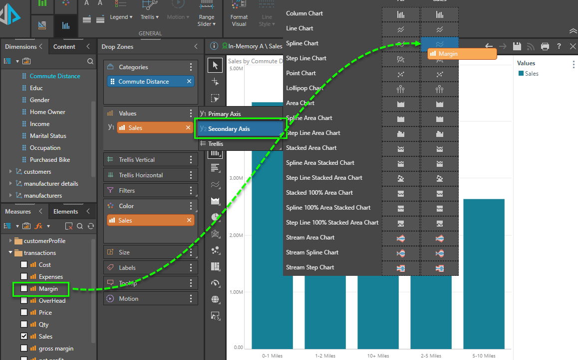
In this scenario, the resulting chart (below) shows both metric values in the same plot area, using two different y-axes. Note: There is no Value chip and no trellising. The measures are also auto-colorized so each one has its own distinct color.
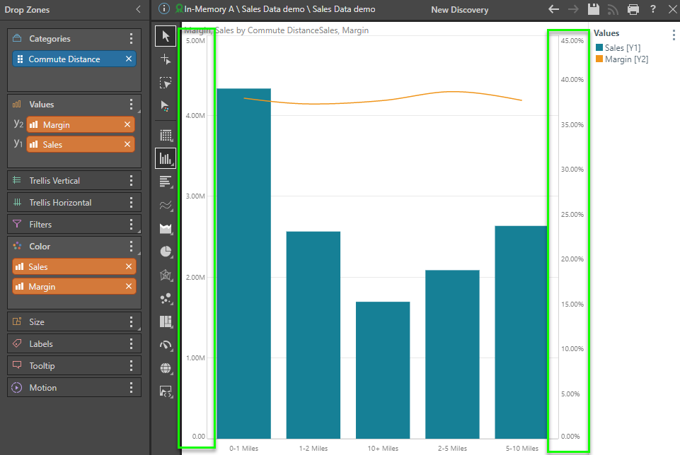
- Click here for more on combo charts
Differentiated Trellising
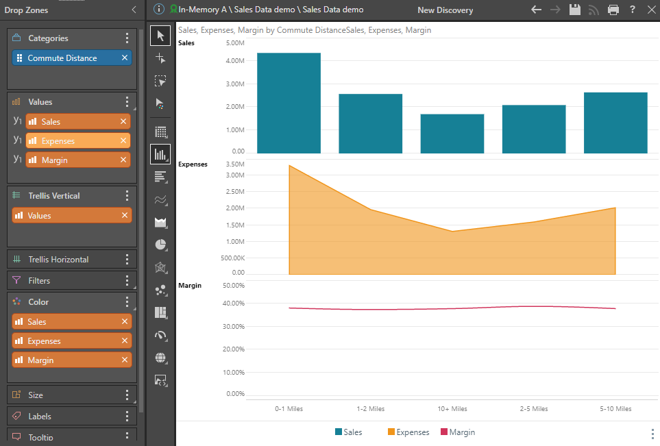
When working with Cartesian charts, you can create multi-measure charts with separate plot areas, y-axes, and chart styles. These are generally known as differentiated trellised charts. They are like standard trellised charts, but each plotted chart can have its own chart type.
In the example below, the Expenses (then Margin) metrics are dragged to the Value drop zone and then using the Trellis secondary menu. The measures are also auto-colorized so each one has its own distinct color.
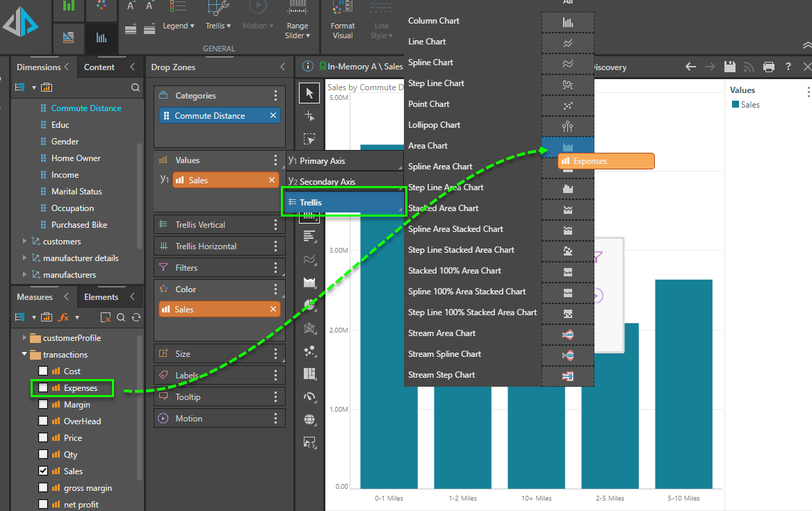
In this scenario, the resulting chart (below) shows all three metric values with their own plot areas, using three different and independent y-axes and three different chart types (column, area, and spline). Note there is a Value chip in trellising.
Multi-Metric Charts
Multi-metric charts are charts that require a minimum of two or more measures. Unlike single metric charts, that require a minimum of a single measure and can then have additive metrics added to create variations (as described above), multi-metric charts are dysfunctional without the extra measures. The processes described above for single charts apply to multi-metric charts as well, but there are subtle differences.
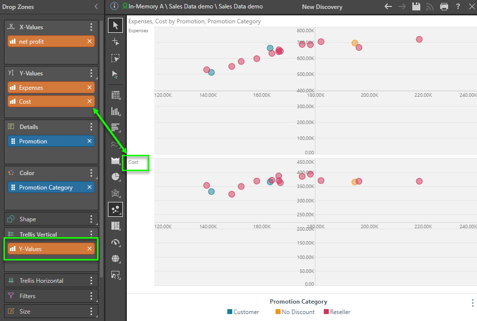
In the example below, the scatter plot requires a measure in each of the X-Values and Y-Values drop zones to be operational.
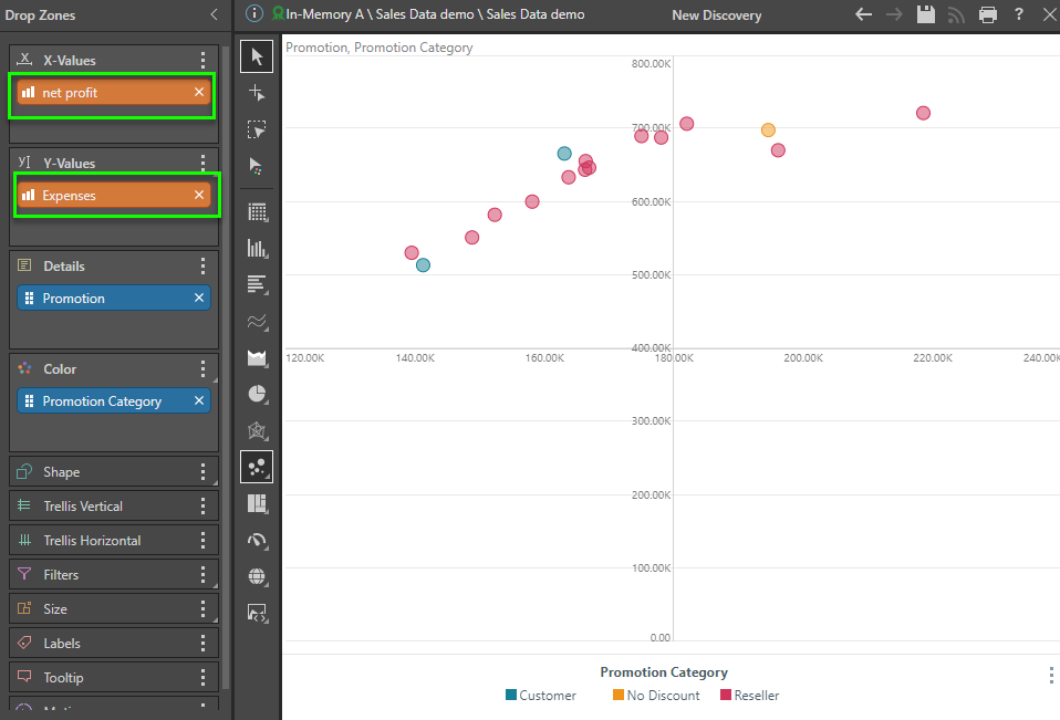
Adding another measure to the y-axis, creates the standard trellising effect described above. as can be seen in the chart below. Here, two different scatter charts are drawn, with their own pot areas - one for net profit and expenses; and another for net profit and cost.
Related information
Colorizing Values
Usually, when using multiple measures in charts (and sometimes in grids), the different metrics need to be "colorized" into different colors. This concept is an extension to the above concepts where a user might use multiple measures in the same plot area and they need to delineate the graphic with colors. The Colorize option on the Values context menu automatically sets each measure with its own color.
- Click here for more about Colorizing Values
Shapifying Values
The same may apply to "shapes" or the icons of data points used in charts such as Line, Point, Lollipop, Area, Stream, and Plotted charts. The Shapify option on the Values context menu automatically sets each measure its own data point shape.
- Click here for more about Shapifying Values