Pyramid's Cartesian charts display the given data as column or bar charts, according to the specific chart-type selected by the user. There are several Cartesian charts to choose from:
- Column Chart
- Stacked Column Chart
- Stacked 100 Column Chart
- Marimekko Chart
- Bar Chart
- Stacked Bar Chart
- Stacked 100 Bar Chart
- Tornado Chart
- Stacked Measure Charts
- Combo Chart
- Line Chart
- Point Chart
- Lollipop Chart
- Area Chart
- Stream Chart
Building Cartesian Charts
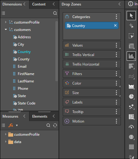
A simple column or bar chart requires at least one hierarchy, either in the Categories drop zone or the Color zone, and one measure. Stacked bar and column charts require either two hierarchies, one in Categories and one in Color, and one measure, or a single hierarchy in Categories and multiple measures in Values and Color (this results in a stacked measure chart).
A Marimekko chart requires two hierarchies (one in Categories and one in Color) and two measures (one in Values and one in Size).
Begin Building a Cartesian Chart
The steps below explain how to begin building a Cartesian chart; for further details, refer to the required visualization type as listed above.
Step 1: Add your initial hierarchy
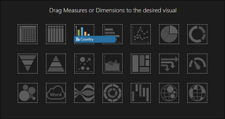
Start by dragging the required member hierarchy to the column or car icon on the canvas of a new query.
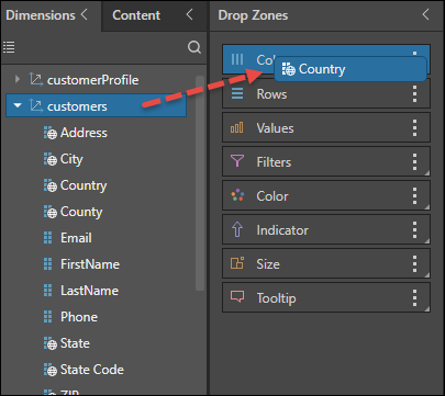
Alternatively, drag the required hierarchy to the Columns or Color drop zone.
Step 2: Choose the Cartesian Type
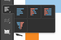
Then choose the required Cartesian; for a column chart, you can click the Column Chart icon in the Toolbox, or right-click to open the submenu and select a different type of column chart.
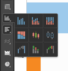
Tip: Hover over the items in the submenu to see the name of the visualization type.
Alternatively, select a Bar Chart type:
In response to this selection, the drop zones are updated to reflect the given visualization.