A Combo Chart is a visualization with two or more measures within the same plot area. These charts are different from multi-metric charts (such as a scatter plot), where data is plotted on the x-axis, the y-axis, and the z-axis (when appropriate), each having different data points and values.
Combo charts are useful when you need to plot two or more disparate measures from the same query in the same plot area. Each value can be displayed as a different chart type on its own y-axis with its own scale. It is one of the various techniques of manipulating the values in a visualization to produce different effects.
- To learn how to display multiple measures on the same axis (primary axis), click here.
Example Combo Charts
Chart Types
You can create a combo chart when working with the following visualizations:
Compare Measures
You can use this method to compare measures for a given hierarchy; for example, Sales and Returns by Manufacturer:
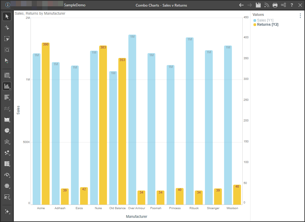
Note: Sales is displayed on the primary y-axis (Y1), while Returns is displayed on the secondary y-axis (Y2). In left-to-right layouts, the primary y-axis is on the left of the chart and the secondary y-axis is on the right.
Multiple Measures and Hierarchies
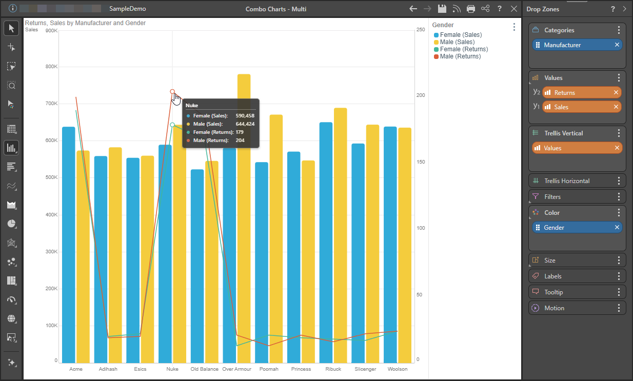
This method can also be used to compare multiple measures for multiple hierarchies; for example, Returns and Sales by Manufacturer and Gender:
Trellised Charts
The charts can also be trellised by adding a second member hierarchy to a trellis zone to create multi-combo charts; for example, Returns and Sales by Manufacturer and Promotion Type.
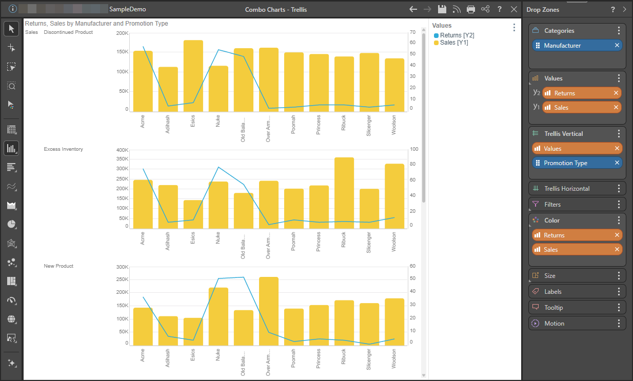
Chart Order
When adding a primary axis, its corresponding chart is moved to the back (it appears "behind" the existing chart). You can change the order of the chips within the Values zone to reorder the layers of the chart. For example, if the measure on the secondary axis is represented as a line chart (as above), placing its chip to the top of the Values zone places the line chart in front of the column chart.
Adding Multiple Measures to a Chart
When adding multiple measures to a chart, the chart will automatically be trellised into multiple charts.
Cartesian Charts
To display multiple measures in a single chart:
- Drag a second measure to the Values zone.
- Hovering over the drop zone header opens the secondary menu, which displays two options:
- Primary axis: These measures will be added to the same, default, y-axis (y1) in a single chart.
- Secondary axis: These measures will be added to a secondary y-axis (y2). This axis is typically on the right-hand side of the chart.
- Drop the measure onto the zone representing the required Chart Type and Axis (see Multiple Values for Trellised Charts for more information).

Scatter and Bubble Charts
Follow the same steps as those listed above for Cartesian charts, but at Step 1, add the additional measures to the Y-Values drop zone:
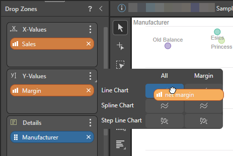
In the following example, a measure is added to the Y-Values zone to create the following Combo Chart:
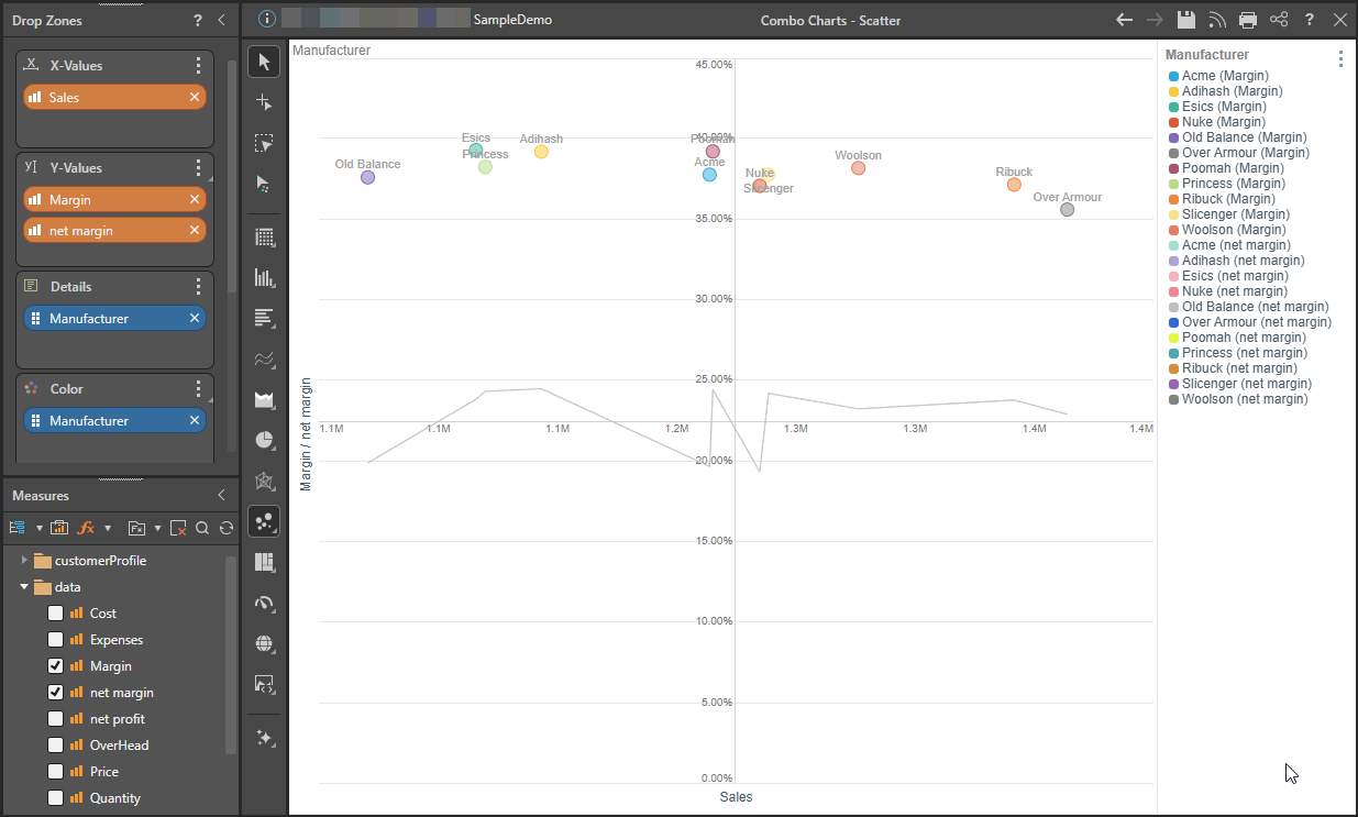
Multiple Values for Trellised Charts
When adding a primary or secondary axis, the secondary menu displays multiple columns; the first is labeled All and the rest are labeled according to the existing measures in the Values drop zone:
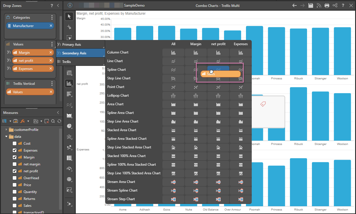
These columns allow you to specify a measure when working with trellised charts. If your chart contains only one measure in the Values zone, it does not matter where you add additional measures. However, if the Values zone contains multiple measures, resulting in trellised charts, you can choose which charts are converted into combo charts.
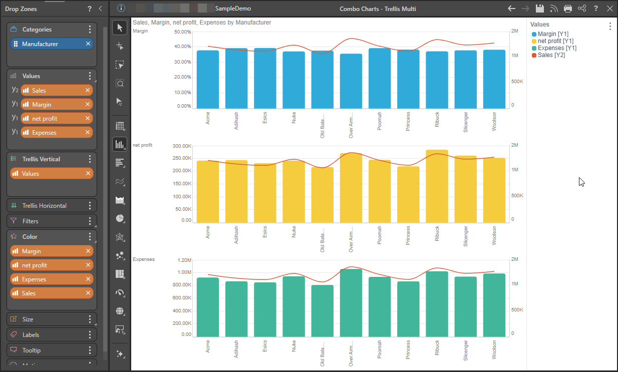
The example chart is trellised by three measures: Margin, Net Profit, and Expenses. A fourth measure, Sales, is added to the Secondary Axis. It is added to the Spline Chart visual for the Net Profit column (purple highlight above).
The result is that only the Net Profit chart is converted into a combo chart (blue arrow below), while the other two charts are not affected:
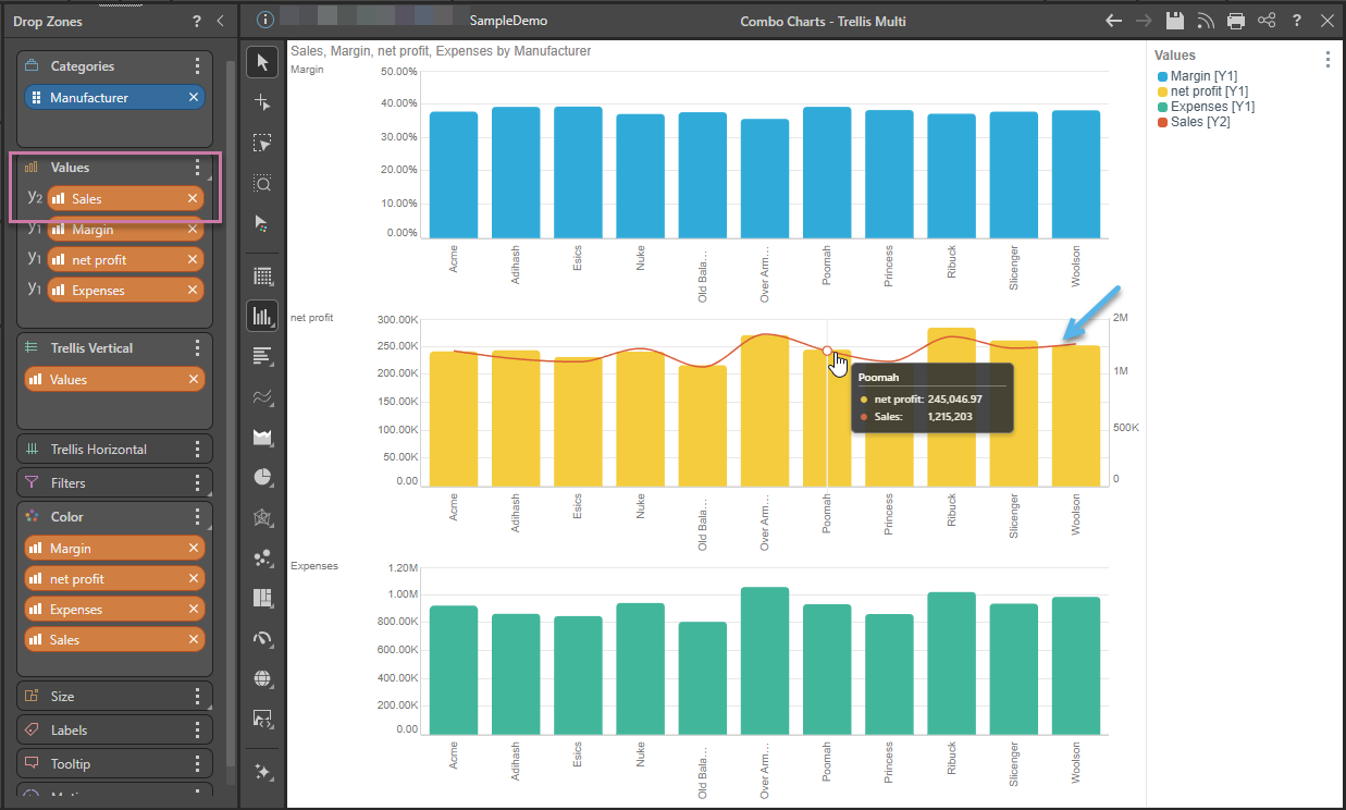
In the following example, the Sales measure is added to the All column, converting all the trellised charts into combo charts: