This option will expose your Power BI analytics catalog, allow you to browse the folder structure, and add a panel into a Pyramid dashboard that embeds a live Power BI Report or Dashboard alongside other Pyramid content. The Power BI content is live and can be dynamically bound with interactions from Pyramid slicers, visuals or interactive buttons to make it respond dynamically to user interactions. Dynamic behavior is driven by a PQL expression that defines the action to take when a slicer or visual element is selected.
For example, you might want to add a visual from a Sales Performance Report that includes a clustered column chart showing sales by region or product category to quickly compare revenue across key segments.
Note: This feature requires specific licensing options
Note: Access to the Power BI Analytics Catalog requires OAuth orchestration by your system admins to be operational
- Click to see how to use the Tableau catalog and embed Tableau content
Configuring Power BI Content
You can add a Power BI Content field to your presentation that embeds a Report in your slide (targeted using a URL) and then, optionally, include a PQL Action expression that affects the content dynamically at runtime. The first step (below) produces the basic content field.
Step 1: Add a Power BI Content field
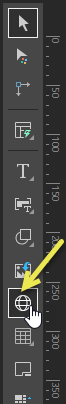
From the Toolbox:
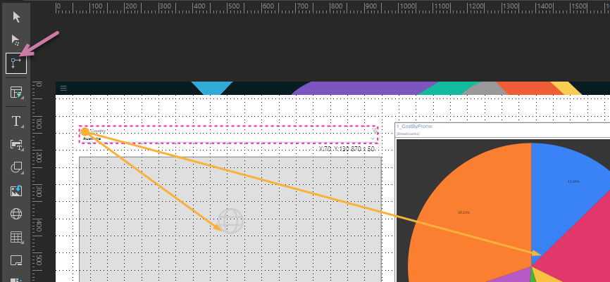
- Right-click Web Content (yellow arrow) > Power BI Content.
- Drop your Power BI Content field onto the canvas:
- Click anywhere on the canvas to drop your field at that location.
- Drag your cursor to draw your field on the canvas. (Use this option to customize the size of your field.)
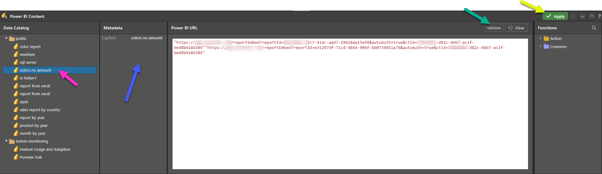
- Navigate through the content in the Power BI Analytics Catalog
- Highlighting an item (purple arrow below) with expose its visible metadata (blue arrow below). Double-click the Dashboard item to add its URL to the Power BI URL window:
- Click Validate (green arrow above) to test the URL.
- Once a success message opens, click Apply (yellow arrow) to save your function.
The Power BI Content panel opens at the bottom of the page.
Note: Your URL is contained within "double quotation marks" and includes the URL scheme (http or https). When you make your content dynamic (at a later stage), you will also add the relevant function or functions here.
Your URL is saved. When you launch this presentation at runtime, your content is embedded in a frame in the slide. You can check that the correct URL is displayed at runtime by clicking the Run button or F2 on your keyboard for a preview.
Reopening the Power BI Content panel
Step 2: Format your panel (optional)
Once you have added the field to your canvas, you might want to resize it, move it to a more appropriate location, and so on. As with any other content item, you can use the standard editing options on the right-click menu, the ribbon, and on the canvas to align and distribute fields with other visuals or text fields, and to drag, rotate, and resize them.
- Click here for more information about editing items on your canvas
Step 3: Create your dynamic function
You can incorporate PQL functions into your URL, describing what should happen in response to your users selecting elements from slicers or visuals. Your PQL Expressions are built using Common functions and functions from the PQL Action library.
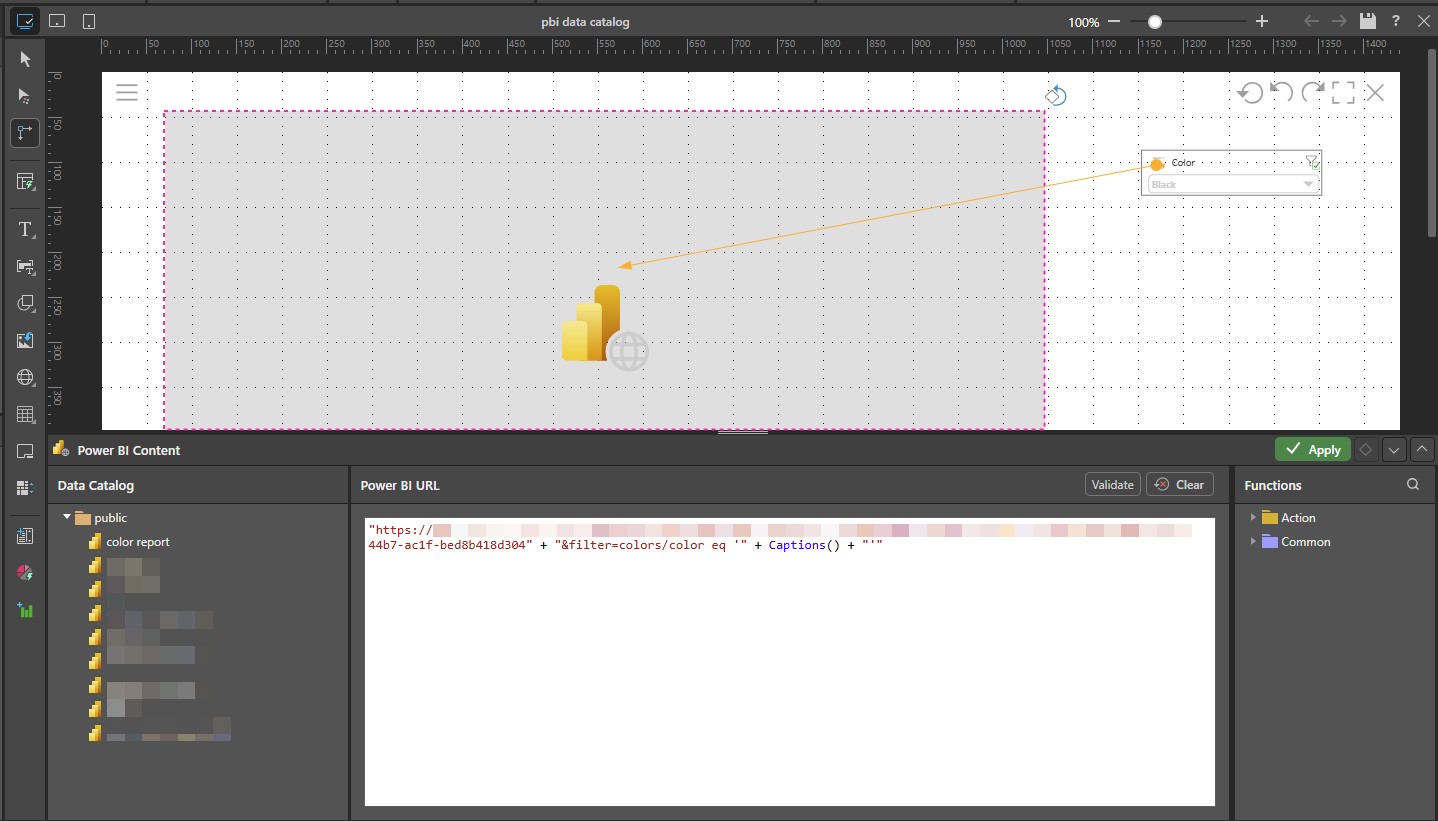
In the Power BI URL window:
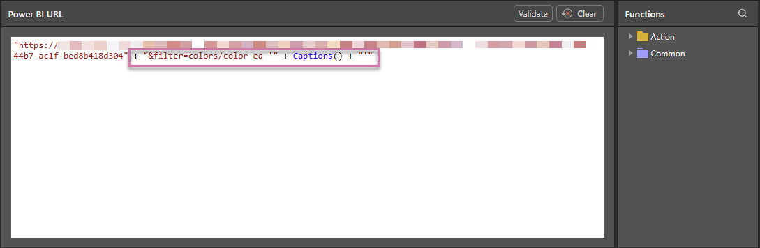
- Position your cursor after the URL string.
- Add the function that drives the interactive behavior to the URL field. This example concatenates the URL, a
&filterquery string, and the parameter value for the query string in the form of the Captions value (indicating that the value will be selected at runtime): - Once you are happy with your function, Validate and Apply it and then Save your presentation:
Tip: You can see a description of each available function, including syntax, by hovering your cursor over the item in the Functions tree. You can also double-click the function in the tree to copy the function into the URL window.

Step 4: Add an interaction
Although you have defined and validated your PQL function, the interaction between the slicer or visual and the Power BI Content field will not work until you have created an Interaction between the slicer or visual and its target.
Note: The interaction must be added after the dynamic function is configured (previous step).
- Click here for more information about interactions
If Auto Interact (Presentation ribbon) is enabled when you add a new slicer or visual to your canvas, a new interaction is automatically created between the new slicer or visual and your field. This is the default behavior and can be checked using Show Interactions (also selected from the ribbon).
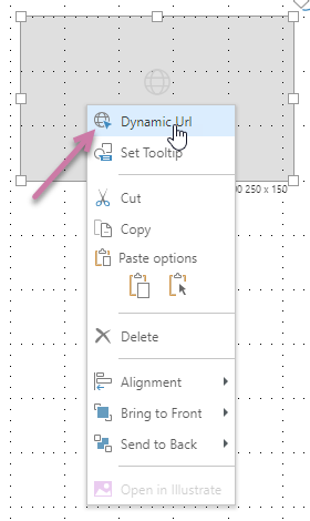
Where there is no interaction between the slicer or visual and the field, select the Interaction Picker in the Toolbox (purple arrow), click the slicer or visual that you want to affect the field, and drag your cursor to the field to create the interaction:
Note: In the preceding example, there are two interactions: (1) between the slicer and the Dynamic Content field and (2) between the slicer and a visual containing a pie chart. This means that selecting a slice at runtime will affect the content of both the field and the visual.
Step 5: Test your changes
You should always check that your changes have the effect you intended. First, open the presentation at runtime by clicking Run or F2. Next, update the options on your slicer or visual to check that the contents of the field respond as expected.
- Click here to learn more about runtime interactivity
Power BI Content example
The example through the body of this topic shows how to add a Power BI Content field to your presentation.
Configuration
The field itself is configured using a Power BI URL suffixed with a query string that filters the report by color, using the Captions() function to capture the color value derived from the slicer:
"https://<Power BI URL>" + "&filter=colors/color eq '" + Captions() + "'"
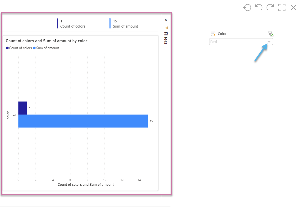
A Color slicer is then added to the canvas, automatically creating an interaction with the Power BI Content field:
Runtime Appearance
At runtime, the Power BI Report is shown in a frame on the selected slide, and it dynamically changes in response to the selected Color slice. For example, selecting "Black" from the slicer will cause the URL for the frame to take the following form:
https://<Power BI URL>&filter=colors/color eq 'Black'
The Power BI Report will be shown in a frame on the selected slide (purple highlight below) and can be filtered by color using the available dropdown list (blue arrow):
Related information
Other Dynamic Content Fields
Users can add a web content panel to slides to blend Pyramid's analytical output with 3rd party web site pages and applications. The content can work interactively with Pyramid functionality, to make it dynamically change and respond to user interactions on in the dashboard.
This function also lets users access the analytic catalogs of Tableau and Power BI to facilitate the embedding of their external analytic content alongside Pyramid content. Importantly, users can build interactions between the elements and Pyramid so that they can dynamically change both Pyramid and the external content using the same slicer or interactive functionality.