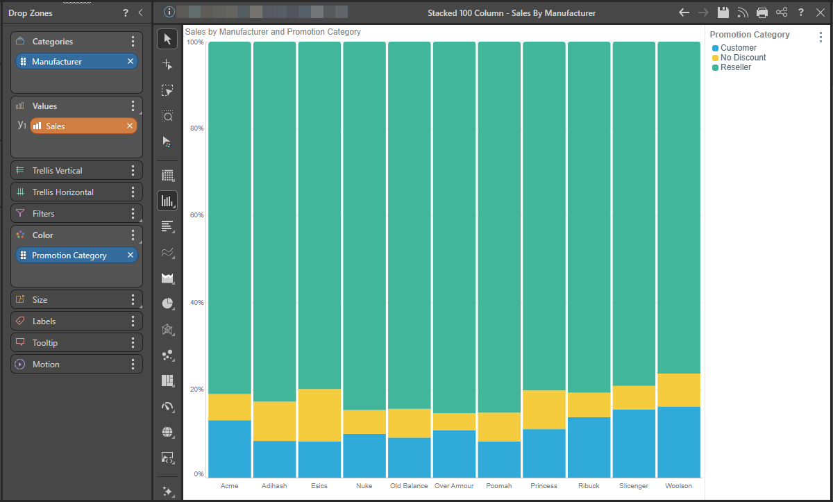
The Stacked 100 Column Chart displays the accumulated series values relative to 100% totals. Like the stacked column chart, this chart requires two member hierarchies; one on the x-axis and one driving the chart color. The second hierarchy is represented by the color of each segment in the columns. The segment height within the columns is driven by the measure in the Values zone.
Unlike the stacked column chart, each column measures from 0 to 100%, with each column segment representing a proportion of the column's total.
Building a Stacked 100% Column Chart
Step 1
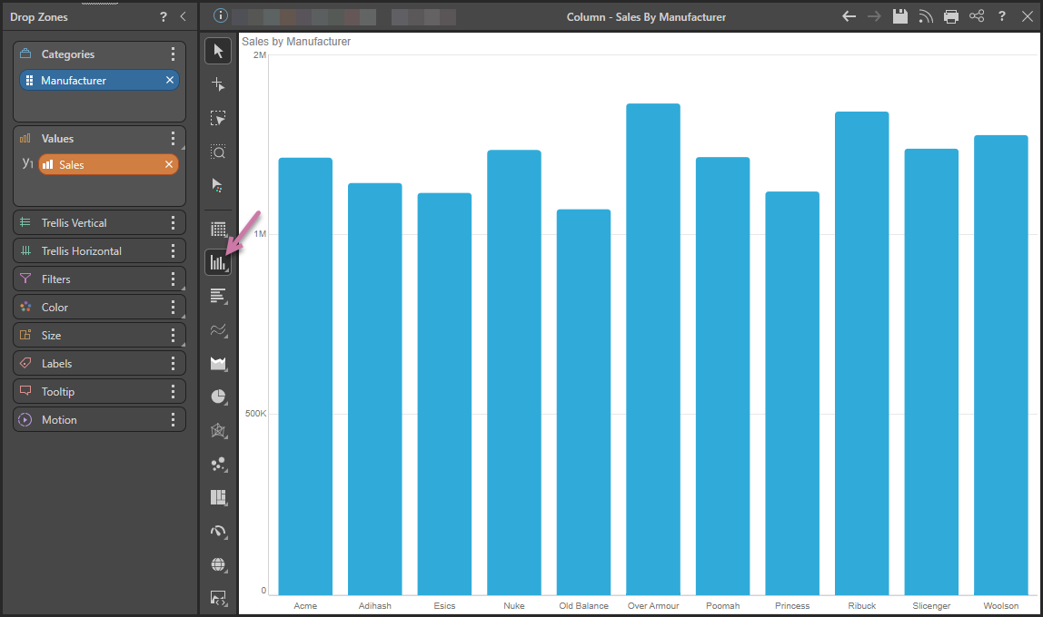
Add the hierarchy that should sit on the x-axis to the Categories drop zone, and add the required measure to the Values drop zone:
Step 2
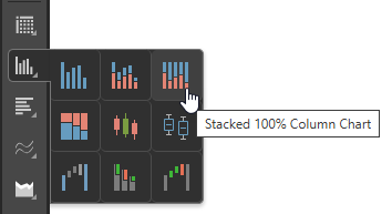
Right-click Column Chart (purple arrow above) and then select Stacked Column Chart in the flyout panel.
Tip: Hover your cursor over the options to view the name of the visualization type in a tooltip.
Step 3
Add a second member hierarchy to the Color drop zone: