The Publish Lite canvas, in the middle of the workspace, is where you design and build your publication, one page at a time. You can use the tools in the left-hand toolbox to add content items, text, images, slicers, shapes, and so on. You can use the tools from the overhead ribbon to change the formatting of those items and of the publication as a whole.
Publish Lite Canvas
The canvas displays the page that is currently selected in the Pages panel and that you are editing in Publish Lite (blue arrow below):
Read-only options
Your canvas typically contains some options that you cannot select or edit in this view. For example, there may be some variable text fields that you cannot select on the canvas (purple arrow below):
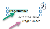
These content items cannot be selected or edited because they are defined in the master and not in the individual page.
Tip: Although you cannot edit, remove, or move these items in Publish Lite, it is possible for a user of Publish Pro to open the master and edit them in there. For more information, see Master Page Ribbon in Publish Pro.
Metadata panel
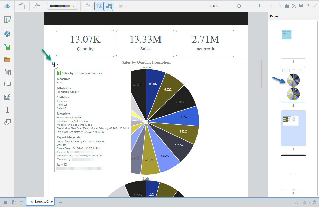
The metadata panel displays metadata information about the visual. This includes the measures and attributes it contains, any filters that are applied to it (where applicable), its statistics (the number of columns, rows, and cells it contains), its actual metadata (name, stored location, and time stamps), and the item ID that is used to uniquely identify it in Pyramid.
- Hover your cursor over the Info icon at the top-left of any visual to open a pop-up showing a summary of the visual's details.
- Click here for more information about the metadata panel
Interactions with items on canvas
Context menu
The right-click context menus allow you to interact with the items on the canvas. The menus include different options depending on what is selected when you right-click.
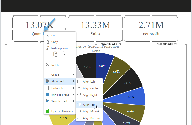
Note: The following image shows a context menu where multiple visuals are selected. The blue arrow indicates where the cursor was positioned on right-click.
|
Function |
What is selected? |
Description |
|---|---|---|
|
Scale Mode |
Visual area |
Set scaling preferences, enabling scaling up and down. |
|
Visual; Text; Shape |
Cut or copy the selected item. |
|
|
Paste options |
All |
There are two methods for pasting an item:
|
|
Delete |
Visual; Text; Shape |
Delete the selected object. |
|
Group |
Visual; Text; Shape |
Where two or more items are selected on the canvas, the items can be "grouped" and the group can then be resized, aligned, moved, copied, cut, or pasted as if it were one item. For more information, see Grouping items in Publish Lite. |
|
Alignment |
Visual; Text; Shape |
Align the object with another object on the canvas. |
|
Distribute |
Visual; Text; Shape |
Where three or more items are selected on the canvas, they can be distributed relative to one another. |
|
Bring to front |
Visual; Text; Shape |
Use one of the two options either to bring the object forward (in front of another item) or to the front (in front of all other items). |
|
Send to Back |
Visual; Text; Shape |
Use one of the two options either to send the object backward (behind another item) or to the back (behind all other items). |
|
Rename Title |
Visual |
Customize the title used for the visual on this page. This does not affect the name of the visual. |
|
Open in Discover |
Visual |
Open the visual in Discover to make changes to it. |
|
Open in Illustrate |
Image; Text; Shape |
Open the image in Illustrate to make changes to it. This function is only available if you have been assigned the correct permissions. |
|
Open in Tabulate |
Visual area |
Open the spreadsheet containing this visual area in Tabulate to make changes to it. |
|
Go to item location |
Visual, visual area (linked only) |
Open the content item in its location in the Content Manager (CMS). |
|
Unlink |
Visual (linked only) |
Unlink a shared item from its source, making it a one-off that is relevant to the Presentation only. |
Canvas objects
|
Function |
Highlight |
Description |
|---|---|---|
|
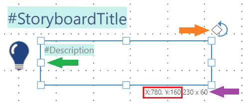
Rotation handle |
Orange arrow |
Text or Image boxes only. Drag the Rotation Handle at the top-right to rotate the text or image panel as needed. |
|
Resize handles |
Green arrow |
Drag one of the eight "handles" to resize the panel in the chosen direction. Selecting the corner handles allows the panel to be resized diagonally (that is, both vertically and horizontally at once). The appearance of your cursor indicates the resize direction. Tip: Hold Note: Resizing a text box does not affect the font size used for the text in the text box. |
|
Move cursor |
Not shown |
The move cursor (four arrows, like the legend of a compass) is displayed when you have any type of panel selected on the canvas and your cursor is over the panel. When the move cursor is shown, you can drag the panel to a different position on the canvas without resizing it. |
|
Coordinates |
Red box |
The current position of the box on the canvas as X and Y coordinates. Updates when you drag the box around the canvas. |
|
Size |
Purple arrow |
The current dimensions of the box. Updates as and when you resize the box on the canvas. |
App Tab Menu
When you have content items (presentations, discoveries, publications, and so on) open in Pyramid, each is shown as a tab in the App Tab menu along the bottom of the page. You can move between the content items using these tabs and also open each tab's context menu from its arrow (purple arrow below):
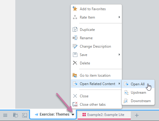
The options available on this menu where your content item is a publication and is open in Publish Lite:
|
Function |
Details |
|---|---|
|
Add to / Remove from favorites |
Adds the open content item to your favorites list or removes the current content item from your favorites list. |
|
Rate Item |
Sets a user rating (in stars) for the content item. You can also use this option to view the current star rating and clear the star rating for this item. |
|
Duplicate |
Duplicates the current content item, creating a copy in the same folder as the selected item and opening it on a new tab. |
|
Rename |
Renames the current content item. (Double-clicking the tab also allows you to rename the item.) |
|
Change Description |
Set or update the item's description. |
|
Save |
|
|
Delete |
Deletes the content item from the content system and closes the tab. |
|
Go to item location |
Opens the content item's folder location in the Content Explorer. |
|
Open Related Content |
Opens any other content items related to the current item. Related items are items that the selected item either contains or is contained by. For example, a publication is upstream of a visual that it includes, and a visual is downstream of a publication that it is contained by. Options are:
|
|
Close |
Closes the current tab. |
|
Close other tabs |
Closes all other tabs, apart from the currently selected tab. |