Add hierarchies to the Shape drop zone to drive the shape of the corresponding data points. Each element in the hierarchy will be represented as a different shape in the visual. This is particularly useful if want to add several hierarchies to the query, and display them in ways that are easy to interpret. For instance, when creating a scatter chart, you may want to add an additional hierarchy aside from those driving the color and details. In this case, you can add a hierarchy to the shape zone.
Shapes
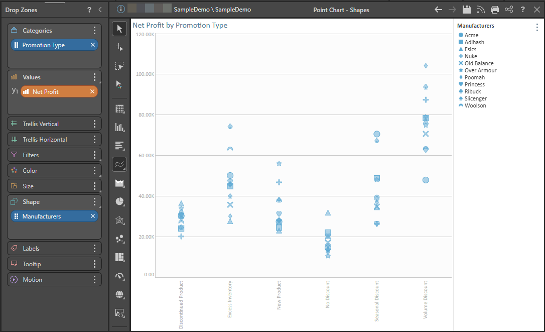
The following Point Chart shows Net Profit by Promotion Type where Manufacturers is added to the Shape drop zone:
The Shape drop zone is available for the following visualization types:
- Line, Point, and Lollipop charts.
- Area and Stream charts.
- Plotted charts (Scatter and Bubble charts).
- Radar charts.
Show Data Points
If you want to show the data points on your visual, you must either enable Data Points in the Component Ribbon or enable Shapes in the Formatting panel.

Formatting Shapes and Legends
With Shapes or Legend selected in the Formatting panel, you can edit the series to specify which shape should be displayed for a given element and what formatting should be applied. You can also combine the color and shape legends when both display the same measures.
Shapify
Use the Shapify function to add your values to the Shape drop zone automatically and have the data point shapes driven by the measures in the chart.
Shape Examples
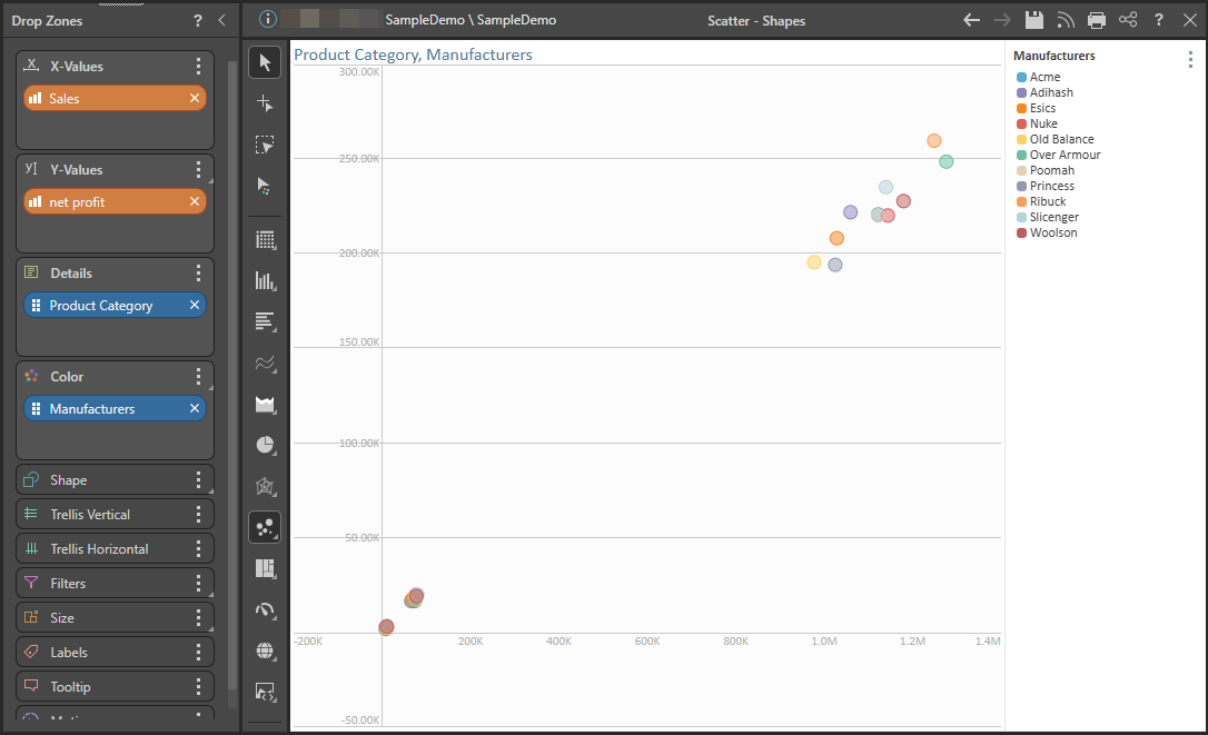
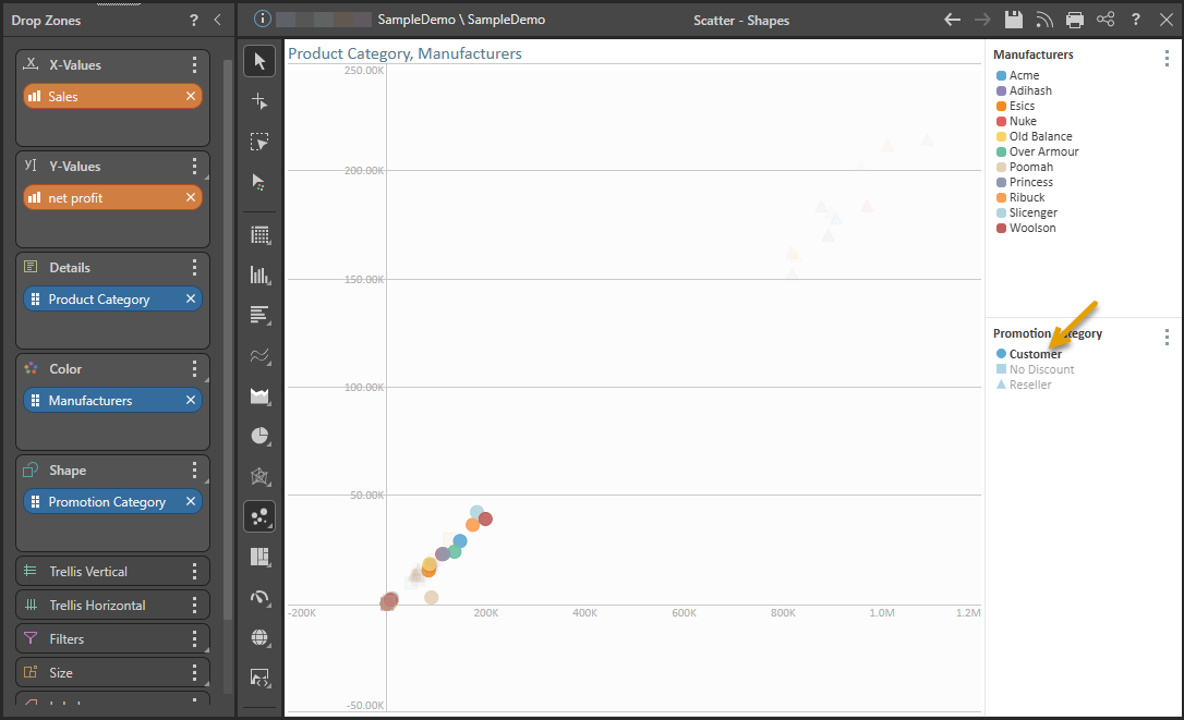
In this example, the Scatter Chart displays Sales and Net Profit for Manufacturers, with Product Category in Details:
Now a third hierarchy, Promotion Category, is added to the Shape drop zone (green highlight below). The Promotion Category legend (purple highlight) indicates which shapes are assigned to each element in the hierarchy:
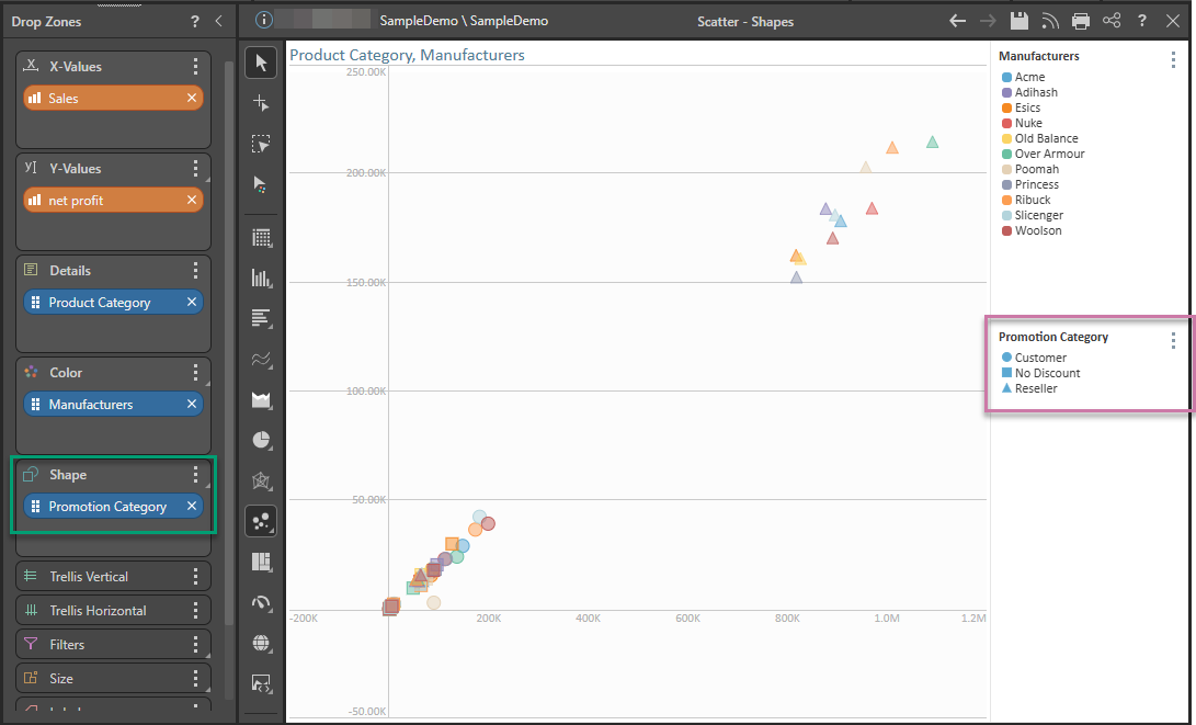
Select an element in the Shape Legend (orange arrow below) to highlight its data points in the chart. (You can click on the chart's background to deselect the series.)
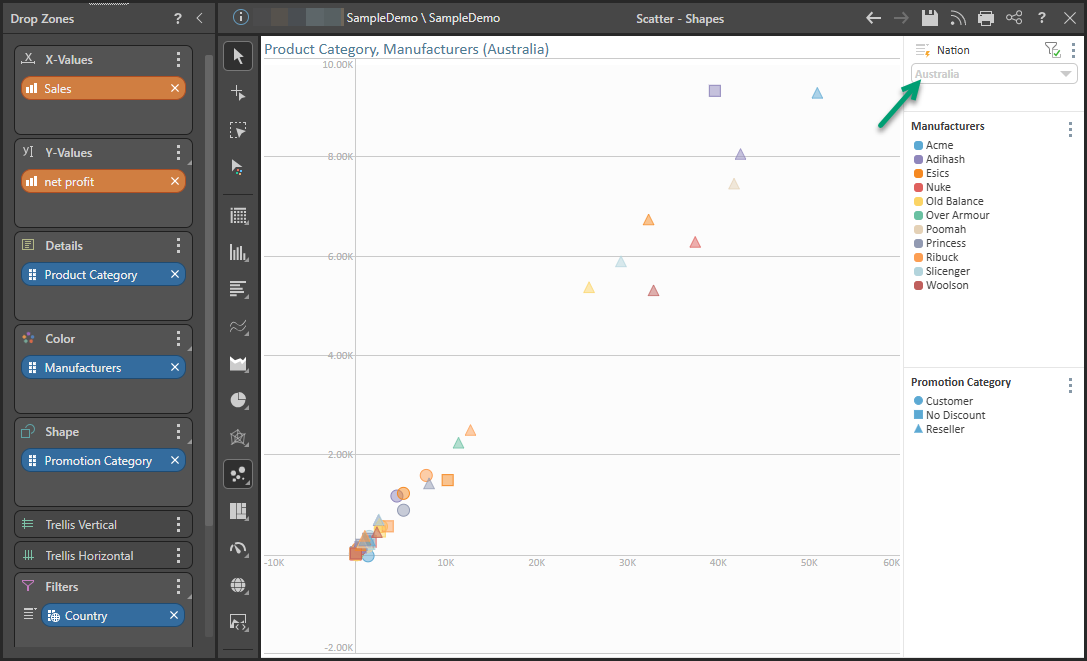
To narrow down the data further, a fourth hierarchy, Country, is added to the Filter zone, so the query can be filtered by country.
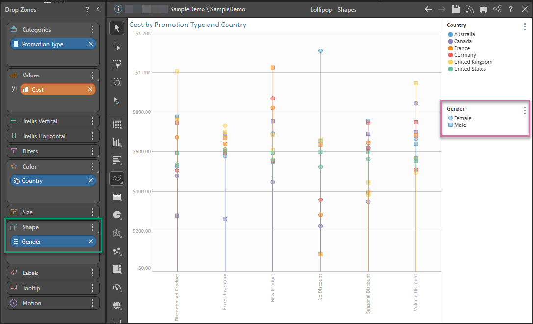
In this example, the Lollipop Chart displays Cost by Promotion Type, with Country in Color:
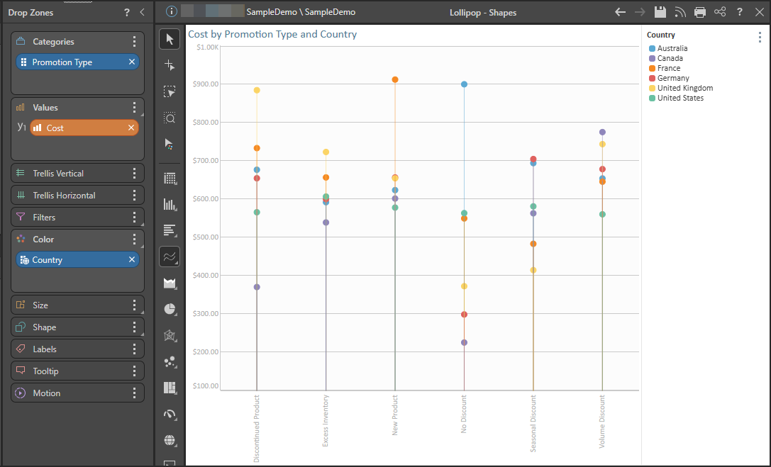
Now a third hierarchy, Gender, is added to the Shape drop zone (green highlight below). The Gender legend (purple highlight) indicates which shapes are assigned to each element in the hierarchy: