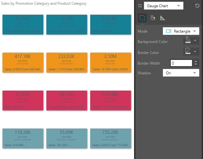
The formatting tools for gauges enable you to change the design of the gauges, change the background color, and scale the chart down to fit the canvas. With the Gauge Chart selected from the Formatting panel drop-down, 3 tabs are exposed: Design, Fill, and Settings.
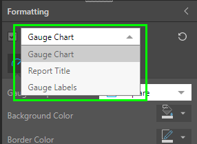
You can also access:
- Report Title: customize the report title.
- Gauge Labels: customize the labels shown in the gauge.
Design
From the Design tab, adjust the look and feel of the bullets in the chart.
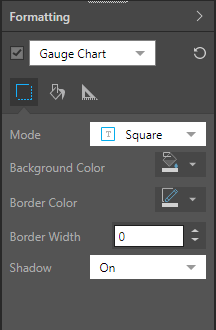
Mode: display the gauge as a square (default) or rectangle.
Background Color: using the color picker change the color of the gauge background; the color will be added to the background of each gauge. If you have a hierarchy or measure in the Color drop zone, this will override gauge background color selected from the Formatting panel.
Border Color: adjust the border color for each gauge; the border color will only be visible if the width is above 0 or the shadow is on.
Border Width: adjust the border width for each gauge.
Shadow: show a shadow around each gauge.
Fill
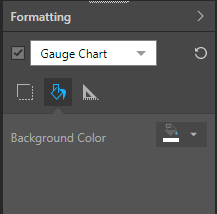
From the Fill tab, change the report background color.
Background Color: using the color picker change the color of the report background, without affecting the gauge background.
Settings
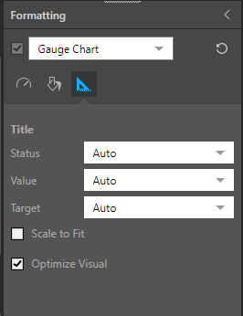
From the Settings tab, customize titles and scale the visual:
Status: use the auto title or set a custom title for the status.
Value: use the auto title or set a custom title for the value.
Target: use the auto title or set a custom title for the target.
Scale to Fit: scale the visualization down to fit on the canvas.
Optimize Visual: the visual optimization engine in Pyramid is a heuristic that automatically redacts certain parts of a graphical visualization based on the amount of space provided.
Example
In this example, the chart was scaled down and the mode was changed to Rectangle:
